User onboarding is a lot like going on a first date. You have to make a solid first impression, gain trust, and highlight your best features if you want someone to return. Most new users sign up for a product with predefined aspirations of what they want to achieve. They’ll have seen your marketing materials and are hoping that the real thing matches up to the online profile.
Your goal with a good onboarding process is to help users navigate your product quickly and realize that you’re totally worth the investment. Dating aside, this flow looks different for mobile and web apps. What works for a desktop onboarding setup might spoil the scene on mobile.
In this article, we’ll break down the core differences in mobile and app onboarding flows and share the best practices for both. We’ve also curated a list of the top three tools to create mobile and web onboarding processes that get your users hot under the collar.
Mobile and web app onboarding differ on many grounds—like varied attention spans, screen sizes, design constraints, and muscle memory UI.
Some shared elements between mobile and web onboarding flow that enhance the user experience include personalization, removing friction, and progress monitoring.
Gamify your mobile app onboarding to increase engagement and help users retain more information.
Designing a tailored experience, using psychological tactics, and creating a self-serve support library are some of the most effective web app onboarding practices.
Mobile vs. Web app onboarding: What sets them apart
An ideal onboarding flow should engage and educate new users, clarifying how they can benefit from your product, and nudge them toward activation.
Here are four reasons why any onboarding flow has to be designed separately for mobile and web apps.
More scope for distraction on mobile than on desktop
Mobile users tend to juggle five different apps at a time—whether it's scrolling through TikTok or replying to a Slack message. This means mobile app onboarding is constantly vying for attention against other apps and real-world situations interrupting the user on their phone.
Remember, they’re on their phone for a reason and there’s a high chance they’re not at their desk, which means they’re on the go and surrounded by distractions. Unlike web apps, a mobile onboarding flow has to be shorter and more engaging to ensure users complete all the steps.
Mobile screens are more immersive but have usability constraints
Given the small(ish) size of a mobile screen, onboarding flows need to be much more immersive. You can combine your in-app onboarding process with exciting visuals, contextual push notifications, and in-the-moment messaging to engage new users and encourage them to complete the process.
But smaller mobile screens create usability constraints, and replicating your desktop interface can overwhelm most users. Instead, you’ll need a scaled-down and minimal design to create a less cluttered flow, hold mobile users' attention for a long, and enable navigation for thumbs over mice.
Navigation design differs for mouse-based and touch-based interfaces
The way users interact with your app also differentiates the mobile and desktop onboarding experience.
Since users can tap, pinch, swipe, and rotate their mobile screens, the navigation design will differ for a touch-based interface. On the other hand, desktop apps use a bigger space for users to click around and hover the mouse for navigating the app.
Mobile apps are built for native platforms
Mobile apps are built for native platforms like Android and iOS. Their interface differs slightly based on these platforms, and so will the onboarding process. This isn't such a challenge with web onboarding since desktop apps have a responsive design across all operating systems.
While mobile and web onboarding flows differ on these four fronts, they’re similar in many ways. Let’s break down these similarities.
Mobile vs. Web app onboarding: Where they’re alike
Despite all the differences between mobile and desktop onboarding, these two processes are alike in many ways.
Take a look at the three major similarities between these onboarding screens:
Personalization: The key to any successful onboarding flow is creating a tailored product experience. Personalize your onboarding to enhance users’ interest in your app and reduce their time-to-value. Whether you’re onboarding users on mobile or desktop, the goal is to customize the process to unique needs and goals.
Friction elimination: Another common link between these two onboarding flows is the need to remove friction points from this stage in the user journey. Whether you're building a mobile app or a web platform, you’ll want to constantly identify areas where users get stuck or drop off and smoothen the process with contextual help.
Progress monitoring: Both mobile and web onboarding processes should include progress indicators or checklists to create an endowed progress effect. This gives users the feeling that they’re making tangible progress and being rewarded for it, gradually pushing them to complete all the steps.
Now that we’ve noted the differences and similarities between these two onboarding processes, let’s discuss the best practices to maximize user success from the first step.
Mobile app user onboarding best practices
If you’re wondering whether you should even invest in designing an onboarding flow, fun fact: 25% of users abandon an app after just one use, and most apps lose nearly 75% of users within the first week.
Take a look at these four mobile app user onboarding best practices to help users fall in love with your product from hello, and win their loyalty for the long run.
1. Keep the onboarding screens concise
Your onboarding should ideally show users around and take them to their “aha!” moments quickly. Aim to complete the flow in four steps or less. Since there's no magic number for the number of steps in an onboarding flow, you can collect user feedback by iterating your steps and offering a better user experience.
You can also review product usage data to pinpoint where most users drop off and modify that step. Remember to add a checklist to give users an overview of all the tasks they need to tick off and help them visualize their progress.
Case in point: Rabbit’s onboarding flow asks users only two questions to personalize the product and get them started. It’s short and hassle-free, helping users start as quickly as possible.

2. Choose your ideal onboarding approach
You can pick any of these three onboarding models, based on your goals:
Contextual: Customize your onboarding flow based on user behavior. Ask users to define their goals/needs and segment them into different personas to offer a contextually customized experience.
Functional: Focus on your core features and create interactive walkthroughs to help users navigate the tool. Demonstrate different functions they can use within the app and spotlight the most crucial features.
Benefits-driven: Prioritize product value over features to show users how they can benefit from your app. This is great for easy-to-use products. You can highlight your core value propositions in the onboarding flow instead of walking users through specific features.
Choose your approach for user onboarding before everything else to guide the design and development process.
Case in point: The mobile app Headspace educates users on the benefits of using the app in its onboarding flow. While asking new users their preferences to customize the interface, the app also shares insights on how they can benefit from it.

3. Use gamification to engage users from hello
Make onboarding a fun learning experience and increase the information users retain through gamification. Introduce gamified elements to your flow like collecting points, unlocking new levels, in-app rewards, and more.
Incentivize users to explore different features and realize product value. Gamification can work well in both web and mobile onboarding flows.
Here's how Evernote gamifies its onboarding with reward badges and tokens for different levels. This encourages users to finish the given tasks and earn these tokens to upgrade to higher levels.

Web app user onboarding best practices
Despite knowing the importance of a seamless onboarding process, most companies rate their onboarding delivery as average. The reason? They don’t follow these web app user onboarding best practices.
1. Give users quick wins with a tailored experience
Users signing up for a new product want to test if your app is a good fit for their needs. While they figure things out, you can make a solid case for yourself by quickly conveying your product's value and giving them a few quick wins.
Make it easy for them to decode your app’s functionality and get cracking in a few steps. How? Instead of asking them to start from a blank slate, create personalized welcome screens for each persona with the essential features they need to get their job done.
Case in point: Zapier’s onboarding flow asks users to select the apps in their current workflows. The welcome screen shows a “Recommended for you” section with the most popular Zaps created for the selected apps, giving users a quick head start to figure out the product.

2. Use a combination of in-app messages to guide new users
Think of your onboarding process as a unified journey for users to understand your product and identify the best ways to use it. Share useful resources at regular intervals to make this onboarding journey a success.
Here are a few ways you can offer self-serve support to guide new and existing users.
Modals
Add a modal window to greet new users with a welcome message. A modal shares an important resource, like a product video, explainers, or get-started guides.
Here’s how Framer uses a modal window to share a product tour that users can watch or skip.

Tooltips
Tell users about the important product features with short and actionable tips. These snippets give users a quick glimpse of what different buttons or features can do—and only appear if a user clicks or hovers over them.
For example, this tooltip by Typeform explains what the “Time to complete” toggle button does and how it can help.

Video tutorials
Embed video tutorials in your onboarding flow to give users hands-on insights into your product. These videos can include a product overview, feature walkthroughs, or troubleshooting tips.
For example, Monday.com uses a slideout to give users quick access to their video knowledge base on YouTube.

Product tours
Create dynamic product tours to walk new users through your tool’s functionality and help them start strong. An interactive product tour will help them realize your product’s value quickly.
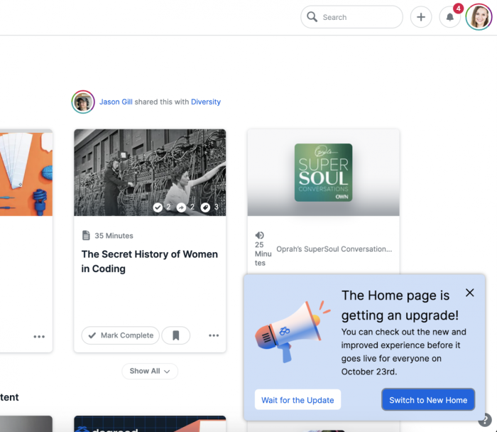
Here’s how Degreed used Chameleon to create in-app Tours to guide users through its revamped interface.
Help widgets
Give users on-demand, in-app guidance with help widgets. They can find quick answers to any issues by accessing your help center with a click.
For example, Harvest has placed a help widget at the bottom of the screen. Users can visit their help center or ask a question to the help bot for immediate solutions.

Checklists
Keep users on track and show them around with a short checklist of tasks. Like progress bars, this checklist will prepare them to set up their account properly and learn all the basic features, it also highlights how much more they need to do so they can manage their time better.
Here’s how Hive uses a checklist to acquaint new customers with its core features, adding the progress bar to help them navigate with ease. Each item has a short tip explaining what users can do with a feature.

3. Use psychology to reduce cognitive effort
Design your onboarding process using psychological tactics and keep users motivated from start to finish. Use logic to drive people to take certain actions and increase adoption.
Here are a few psychological tips to strengthen your onboarding flow:
Prevent analysis paralysis by reducing the number of choices a user has to make—for example, think of three options instead of six for a question about their goals
Use the Zeigarnik effect to turn users’ attention to the incomplete steps in your checklist and send in-app notifications to remind them about these tasks
Perform heuristic analysis to ensure your interface complies with pre-determined heuristics and ticks off diverse usability needs
Create an endowment effect to make users feel they own your product and let them personalize the tool’s look and feel
On top of these tips, activate your users’ muscle memory with an intuitive onboarding interface. Muscle memory helps people remember different elements of an app’s interface from their past experiences.
Lean on this and understand different cognitive biases to make your onboarding a breeze for end-users.
4. Give users the option to complete or skip the onboarding
Not everyone wants to complete your onboarding tour—no matter how fabulous. Some users might be short on time, and others prefer learning while using your tool instead of hand-holding.
Forcing users to go through the entire tour can create friction and turn them off. Instead, let users explore your product independently and add the option to skip your onboarding tour. This makes your onboarding more flexible for every type of user.
Case in point: Slack lets users skip the onboarding flow at any point in the process. You can hit the skip button at the welcome screen or during any step in the flow.

Enable users to Snooze onboarding tours and get back to them at a more convenient time. Will they come back? Yes, they will! Our Benchmark Report shows that one in five users will appreciate this option and complete a tour at their own pace.
Top 3 tools to create impactful mobile app onboarding flows
We’ve rounded up the three best tools to use for designing a smooth and engaging flow for your mobile app onboarding.
1. Braze

Braze is a customer engagement platform for designing a mobile onboarding sequence. The tool allows you to personalize your flow and make it engaging with on-brand push notifications, interactive product tours, and data-driven experimentation. The tool collects customer data from multiple touchpoints, studies users’ behavioral patterns, and tests real-time campaigns to create a high-impact journey.
2. Airship
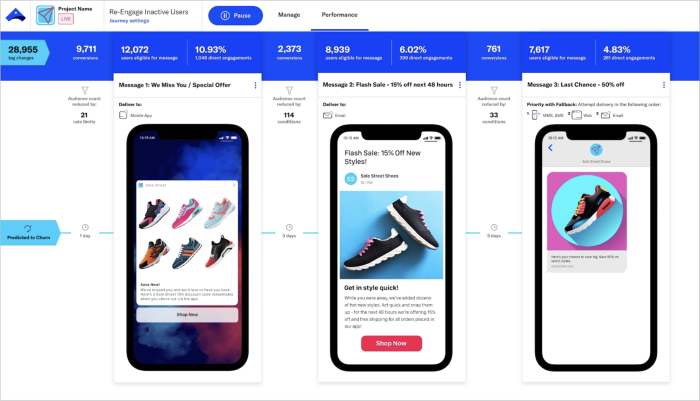
Airship is a mobile app experience (MAX) platform designed to increase your time-to-value. With its core focus on mobile apps, the tool can help you deliver a multi-channel onboarding flow and optimize it for maximum retention. You can run A/B tests and roll out your new onboarding flows to a small audience. Airship also has a powerful reporting function to track your customer satisfaction levels.
3. Pendo

Pendo is a product experience platform with powerful features to onboard users effortlessly and turn them into power users. It helps you create an intuitive onboarding experience based on every user’s preferences and acquaint them with the most relevant features. You can automate parts of your process, create interactive training resources, embed videos inside the app, and simplify the sign-up process.
Top 3 tools to build effective web app onboarding flows for your SaaS product
Here are our three best tools to create a frictionless onboarding journey for your web app users.
1. Chameleon

Chameleon sits inside your product to empower users through self-serve support and guide them with interactive tooltips, product walkthroughs, and other forms of in-app guidance. Plus, with the all-new HelpBar, you can offer users quick, just-in-time access to your knowledge base with a powerful search engine.
Use Chameleon to help users understand and adopt your product in their routine. Design a fully on-brand experience and integrate Chameleon with the rest of your tech stack for better performance. The best part? You don’t need to know a lick of code to implement it.
2. Appcues

Appcues is a digital adoption platform with a user onboarding function to create tailored in-app experiences. Its no-code design builder makes it easy to get started. You can use segmentation to create custom journeys for every user persona and iterate these paths based on user behavior.
3. WalkMe

WalkMe creates contextual user onboarding for SaaS products and works best for large companies that want to create employee onboarding flows, too. You can use it to map user pain points and create helpful tips to tackle these challenges, helping users to navigate your product effortlessly. The tool easily integrates with other tools in your product management toolkit, capturing the voice of the customer for any modifications.
Tailor user onboarding to improve your product experience
A lot is riding on your onboarding process—more than most teams imagine. You're not just setting the first impressions for your product but helping users understand that your product is the one they’ve been looking for.
We compared mobile and web onboarding in this article to help you prepare unique journeys. Both journeys have to adapt to the screen and people’s preferences for using apps on different devices but still complement each other in design, product, and brand experience.
The bottom line: Invest enough time researching, planning, and creating a customized onboarding flow to match user intent and drive product adoption in the long run.
Boost product adoption with in-app messaging
Get started free with Chameleon and harness the power of product tours, tooltips, checklists, and surveys.


