


Across our own experiments and roundtables with leading SaaS teams, one thing is clear: vibecoding moves fast – but it's hard to scale.
Whether you’re hacking onboarding flows solo or building infrastructure for a growing product, we’ve distilled the best lessons from real-world examples, frameworks, and tradeoffs to help you use AI wisely in your user onboarding, and know when to graduate from prototype to production.
Here's the TL;DR:
What is vibecoding?
Call it vibecoding, agented development, or prompt-to-prototype, whatever makes it sound less cringeworthy in your product review. The terminology doesn’t matter. What matters is that AI has quietly and quickly become a collaborator in your day-to-day work.
You’ve probably seen it: someone uses AI with no designer, developer, or Jira ticket in sight, then posts, “Made this real quick.” And somehow, it works.
from our own team at Chameleon, using ChatGPT to quickly generate scoped CSS for in-app Experiences, skipping the usual ticketing flow entirely.
That’s vibecoding. Not quite no-code. Not quite engineering. Definitely not scoped. But fast, intuitive, and good enough to test an idea. It’s not a technical method, it’s a cultural moment. A new way of building: AI-assisted, momentum-driven, and mostly unstructured.
Vibecoding is most prevalent in SaaS's “gray areas,” where traditional development processes don’t always apply (think internal tools and admin dashboards, QA workflows and experimentation sandboxes, or quick fixes that unblock teams without consuming an entire sprint). More recently, we’ve seen it make inroads into user onboarding, as teams look to improve first-time user experiences quickly.
What does user onboarding vibecoding actually look like?
- 1 It's an interactive demo spun up in Replit to test messaging variations before your next user research session. Instead of showing static mockups, you're clicking through actual signup flows with users and watching their real reactions to different copy approaches.
- 2 It's a welcome modal co-written with GPT, previewed in Vercel, and shared with your team for feedback. In one afternoon, you went from "should we explain features upfront or let users discover?" to having a working modal that stakeholders can actually experience and react to.
- 3 It's an onboarding checklist scaffolded with Cursor sitting one PR away from real users. You built it to test a hypothesis about completion rates, validated it works, and now engineering needs to integrate it properly rather than building from scratch.
The advantage is you're validating ideas with interactive experiences that feel real, generating better user feedback, and de-risking development work—all without touching your sprint capacity.

"The exact same idea shown in Figma vs. shown as a working prototype gets completely different user feedback. Real interactions surface real reactions."
we made in Bolt.new. Throw in your brand colors, add some design best practices, and you have a simple pop-up ready to share.
Vibecoding your user onboarding feels deceptively straightforward. It's visible, high-impact work that often lives as a layer on your core product rather than deeply embedded within it. So it's tempting to quickly assemble modals, tooltips, or checklists using openly available React libraries like Joyride, Shepherd.js, or Intro.js and consider the problem solved. Add AI tools into the mix, and the appeal becomes even stronger:
Generate contextual copy variations instantly
Spin up interactive prototypes in minutes
Deploy something that appears helpful within hours
The potential payoff justifies the excitement; small onboarding improvements frequently drive significant lifts in activation and revenue. But that apparent simplicity masks a more complex reality: user onboarding isn't a single flow; it's an interconnected system.
It spans multiple personas, use cases, pricing tiers, and product maturity stages. It demands sophisticated targeting, continuous testing, conditional logic, localization support, robust measurement... and crucially, long-term resilience. This is precisely where most vibecoded onboarding solutions falter. They were designed for rapid deployment, not sustainable operation.
The gap between "shipped quickly" and "built to evolve" becomes the difference between a promising prototype and a production-ready system that moves your business metrics.
Where vibecoding in user onboarding thrives (and where it falls apart)
🧪 Track 1: AI-assisted prototyping
Tools: Bolt, Lovable, Vercel v0
Used by: PMs, Designers, Growth Marketers
This is where early ideas take form fast. These tools let you build interactive mockups that feel real enough to test or present without needing to open Figma or write a line of code. They’re ideal for alignment, validation, and lightweight experiments.
Good for:
- 1 Spinning up three onboarding flows to test messaging and layout before involving design
- 2 Building a simplified onboarding checklist to walk through in a stakeholder sync
- 3 Creating a click-through version of a user settings page to gather early feedback
The catch:
These tools don’t integrate with your actual product, so what you build is functionally isolated.
- 1 Logic isn’t real: clicking a CTA might animate, but it doesn’t update any user state
- 2 Although the style may look consistent, because it’s not built with your real design tokens or components, any updates to your system won’t apply, so things drift, and maintenance becomes manual.
- 3 Components don’t follow your product’s logic or naming conventions, so nothing is reusable
Bottom line: Perfect for building momentum. Complicated if mistaken for a shippable product.
👨💻 Track 2: AI inside your codebase
Tools: Cursor, Devin, GitHub Copilot, Sweep
Used by: Engineers, technical PMs
These tools live in your codebase. They’re not for dreaming up ideas. They’re for speeding up real product work that’s already been scoped. Think of them as extremely fast, very literal junior engineers. If you tell them exactly what you want, they’ll move quickly. If not, they’ll guess.
Good for:
- 1 Updating the empty state content in your onboarding checklist across multiple locales. When your product supports multiple languages, every change, like new copy in an empty state, needs to be made across English, French, Spanish, etc. AI tools can help find and update those strings in the right files, quickly and consistently.
- 2 Refactoring an onboarding tooltip to support multiple user roles. Let’s say you built a tooltip that only shows to admins, but now you need different tooltips for admins and end users. AI can help rework (aka refactor) that logic, splitting it into clearer, role-specific flows, without changing how the rest of the app behaves.
- 3 Writing the boilerplate logic for a new onboarding step. Say you're adding a new step to your onboarding flow—a settings reminder, for example. You still need to wire up how it appears, when it dismisses, and how progress is tracked. This is tedious but predictable. AI can write 80% of this quickly, as long as you give it clear instructions.
The catch:
These tools know code but don’t know your codebase unless you teach them. They won’t magically follow your product’s architecture, naming conventions, or design guidelines—and they’re limited by how much of your code they can actually "see" at once.
Most AI dev tools have a context window, meaning they can only understand the files currently open or explicitly referenced. If your logic lives across 10 files and you only prompt with one, they’ll fill in the blanks—and often fill them wrong.
That said, it’s not hard to teach them. It just takes clarity. Here’s how you make it work:
- Give them a precise prompt: “Update this modal to use SettingsTooltipV2, show it only to new users, and track dismissals via useOnboardingEvents().”
- Link to real examples: “Follow the pattern in TooltipWelcome.js and TooltipUpgrade.js.”
- Call out rules explicitly: “Never hardcode colors, use theme.palette. Always get user info via useAuthContext().”
With that level of guidance, AI tools can move fast and smart. Without it, they’ll guess—and those guesses can break three other things you didn’t even mention.
Bottom line: These tools are great at doing. You still need to be great at directing.
Heads up from the field: One theme we heard repeatedly in our roundtables was that the real slowdown happens when PMs rush the prompt. AI agents aren’t mind readers. As one product leader put it:
The biggest mistake everyone makes is trying to go too fast. If you just slow down and give the AI proper context, everything speeds up.
Why vibecoding feels like progress (but isn’t always)
AI prototyping tools like Lovable make it feel like you’re moving fast, especially compared to static docs or Figma mockups that never leave the design phase. Stakeholders can click through something. Sales can demo it. You feel like you're shipping. But here's the catch: you’re almost always looking at a prototype, not a finished product.
What makes it helpful:
You can explore ideas quickly
You get instant stakeholder feedback
You bypass long planning loops and alignment meetings
What makes it risky:
There’s no real logic or state management
It ignores your design system and tokens
It’s functionally isolated, so engineering can’t build on it without starting over
It’s the kind of thing that looks finished in a pitch deck, but collapses the second someone asks, “Can we ship this?”
Track 2 (AI inside your codebase) doesn’t carry the same risks if you give your AI dev agent clear instructions. The output is real, usable code. But it still requires thoughtful direction to avoid confusion, rework, or broken behavior.
The Vibe vs. Viability Matrix
So, how do you know if your vibecoded onboarding is harmless experimentation or a ticking time bomb? We created this matrix to help teams determine where their vibecoding lives, and whether it should stay there. It maps out two key dimensions:
Stability – how reliable and integrated the output is
Intent – whether the work is exploratory or meant to ship
Each quadrant represents a different output type, some useful, some dangerous. Use this to check if you’re learning fast, building smart, or accidentally duct-taping your roadmap..png)
Why isn’t vibecoded onboarding making it to production?
The prototype landed. Sales used it in a call. Your Head of Product called it “slick.” You felt unstoppable… until Engineering took a look.
That’s usually when things fall apart. Because while you were basking in the glow of “we built this in 20 minutes,” your onboarding mockup was quietly accumulating debt it didn’t earn.
It looked polished, sure. But it didn’t use your design system. It ignored naming conventions. It didn’t do anything… it just looked like it might.
And in onboarding, that’s a bigger problem than most realize. As one product leader mentioned:
Onboarding isn’t a static page. It’s a logic-driven experience that adapts by user role, lifecycle stage, or plan. It often includes conditional flows, progressive disclosures, and time-based nudges. If a prototype doesn’t account for all of that, it’s not just incomplete. It’s misleading.
That’s why most vibecoded onboarding never survives the jump to production.
What’s missing (and why it matters)
Engineering teams can’t just “clean it up.” They can’t bolt on targeting logic, state persistence, or cross-device compatibility after the fact. The prototype usually gets scrapped and rewritten, often from scratch. What felt like momentum ends up as another ticket in the backlog, this time with unrealistic stakeholder expectations attached.
Onboarding is one of the worst places to fake it. You’re teaching users how to use your product. If the experience is broken, confusing, or inconsistent, it damages trust. So if you’re vibecoding user onboarding, you have to be honest about the intent.
- Flag it clearly: “This is for feedback, not shipping.”
- Don’t promise logic you can’t deliver.
- Use screenshots or real system components if you can.
- Never end a review with “can we just wire this up?”
Instead of ending a review with "Can we just wire this up?" (which implies the prototype is ready to ship), you want to shift the conversation from output to intent. The goal is to validate the idea, not push it prematurely into production.
What to say instead:
-
1
“What would it take to build properly?”
→ Signals respect for engineering effort and opens the door for technical feedback. -
2
“Does this concept make sense from a systems perspective?”
→ Encourages alignment on architecture, logic, and feasibility. -
3
“What assumptions would we need to validate before we scope this?”
→ Turns the review into a planning conversation, not a handoff. -
4
Would this be easier to build with the patterns we already use?”
→ Keeps momentum while staying grounded in reality. -
5
“This helped clarify the experience—what’s the cleanest path to making it real?”
→ Invites collaboration without skipping the process.
Prototyping onboarding can be incredibly valuable, but only when the team understands it’s a sketch, not a spec. When you try to scale it, your throwaway code becomes a real obstacle.
Where does vibecoding in user onboarding work?
Let’s be real: vibecoding tools are powerful, but they’re not mind readers (yet). Think of them less as magical engineers and more like enthusiastic interns with instant recall. Super helpful with guidance. But without direction? They’ll build confidently… and incorrectly.
When it comes to onboarding, that’s where Track 2, AI inside your codebase, really shines. These tools might not be great at big-picture architecture, but they’re incredibly effective at high-frequency, low-stakes tasks—the kind onboarding is full of because onboarding isn’t one big feature. It’s a hundred tiny ones. Those are exactly the tasks AI can handle.
The real problem with maintaining hard-coded onboarding
Every PM has felt the “this should’ve taken 10 minutes” problem.
You want to change one word in an onboarding modal, but it’s hardcoded.
You notice unreadable tooltips in dark mode, but design is already onto the next sprint.
You finally get stakeholder buy-in on a better checklist… and realize engineering needs a full spec just to start.
None of these tasks are hard. But they’re tedious, thankless, and constantly pushed to “next sprint.” That’s how onboarding UX quietly decays, one unreadable tooltip, misaligned modal, and ignored copy tweak at a time, until someone finally asks why activation just dropped 27%.

"If something already has high maintenance overhead, it’s worth vibecoding a tool to solve it, even if you have to maintain it later. It pays off by turning reactive fire drills into proactive fixes."
This is where AI agents actually help
Agents can claw back the hours lost to onboarding friction if used correctly. They’re ideal for the work no one wants to own:
✏️ Replacing generic copy with segment-specific headlines across a 5-step tour
The problem: You’ve got one-size-fits-all onboarding, but different personas need tailored messaging.
How to use AI:
-
1
Prompt with segmentation context: Rewrite the headline and body copy in Step3.js of the onboarding tour for these 3 personas:
Enterprise admin → emphasize security and governance
Startup founder → emphasize speed and control
Developer user → emphasize extensibility and docs - 2 Give good tone/messaging examples: Link to successful past copy for each persona, or paste inline examples.
- 3 Automate the creation of variants: Ask the AI to duplicate the component and inject a prop like userPersona to swap content conditionally: “Create a getHeadline(persona) helper that selects the appropriate headline string based on a userPersona prop.”
✨ Standardizing between modals that were built six quarters apart
The problem: Legacy modals behave and look differently across your onboarding experience.
How to use AI:
- 1 Open multiple modal files side by side, e.g., WelcomeModalV1.js, FeatureIntroModalNew.js, TrialEndingModal.js
- 2 Prompt for normalization: “Make all three modals use the ModalContainerV3 wrapper, align to the same theme.spacing, use the new useDismiss() hook, and use the same animation pattern as FeatureIntroModalNew.js.”
- 3 Add style enforcement: “Ensure all modals use theme.palette.primary for CTA buttons and fontSize.h4 for headlines."
🧠 Refactoring four one-off onboarding banners into something semi-reusable
The problem: Your onboarding banners are hardcoded, inconsistent, and hard to update at scale.
How to use AI:
- 1 Show it the four versions: e.g., NewFeatureBanner.js, UpgradePromptBanner.js, RetentionNudgeBanner.js, WelcomeBanner.js
- 2 Prompt to abstract shared logic: “Create a reusable OnboardingBanner component that accepts props for message, CTA text/link, dismiss tracking, and audience targeting. Use logic from UpgradePromptBanner.js as a base.”
- 3 Ask for cleanup: “Remove duplicated logic from the original four files and replace them with usage of the new OnboardingBanner component.”

"The devs who get the most out of AI aren’t just writing more code... they’re automating the repetitive stuff so they can focus on harder problems."
📲 Cleaning up a UX pattern that “kind of works” but breaks on iPad
The problem: Responsive issues are hurting the onboarding UX on non-desktop devices.
How to use AI:
- 1 Open the problematic component: e.g., StepTooltip.js
- 2 Prompt for responsiveness: “Fix positioning logic so this tooltip doesn’t obscure CTA buttons on iPad (1024x768). Add a media query or container logic so it repositions to the bottom on narrow viewports.”
- 3 Ask for test plan or device-specific preview hooks: “Add viewport condition logic so I can test it locally at iPad and iPhone dimensions with a single prop toggle like forceViewport='tablet'.”
- 4 Request consistent cross-device styling: “Ensure padding and alignment match TooltipBase styling used in MobileHelpTooltip.js.”
These tools are best for structured, scoped changes inside your product, especially when the alternative is waiting two weeks to fix a spelling error.
The real unlock isn’t AI. It’s local.
AI dev tools don’t care about your staging pipeline. They expect you to be working in your environment. That means you—yes, the PM—need to be able to:
Run your app locally.
Preview onboarding changes live.
Know when something broke before your customer does.
Otherwise, every fix goes through a cycle of:

You’re not vibecoding. You’re just writing to-dos.
You don’t need to code. You need control.
You don’t have to be an engineer to take advantage of this. You just need to reduce the lag between idea and output. If you can test a new tooltip or tweak a checklist step yourself, you’ll make better decisions, faster. That’s the difference between “We should fix that next sprint” and “I fixed it before this meeting ended.”
How to actually get value
- 1 Treat AI like junior devs: Never say “fix onboarding.” Instead, say, “Update tooltip copy on step 4 to match this tone and use spacing token X.”
- 2 Feed them guardrails: Include your style guide, naming patterns, and UI examples. If you don’t, they’ll freestyle—and you’ll be the one cleaning it up.
- 3 Scope tightly: One task. One flow. One prompt. These tools don’t handle ambiguity well.
- 4 Loop in engineers strategically: Your engineers can use these tools too, but with more precision. Let them own complex logic, while you own the “should’ve been done last quarter” list.

"If you don’t clearly define the problem and context, the AI gets creative, but useless. Vibecoding only works when you put in the thinking first."
How the best Product teams use vibecoding
The most effective Product teams aren’t vibecoding because it’s novel, they’re doing it because it helps them move faster with more clarity and less friction. Not to skip steps, but to tighten loops. They're not replacing engineers. They're clearing the runway.
They use AI to collapse idea → feedback cycles and unblock product conversations. Not to ship faster, but to learn faster. Here’s what that actually looks like in practice, based on what we’ve heard and discussed at multiple roundtables with PMs and product leaders at top tech companies:
1. Prototype to think, not to impress
Many teams shared that vibecoded prototypes aren’t meant to wow stakeholders—they’re there to anchor the conversation. You take a fuzzy idea from a PRD or a customer interview, and instead of waiting for design, you spin up a mock version.
Now you have something concrete to share. Something to poke at, critique, and improve. It’s not a replacement for the design phase—it’s a warm-up. And it beats abstract Figma flows that live in a vacuum. Prototypes aren't answers, they’re better questions.

"Vibecoding doesn’t replace design. It’s just a faster way to get the conversation started. Instead of tossing over a doc, you hand off a prototype that says, ‘Here’s what I mean’."
2. Kill bad ideas before they eat your roadmap
One team used a prototyping tool to mock up three onboarding variants, then tested them with users. Two flopped, but one showed promise and was prioritized.
Because it felt interactive, the feedback was richer than with mockups. And because it was disposable, no one got attached. It’s easier to throw away work when it only took 2 hours to make.

"When it only takes 4 hours to prototype something, you're no longer precious about it. You’re free to try 5 versions, test them, and throw them out without regret."
3. Build internal tools no one has to pretend are “temporary”
Internal tools were a recurring use case. From debugging dashboards to onboarding health trackers, PMs are spinning up rough, usable versions of tools that would never get real engineering time. They’re not polished. They’re not scalable. They’re not meant to be.
But they unblock teams, prevent Slack chaos, and often get adopted faster than anything official. If it saves five people 30 minutes a week, it doesn’t need a roadmap.
4. Turn live customer calls into live co-creation
One PM shared how they used an AI design tool during a customer call. They typed prompts in real time, iterating the UI based on the customer's words. By the end of the call, the customer could see a rough version of a solution.
This wasn’t “we’ll take this back to the team.” It was: “What about this?” And it built trust on the spot. Vibe-coded mockups make discovery feel like delivery.
5. Use AI to accelerate the scoped, not the squishy
Vibecoding isn’t just for prototypes. PMs and engineers use tools like Cursor or Copilot to speed up execution on work that’s already defined: converting hardcoded flows to config-based ones, reworking copy, or polishing tooltip styling.
However, the human brain still wins when judgment, architecture, or system design is involved. AI is great at helping you build. It’s still bad at helping you decide.
What these teams get right
They vibe to clarify, not to ship.
They collaborate earlier, not later.
They’re comfortable throwing things out.
They never confuse an interactive UI with a production-ready feature.
Across every roundtable, one message was clear, there’s no definitive playbook for this yet. Everyone’s still figuring it out. As one PM put it: “Nobody really knows how to do this. The only way to learn is to get in, get messy, and figure out what works.” The best teams aren’t perfect. They just start early, learn fast, and aren’t afraid to throw things out. Vibecoding is a new skill, and like any skill, you get better by doing.
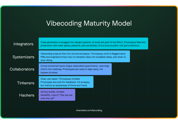
Where do you sit on the vibecoding maturity curve?
To help you assess your team’s relationship with vibecoding, we mapped out a simple maturity model based on our research and roundtables. It captures how teams evolve—from ad hoc builds that raise eyebrows, to strategic collaboration where AI becomes a true co-pilot. Take a look below. Then ask yourself: Are we still hacking? Or are we starting to systematize?
Before you ship that prototype…
Ask yourself:
- Is this helping your team think better or just bypassing important steps?
- If someone inherited this in 6 months, would they understand it, or rewrite it from scratch?
- Are you vibing to unlock feedback, or because you’re avoiding a hard decision?
Track 1 vibecoding is not a shortcut to done. It’s a faster way to say: “Here’s what I’m thinking... am I close?” It’s about exploring ideas, not delivering code. The best teams know the difference, and they know when it’s time to stop vibing and start building.
In this episode of the podcast How I AI, Ryan Carson walks through his lightweight system using Cursor, turning prompts into PRDs, breaking them into tasks, and shipping clean code without spiraling into chaos.
When should you stop vibecoding and start scaling?
When your onboarding stops being a prototype, and starts needing a process.
Track 1 tools like Lovable, or Vercel v0 make it feel easy to build onboarding. You can go from “idea” to “interactive prototype” in one prompt.
But that’s also the trap. Track 1 is great for unblocking momentum, exploring ideas, and getting buy-in. But the moment onboarding needs to support growth, across roles, products, or segments, you’re not just building flows. You’re managing an in-app system.
Track 2 (AI in your codebase) offers more durability. The output is real code. But even then, you still need structure: ownership, governance, and a clear strategy to scale it.
✅ Stick with vibecoding (especially Track 1) when:
- You’re testing an unvalidated or risky idea
- The flow is niche, internal, or disposable
- You’re aiming for speed, not polish
- You’re aligning stakeholders, not launching at scale
Think of this as exploration mode. You're learning, not shipping.
🚫 Stop vibecoding and shift to scaling when:
- You’re supporting multiple user types, products, or lifecycle stages
- Other teams—marketing, CS, sales—depend on it
- You need localization, versioning, analytics, and A/B testing
- You’re maintaining logic, not just layout
- You’re making decisions that will live for months, not minutes
That’s when you move into infrastructure mode. You’re not just showing what onboarding could look like. You’re deciding what everyone will experience.
Why scaling breaks the vibe (especially in Track 1)
Vibecoding gives you:
Real feedback from fake UI
No tickets, no blockers
A playground for wild ideas
But it lacks:
Safeguards (tests, logs, error states)
Integration with your tokens, roles, and themes
Reusability and governance
Confidence that your flows won’t fall apart on smaller screens
So what started as a shortcut becomes a maintenance trap. And the stakeholders who loved the prototype? They now expect it in production.
What Chameleon’s seen after a decade of in-app chaos
Some teams do build in-house. Sometimes, that’s the right call, especially if you’ve got a unique stack, tight data governance needs, or a product philosophy that demands total control.
But we've seen every edge case after 10 years of helping teams build, scale, and rethink onboarding—from seed-stage tools to enterprise-grade platforms.
We’ve seen:
Onboarding hacked into CMSs
Targeting logic spread across 3 dashboards
QA teams using Post-its to track multiple versions
In-app messaging rebuilt three times in three years
If you’re building your user onboarding system, hats off. But just know: the easy part is over. You’re in infrastructure territory now.
When vibecoding isn’t enough
TL;DR: Vibecoding is for velocity. Scaling is for systems. Track 1 gets you momentum. Track 2 helps you ship faster. But onboarding isn’t just a flow; it’s an experience that spans roles, moments, and expectations.
So stop vibecoding and start scaling when:
Your flows need to evolve and adapt
Other teams depend on them
You can’t afford rework every quarter
Because vibecoding isn’t the end, it’s just where good onboarding begins.
Take this quick quiz and find out the best approach for your case 👇🏼