


Segment's New Feature Tour
This Segment (by Twilio) efficiently spotlights two key features: Profiles Sync and Reverse ETL. It bridges...


For six years, we’ve dissected in-app experiences: tracking trends, debunking myths, and spotlighting which strategies drive engagement.

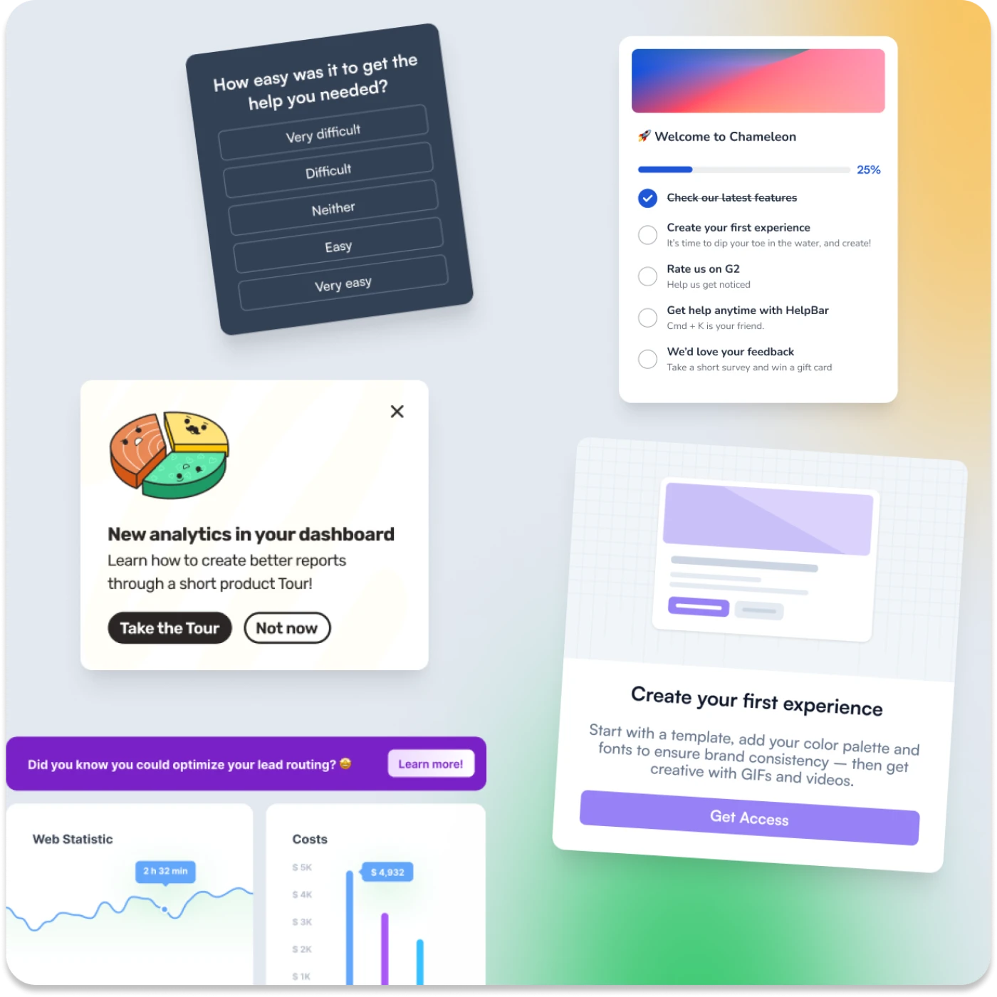
Create delightful, seamless in-app experiences with Chameleon that truly help your users. Powered by AI-driven insights, smart automation, and well-timed UX patterns, every user journey feels tailor-made. With intuitive banners, checklists, and surveys, Chameleon enables smooth onboarding, feature adoption, and feedback collection, without disrupting the user experience. Sign up for free here, or book a demo to learn more.
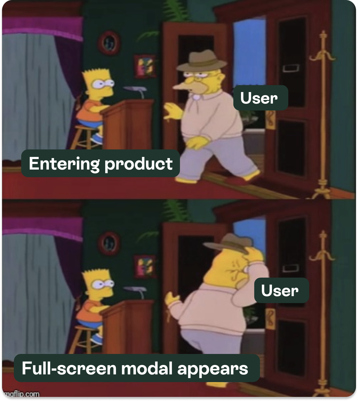
Remember the good old days when product tours were mandatory marathons of clicking the "Next" button? 🥴
We’re kidding. Thankfully, those days are fading fast. Today's users aren't sticking around for your 20-step modal sagas; they want personalized experiences delivered just at the right time. As if they were tailor-made.
Classic product tours, once the standard, now feel like an aging rockstar playing county fairs: slightly awkward, and overdue for retirement. Sure, they still get some applause, but users have mostly moved on.
The reality check: Do product tours still work?
Users don't hate tours, they hate feeling forced into them. Think unnecessary meetings or endless voicemail intros. Here’s what our data revealed at a high level:
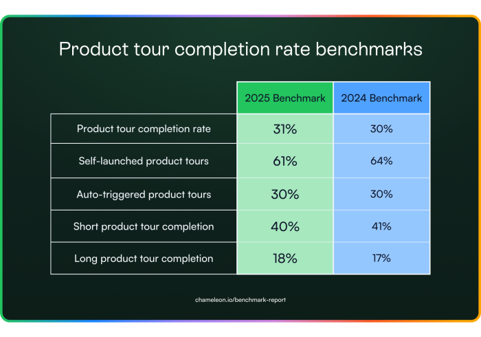
Self-triggered tours double the engagement compared to automated, blanket-triggered ones. Let users decide when to start a tour and keep it to five steps or less. Beyond that, completion drops sharply. Testing different triggers and lengths is key to finding the perfect balance.
The average time spent on a tour increased from 132 to 154 seconds. This could mean users find more value in the content or hit friction points along the way. Use tools like heatmaps and user feedback to determine whether the extra time is helping or hurting the experience.
Progress indicators are another win: they improve completion by 12% by letting users know exactly where they are in the process. Clear visual cues help set expectations and keep users moving forward.
Overall, give users control, keep tours tight, use timely tips and progress indicators to guide them. These quick tweaks can make your in-app tours so much more effective.
Let’s look on the bright side; not all tours are doomed.
After looking broadly at product tour benchmarks, we zoomed in on the top 1% of product tours in 2024 so you can get the cheat code of how to win. The top-performing tours all shared two core traits:
✅ Short and sweet: Product tours in the top 1% of completion rates didn’t go over the 5-step limit.
✅ User-triggered: No more forced walkthroughs. The best-performant tours used event-based or smart triggering to display rather than appearing out of the blue without context.


Users don’t just quit bad tours, they smash the exit button like it owes them money. Frustration levels spike, and completion rates plummet when tours feel like an obstacle rather than a guide.
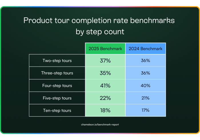
If your tour exceeds five steps, brace yourself for completion rates that nosedive sharply. Tours beyond five steps lose attention from more than half of users.
The best way forward? Break your tours into snack-sized, modular segments. Optional steps keep users happy by letting them Netflix their onboarding experience: skip the boring parts and fast-forward straight to the good stuff.
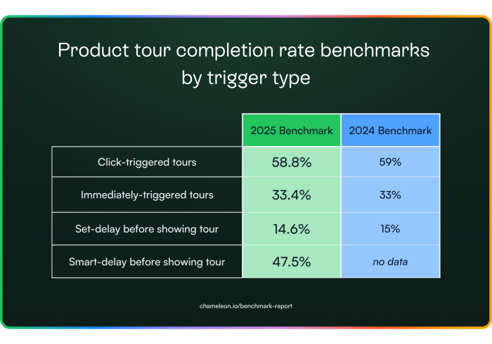
Not much changed here when we looked into the completion rate of tours by trigger type; only a few decimal places. However, user-triggered or smartly timed tours dramatically outperform delayed ones by a factor of 2-3x.
In short, if your tours don’t meet users exactly where and when they need them, you're not just risking engagement, you're losing it. It's crucial to nail your timing if you want your tours to thrive.
The data is clear: traditional, passive product tours are fading. It's officially time to abandon the status quo of launching a product tour and evolve your onboarding. Ditch the endless steps and embrace the embedded, interactive future.
Let’s learn about it 👇
Embeddables are in-line, native patterns that guide users without interrupting them. Unlike modals, they don’t block workflows. Unlike tooltips, they don’t disappear before users can actually read them. Instead, they blend seamlessly into your UI, letting users engage on their terms.
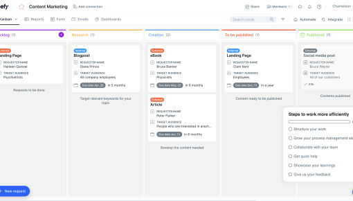
In this section, we’ll look at a pattern that we call "Cards." Cards are in-line content blocks that make space for your content and push down your app’s UI. They are most commonly used for empty states, self-paced user onboarding, and product marketing. Up to four of these can be placed together within Chameleon.
To understand how much engagement Embeddables are getting, we compared the data to Modals (one-step product tours with up to two buttons). We found that users are up to 1.5x more likely to take action on an embedded experience than a pop-up. Interestingly, embeddable Cards with an image outperformed all of our product tour engagement metrics.
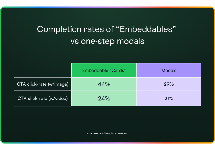


Users are up to 1.5x more likely to take action on an embedded experience than a pop-up.
These patterns are still very new and there’s plenty of room for experimentation. If your current approach isn’t hitting the mark, try trimming your copy down to a maximum of 26 words: long-winded messages get skipped. Stick with images rather than videos, since users prefer a quick glance over a watch. Also, consider testing different placements. Inline embeddables tend to perform better than top-of-page banners, which often fall victim to banner blindness.
Bottom line: if you’re still relying on modals, pop-ups, or forced onboarding flows, it’s time to rethink your strategy. Modern users expect a native, non-intrusive experience that introduces features to users without intruding on what they’re trying to get done with your app. Embracing smart, embedded guidance can give users control over their interactions, making your in-app experience both supportive and effective.
Modals have earned a reputation as the digital equivalent of a door-to-door salesman. You’re in the middle of something important. Focused. On a mission. Then BAM! A modal appears.
"Wait! Before you go..." 😡
We’ve all been there.
We’ve rage-closed them.
We’ve clicked “Remind me later” just to make them disappear.
Some of us (no judgment) have even sworn at our screens.
But are modals inherently bad, or are most just…badly done? Let’s break down the data.
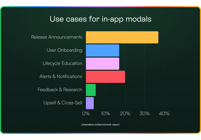
We analyzed all the modals created last year and grouped them by use case. As expected, most teams use modals for release announcements: front and center pop-ups sharing product updates that drive adoption. But we were happy to see more niche cases, such as upsell nudges and lifecycle education.
Despite all the effort that goes into crafting the perfect modal for those use cases above, many users still slam the close button before they even see what’s inside. To figure out if people are actually reading modal content, or just clicking “Nope” at first sight, we looked into dismiss and click rates.
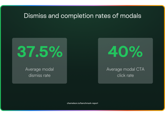
Ultimately, these findings show that while modals can grab attention, many users aren’t sticking around to engage with the content. The key is to balance visibility with relevance, ensuring that modals appear at the right moment and offer genuine value so users actually read before they decide to bail. So we looked at relevance in the form of triggering next.
When it comes to modals, timing is everything. The data tells us that modals triggered by user actions, whether custom, hover-based, or click-based, are far more effective than those that appear immediately on page load or after a preset delay. This isn’t just about the numbers; it’s about understanding the user journey and delivering the right message at the right moment.
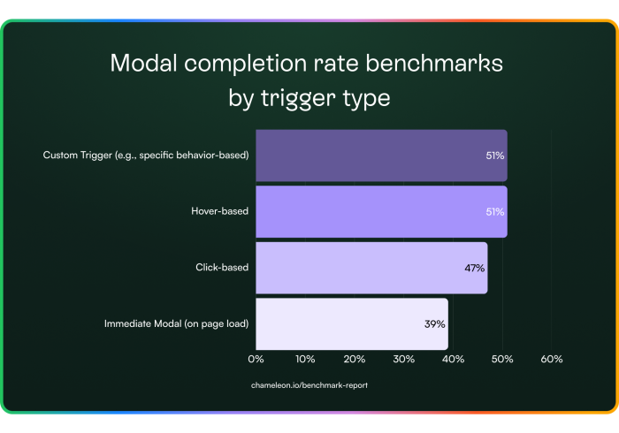
Imagine a first-time user exploring your product. A custom trigger can detect when they hit a milestone, say, after a few actions in the Profile area and offer timely tips. A hover trigger, meanwhile, provides on-the-spot explanations when a user lingers over a new icon. Click-based triggers work best when users seek more information, such as clicking a “Learn More” button, making them more receptive to additional content.
In contrast, immediate modals that pop up without context often disrupt the user journey, leading to quick dismissals. The key is to align your modal strategy with user behavior. Trigger modals based on specific actions, hovers, or clicks, so the guidance feels both timely and relevant. This approach boosts engagement and transforms modals into valuable, non-intrusive UX patterns that enhance the overall user experience.
Figuring out the right content for a modal is tricky, especially when you only have a few seconds to grab attention. Do you stick to text, add images, or go all-in with video? The data below breaks down how each format impacts engagement, and might just change how you approach your next modal…
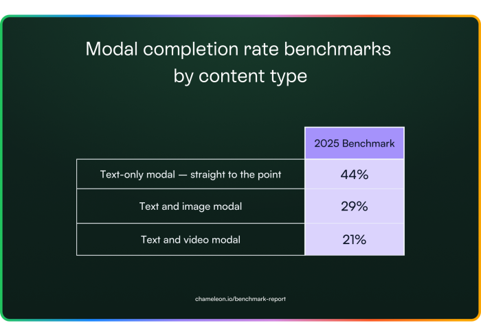
Ultimately, simpler is better. Text-only modals tend to outperform the rest, while images see some engagement, and videos usually fall flat. If you must add media, keep it minimal and relevant. Better yet, skip the modal altogether and embed your guidance directly in the product.


When a modal pops up, users respond in different ways, and that split can really affect your results. Here’s what our data shows:
For dismissed modals:
38% of users close them in under 4 seconds, giving you almost no time to make an impression.
37% hang around for 10 seconds or more before dismissing, meaning some are taking a closer look, even if they eventually opt out.
For completed modals:
35% act within the first 4 seconds.
40% take 10 or more seconds before completing the action.
In short, you've got just a few seconds to convince users that your modal is worth their time. Timing is everything: combining modals with well-timed triggers can boost completion rates to around 47%. And remember, modals don’t have to be intrusive. If they’re relevant and timely, they can really engage users.

"Try adding a “remind me later” option. We’ve seen that 12% of snoozed modals are completed on the second try."
Modals aren’t going away, but the data clarifies that they need a lighter touch. With nearly 40% dismissed on sight, and only a handful of scenarios, like mission-critical alerts or user-initiated triggers, where they truly shine, teams increasingly turn to embedded, contextual guidance.
This year, we expect more products to rely on inline UI elements rather than pop-ups. In other words, if your modal can’t prove its value in under four seconds, it’s already lost.
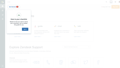
"Launcher" Checklists or Resource Centers are the digital equivalent of a friendly but persistent gym coach for your SaaS product. Done right, they guide users smoothly through critical setup steps, surface new features where they’ll actually be seen, and provide just-in-time answers that head off support tickets. In other words, they nudge without nagging, keeping you far away from a dreaded Clippy 2.0 scenario.
But when done poorly, they become a to-do list from hell that nobody asked for, ignored faster than Terms & Conditions, and clutter your UI without providing real help.
Here at Chameleon, we call these patterns “Launchers.” In this section, we examined Launcher engagement rates, use cases, and completion rates of other in-app experiences triggered by Launchers. Is self-serve help still strong in 2025? Let’s find out.
Launchers are getting more action than a Marvel post-credits scene. But are they driving user engagement?
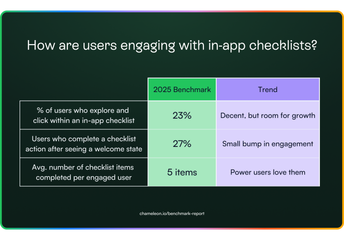
Around 23% of users explore and click within a Launcher, which may not sound like blockbuster numbers, but it’s a solid chunk of users who might otherwise be hitting the “start live chat” button.
Zooming in on that first click of a Launcher, using a Welcome State to set the tone of what’s to come next, boosts that Launcher click rate up to 27%; proof that first impressions really do count.
Even more impressively, the users who do interact with these checklists complete on average five checklist items per session, suggesting that once users commit, they’re all in.
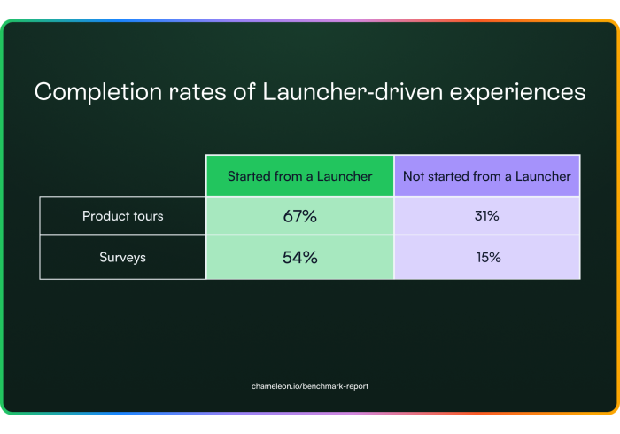
Meanwhile, Launcher-driven product tours boast a 67% completion rate, the highest tour completion rate we saw in all the data. Microsurveys also pull in a surprisingly high 54% completion rate here, revealing that users are more willing to give feedback on their terms than teams might expect.
All of this points to one big takeaway: Launchers work best when they meet users exactly where they are. A well-timed welcome state can turn a casual glance into meaningful action, and a checklist that resonates with a user’s role can keep them coming back for more.
If you’re looking to level up user engagement, it might be time to give your Launchers the red carpet treatment.
A well-timed welcome state can turn a casual glance into meaningful action, and a checklist that resonates with a user’s role can keep them coming back for more.

Microsurveys have long been the MVP of in-app feedback: quick, contextual, and (usually) painless. But this year, something shifted. More surveys were started than ever before, yet fewer users actually finished them. Turns out, users don’t mind giving feedback, but how you ask matters more than ever.
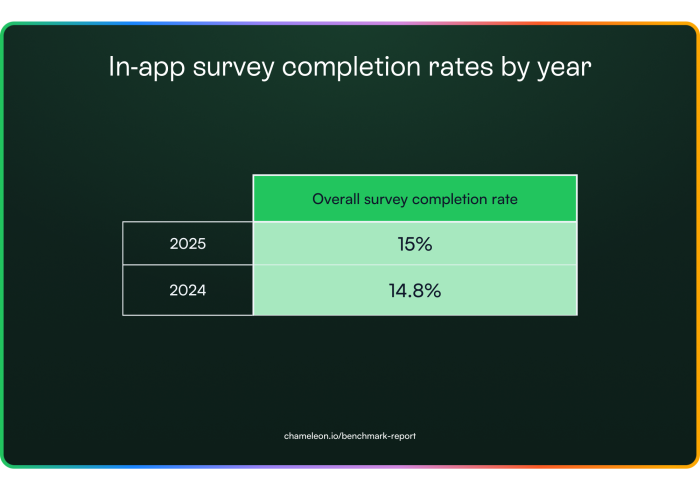
Microsurveys continue to be a go-to pattern for capturing in-the-moment user feedback, with overall completion rates holding steady at around 15%, around 25x better than email surveys (which have average open rates of 20-30% and clickthrough of 2-3%,. This figure looks at all survey types combined. However, not all surveys are created equal; more on that in a second.
NPS survey completion rates continue to drop. In 2022, they were at a 15% completion rate, dipped down to 10% last year, and now they’ve sunk into single digits with a 9% completion rate.
On the other hand, completion rates for every other survey type increased, with CSAT surveys doubling their previous response performance.
The data here shows us that NPS survey fatigue is real. They’re usually launched on a cadence and ignore user behavior.
Plus, you end up with users who are annoyed in the moment smashing the 0 button or fans of your product clicking the top scores without a second thought.
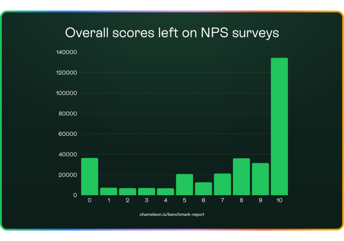
It looks like NPS surveys are in their flop era, while CSAT surveys are out here doubling their completion rates, proving that asking the right questions (in the right way) matters.
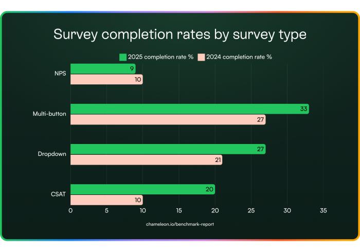


Multi-button surveys took the crown this year for completion rates, but the question is: how many buttons do you need to get the most responses?
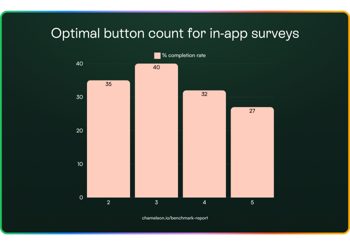
The key takeaway is that users prefer a quick multiple-choice approach, not a pop quiz. Try using emojis or short text options. If you're aiming for higher completion rates, keep your surveys concise, direct, and user-friendly.
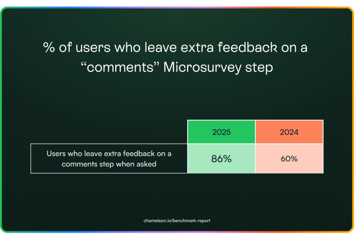
A 44% increase in users leaving comments suggests that feedback collection is improving in volume and relevance. The shift isn't because users have suddenly become more generous with their time; companies are asking smarter questions at the right moments.
Users will give feedback when it feels relevant and easy. If your surveys aren’t seeing engagement, the problem isn’t the users, it’s the way they’re being asked.
That's a wrap on our in-app benchmarks for 2025. But the year is still young. With AI booming and traditional "one-size-fits-all" patterns in decline, what does the future hold for user onboarding and product adoption? Here's our take...
The future of software is exploding. The age of generative AI and “vibe coding” means that many more people are creating software.
Even with Agents, more automated workflows, and conversational UIs, there will be a persistent and critical need to help users discover what’s possible and learn the most efficient ways to get their jobs done.
Certainly, users’ expectations for more personal, smarter, and more dynamic UX are rapidly increasing, and this means that in-app experiences need to adapt… in form factors, in smarter inference about a user’s situation and state of mind, and in relevant follow-ups.
Here are some tangible trends that we believe will become more prominent in the short term:
✅ Shifting Left — users wanting to experience software before creating accounts or completing setup actions
✅ Non-intrusive — more embedded components that manifest as part of the core product UI and not as an overlay
✅ Predictive — smarter understanding and targeting based on inferring user needs
✅ Automations — walkthroughs replaced by “Operator”-like automated actions
Let’s dive into each of these to better understand the specifics and how Chameleon is adapting to enable customers to meet these changes:
The trends around PLG and product-led sales from the last few years have continued: users want to evaluate software by experiencing it, but now they don’t want to go through the effort of creating an account and doing setup work to get there.
Accordingly, we’ve seen a boom in a new category of software: “Interactive Demos,” which allow teams to record a snapshot of the product (e.g., a feature workflow), annotate it, and then embed it on a public page so users can click through and “experience” that aspect of the product without actually using the product natively.
 📈 31% of SaaS companies now offer pre-signup interactive demos, up from 17% in 2023 (Navattic)
🚀 Trial conversions increased by 65% when SaaS companies introduced an interactive demo before signup (Arcade Software)
🔄 Products with early onboarding touchpoints saw 30% higher activation rates (Product-Led Alliance)
To better meet this trend, Chameleon has built an Interactive Demos product so you can help onboard users outside of your product and inside your product. In creating Interactive Demos with Chameleon, you’ll benefit from our robust integrations, consistent styling, and easy-to-use design.
What you should do
Ensure you have an interactive demo on key marketing pages showcasing the product
Don't require sign up to be able to use your product
Defer email and password gates until after users get value
One of the biggest reasons that in-app popups or walkthroughs have developed a negative reputation is that the timing is almost always wrong. These often interrupt users when they're not receptive, and so the natural reaction is to exit - they feel like blocking the user from value.
 This doesn't mean that users aren't interested in the content you have to share, you just can't interrupt them. Embedded experiences are a great way to solve this. They can stand out (as in-line banners), offer a self-serve menu (tiles on a page), or persist until a user is ready to engage (e.g., a card in the side menu).
Chameleon launched “Embeddables,” which empower you to create in-line experiences without coding. These have been extremely successful, with engagement data far outperforming traditional modeas.
What you should do
Reduce interruptive experiences by using Chameleon’s smart delay feature, or other smart triggers
Identify some in-line real estate in your product where you can embed experiences
Limit interruptive experiences/announcements by reducing the frequency using “Rate Limiting” (targeted specifically to this type of experience)
We’ve all experienced the thrill of AI giving us exactly what we need through conversation. User expectations for products communicating relevant, timely, and contextual information are rapidly increasing, and so we’ll see engagement rates plummet (and frustration skyrocket) for irrelevant noise.
Accordingly, teams have to get a lot smarter in their targeting of experiences by using pattern matching and a more nuanced understanding of intent based on activity to show the right in-app experience at the right time.
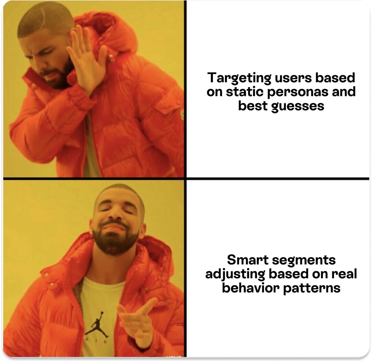 Chameleon will introduce “Smart Segments” this year, which automatically create audiences based on our inferences, which you can incorporate into your target audiences. In addition, we’ll be launching our first Agents that adjust targeting on the fly and suggest follow-up actions based on how users reacted.
What you should do
Ensure you scrutinize target audiences deeply to create more specific experiences that you expect to resonate
Increase the amount of data you’re leveraging, ideally connecting your warehouse with a reverse ETL tool to expose state-of-user data for targeting
Offer more “on-demand” in-app Experiences (via Embeddables or Launchers/checklists etc.) to reduce the risk of poor targeting
We’ve known that showing is better than telling, but we’re now in the age of doing, not showing. Users just want the job done and often don’t want to learn how to navigate the UI. That’s led to the rise of chat-based actions and “conversational agents” that execute tasks on behalf of users.
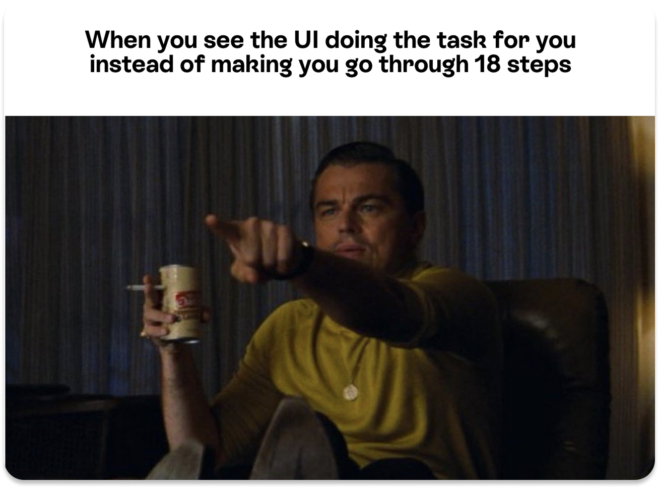 However, user interfaces aren’t going away, they are often more efficient than chat, and so there is still a need and scope for users to better understand these, and discover what’s possible. But in that world, step-by-step walkthroughs are just too slow and tedious, and can/should be replaced by automations.
Chameleon’s new “Automations” feature allows you to record a workflow on behalf of the user and then replay it for them with a second cursor. This has the benefit of showing a user how something happens while also completing the task on their behalf, accomplishing both goals.
What you should do
Employ a smart, AI-enabled support tool that can help automate some simple user actions
Re-think or remove step-by-step walkthroughs; in lieu of higher-level guidance (setting users a task), linking to docs for details, and of course, Automations
Speed up key actions by offering shortcuts, potentially leveraging Chameleon’s HelpBar or your own CMD+K keyboard search, navigation, and action
Make every in-app experience feel tailor-made with native-feeling, AI-enhanced patterns