


New users signing up but not sticking around? It could be that they’re missing the guidance they need right when they need it. In-app messages are a very important part of the customer experience. These targeted messages appear right within your app, encourage and engage users, and match their workflow inside your product.
The result? Higher adoption rates, increased user engagement, and ultimately, happy, productive customers.
In this article, we cover what in-app messaging is in the context of a SaaS product, when and why you should use them and walk you through real-life examples.
Ready to turn first-time users into lifelong fans?
In-app messages are timely, relevant, and contextual notifications your users see while interacting with your product or app.
A low-code tool helps you quickly build and deploy in-app messages. You'll be able to save resources while grabbing users' attention at contextual moments—like when they’re navigating new features, completing a purchase, or reaching a milestone in their workflow.
Common types of in-app messages include product tours, in-app checklists, tooltips, and modals. The most common use cases are improving onboarding flows, offering self-serve support, and getting relevant user feedback.
Read on for more, and get expert insights from Kirsty Finlayson, Head of Marketing at Chameleon, and Moritz Dausinger, Co-Founder and CEO of Refiner.
What is in-app messaging?
In-app messages (also known as in-app notifications or message center messages) refer to timely, relevant, and contextual notifications your users see while interacting with your product or app. These messages come in various types, shapes, and forms that you can adapt to the specific use case and convey a clear message every time.
Here’s a short video explainer of in-app messaging from Kirsty Finlayson, Head of Marketing at Chameleon.
7 best benefits of in-app messaging
So what are the advantages of in-app messages? Let's get into it.
1. Reach your entire user audience
A lot of times SaaS companies communicate their updates or announce new features through their marketing websites, social media, or through email. However, an external messaging strategy may not reach all of your users at the best time for them.
But when you send an in-app message, you can be sure that you'll reach every single person who uses your app. This is why an in-app survey will typically have a much better response rate than email surveys. This leads us to the next advantage of in-app messages.
2. Drive product adoption with contextualized feedback
In-app messaging provides your users with relevant, timely information as they navigate your app. For example, let’s say a user frequently uses a basic function of your app but hasn't explored its more advanced capabilities. An in-app message can showcase these features with a quick demo or highlight their benefits, encouraging the user to unlock the app's full potential.
3. Provide a smoother onboarding experience
The first few minutes a user spends in your app are crucial. In-app messages ensure that new users get off to a smooth start by offering real-time guidance tailored to their actions. Instead of leaving users to figure things out on their own, these messages can offer step-by-step walkthroughs, highlight essential features, and provide quick tips exactly when they’re needed.
This proactive approach helps users feel more confident and supported from the get-go, reducing drop-off rates and leading to faster product adoption.
Plus, in-app messages can also ask new users for feedback. A quick question like "How was the onboarding process?" can help you understand what's working and what's confusing.
4. Boost user retention
In-app messaging increases user retention by delivering timely, relevant content that keeps users engaged and continuously seeing value in your product. When users receive personalized messages—whether it’s a feature reminder, an update, or even a reward for their activity—it strengthens their connection with the app and reduces the chances of them dropping off.
5. Grasp users' attention
In-app messages are shown as users navigate through the product, meaning they are more likely to catch the attention of your users.
This is as opposed to other external methods of notifying users such as push notifications. When people receive push notifications they are outside the app, meaning it's easier for them to disregard the information.
6. Target different segments of users
Different audiences will behave differently which is why you need to offer customized experiences to each.
For example, if your SaaS tool serves both freelancers and enterprises, create separate tours for each audience. Tailor the in-app messaging flows to guide individuals and teams based on their specific needs and the jobs to be done.
With in-app messages, you can adjust personalization with pinpoint accuracy, like targeting them to appear in certain places to different groups at specific times.
As Moritz Dausinger points out:
“Getting the timing right is probably the most important thing to consider when implementing in-app messages or in-app surveys. That’s because context matters. With the right timing, you can show valuable information to your users when they most need it. On the contrary, if you are not careful, you risk providing an annoying experience.”
7. Easy to design and build without devs
If using a product adoption platform as a low-code solution, you can easily create in-app messages, make them visually appealing, and customize them to your needs.
This way, instead of building messaging solutions in-house which could take longer than expected and become a costly endeavor, you can save both time and resources, while also increasing user activation, engagement, and retention rates.
When to use in-app messaging for your SaaS
Now that you know the benefits of in-app messaging, let us walk you through the most common use cases of when and where in-app messages fit in your product.
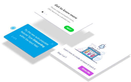
Onboarding new users: onboarding flows for first-time users are one of the most common use cases for in-app messaging. Product tours, welcome messages, and step-by-step guidance help new users navigate your tool effectively from the start.
Transitioning users: in-app messaging is also ideal for guiding users who are transitioning from a free trial to a paid plan or moving through subscription upgrades. Product tours tailored to these users can introduce them to premium features and ensure a smooth transition.
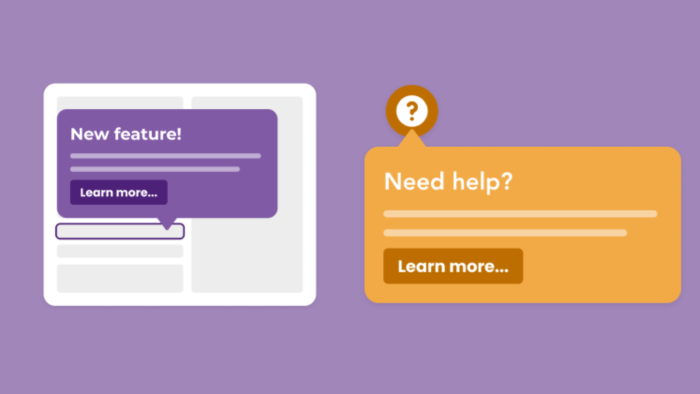
Announcing new features: if you launch a new feature but don’t notify users about it, chances are that only a small portion of your customer base will find it on their own. This is where in-app messaging can help you announce the features and redesigns, briefly explain them, and drive feature adoption.
Product updates: use in-app messaging to showcase product updates in context. To get the most out of it, use product analytics to uncover behavior-based data and create short, contextual announcements that will add value while users are interacting with your product.
Self-serve support: provide real-time assistance through tooltips, banners, and live chat. Segment users to proactively offer help with trigger-based checklists that link to help docs, videos, FAQs, or live chat.
Idea validation and prototype testing: use techniques like fake-door testing, A/B testing and prototype testing. For example, announce a future feature via a tooltip and gather data from clicks or run in-app surveys to understand user expectations.
Collecting user feedback: capturing customer satisfaction and sentiment throughout the product lifecycle will show that you’re customer-centric and that you value users’ opinions.
Our Benchmark Report shows that, on average, Chameleon customers launch 18 Microsurveys a year. Keep in mind that these surveys have different purposes and they show to different users at different stages of their journey. Our data also shows that the average Microsurvey has a completion rate of around 60%.

Download the In-Product Experiences Benchmark Report
Improve your in-app messaging and scale self-serve success with data and insights from 300 million user interactions with Chameleon Experiences. We'll send the Report to your inbox!
What’s the difference between in-app messaging and push notifications?
In-app messaging focuses on improving the user experience within the app, while push notifications aim to bring users back into the app from outside.
Here's a quick overview of the differences:
In-App Messaging | Push Notifications | |
Where it appears | Inside the app | User's device screen |
App needs to be open? | Yes | No |
Goal | Guide users within the app | Bring users back to the app |
Needs permission? | No | Yes (usually opt-in needed) |
Disruptive? | Less disruptive | Can be disruptive |
6 common types of in-app messaging for SaaS
Let's take a look at the most important in-app messaging types when it comes to driving adoption for SaaS products.
Product tours
Product tours, walkthroughs, and in-app guides are a great way to onboard new users and help them find their way around your product from the moment they sign up. But this doesn’t mean that you should throw a 15-step onboarding tour at them to show everything there is.
Ditch the long, boring tours – there’s only so much information users can take in at once. Instead, create several tours. Keep them clear and concise to offer just the right amount of information at this stage of the users’ journey.
At Chameleon, we analyzed user interactions with over 58 million Tours and found that 3-step Tours have the highest completion rate of 72%. In comparison, only 16% of Tours with seven steps are completed.

2. Customizable widgets
Within customizable in-app widgets, you can add important tasks that users need to complete, offer links to relevant help documents, point users in the direction of your knowledge base, add video tutorials, and more.
Even though widgets are going to be structured in a different way than product tours – this format should also be highly relevant and concise. Think of it as one of the pillars of your self-serve support and use them to offer structural guidance.
At Chameleon, we call this kind of in-app messaging Launchers – and we practice what we preach. For example, we recently created a new Launcher to present quick links to useful resources for our customers. From one place, new and long-term users can quickly launch an Intercom Chat, read about new feature updates, or even join one of our webinars. And here is what it looks like 👇

3. Chatbots
Chatbots offer a 24/7 live chat experience for any kind of customer support, new user guidance, or lead generation such as scheduling for a product demo.
Keep in mind that the response time is important. The HubSpot research shows that almost ⅔ of customers expect the response in 10 minutes or less.
Chatbots can also be pre-programmed to greet new users or website visitors, offer answers to frequently asked questions, collect user feedback, and much more. The most important thing is to resemble real conversations as much as possible. This is where the language you use and how you use it matters the most.
As Dave Gerhardt, VP of Product at Drift, explains in the Talk Stack podcast episode on B2B conversational marketing:
“If there are no real humans on the other end of the chatbot, be transparent about it. Otherwise, you risk adding noise and not meeting customer expectations”
– Dave Gerhardt, VP of Product at Drift
All in all, chatbots are a great way for SaaS businesses to engage with prospects, capture qualified leads, answer customer support queries, and help users find the right information by balancing the signal-to-noise ratio.
4. Tooltips
Tooltips are short messages related to specific UI elements that provide additional explanations and guide users towards taking specific actions. They are often used to help users discover the product value and quickly reach their “aha!” moment.
Tooltips are typically triggered when a user hovers over an on-page item or when they click on an icon, a hotspot, or another element. By helping users get the right information exactly when and where they need it, you pave the way for your product success.
Here’s a mock-up example of how tooltips triggered by a hover over an element or by clicking on an icon could like.
Want to learn the right way to approach in-app messaging and Tooltips copy? Here are tips from TJ Vo, Chameleon's Product Manager
5. Modals
The purpose of modals is to grab the user’s attention, but it’s important when they're triggered and how you position them.
For example, you can use modals for your in-app tutorials and anchor them to specific elements on the page. Or you can add a pop-up with an animated confetti effect to celebrate once the user has completed onboarding successfully.
Make sure to add real value with a pop-up notification, align content with context, and match the message with the user persona and the stage of their user journey.
Take a look at how Degreed used modals to announce a new Home page redesign and offer a sneak peek for website visitors who wanted to check it out before everyone else.

An example of a modal built with Chameleon
6. In-app surveys
Continuous feedback is crucial for every SaaS business, especially if you want to implement a product-led growth (PLG) strategy. In-app surveys are an excellent way to gather feedback in-product and keep track of customer health metrics over time.
You can use NPS, CSAT, or CES surveys to check the pulse on customer satisfaction, or contextual Microsurveys, triggered by specific user actions to build custom feedback prompts from scratch.
For example, you can use drop-down and open-form surveys to personalize the onboarding flow. Or run multiple-button surveys to collect feedback about new features, address issues your users might be facing at the moment of interaction, and get highly contextual responses you can later extract useful insights from.
Get user feedback with Chameleon
Run in-product surveys to collect contextual user feedback throughout the development process – from ideas to validation to deployment.
5 best in-app messaging examples
We’ve mastered the theory. Now, let’s see how these best practices play out in real life. We’ll break down some of the best in-app messaging examples from SaaS companies.
1. LANDR’s onboarding tour

LANDR is a music editing software that offers a well-balanced, informative onboarding tour (built with Chameleon 😉) to their new users. In three steps they explain and showcase everything that someone who just signed up needs to know.
Why this is good: Even though some of the tour steps are text-heavy, the copy includes the right type of information, along with a conversational and reassuring tone of voice. Accompanied by the on-brand design and relevant visuals, it makes a delightful onboarding experience.
2. Figma’s new commenting features

Figma has redesigned its feedback feature to make the comments easier to read and manage. They used a simple 3-step walkthrough to explain what has changed and how users can benefit from it.
Why this is good: This redesign announcement grabs the attention of the users as they sign back into the product. It offers short textual explanations that communicate the benefits, along with clear CTA buttons to guide users through. Each step also includes effective GIFs for a visual representation of changes, which sets the ground for feature adoption.
3: Vivaldi’s personalized onboarding flow

Vivaldi is a web browser that positions itself against its biggest competitor – Google Chrome by offering ad and tracker-blocking functionality and built-in translations. By asking “How much Vivaldi do you want?” on the first step of the onboarding flow for first-time users, it does a great job of personalizing the experience.
Why this is good: The visual comparison of options available speaks clearly to different user personas and offers the “choose your own adventure” type of onboarding. The clear explanation that the most important features are available even if a user doesn’t want the fully customized browser is a nice addition.
4. Mixpanel’s new Dashboard tour

Mixpanel has redesigned its Dashboard and created a well-rounded tour to explain the changes (once again, it’s a Chameleon-built Tour 🦎). When the redesign was released, they announced it on a Dashboard page with an attention-grabbing modal aligned with their brand style.
Why this is good: Using a modal with a CTA button is an effective way to encourage users to start a tour. Lightboxes can direct their attention to important changes, helping to keep users engaged and informed during app updates. It’s also an excellent example of progressive disclosure in action.
Example #5: Chameleon’s new Builder UI announcement

The Chameleon Builder puts all available options for customizing the Experiences in one menu called the Control Panel. This panel also offers quick references to know if the Position, URL Rules, or Element Rules are matching (green) or not (red) based on the setup.
Why this is good: First of all, we listened to customer feedback and simplified the editing experience. Then, with a clear, benefit-oriented message inside a Tooltip, we announced the new look and functionality of the Builder. Overall, we made the announcement useful, valuable, and distinctive yet non-intrusive.
Final thoughts on in-app messaging
That’s all, folks. We hope you learned something new and gained valuable advice, along with actionable tips you can start implementing right away.
Remember, in-app messaging is a delicate matter. Treat it with great care because it can easily make or break the user experience. Think of it as a conversation with your users and a powerful tool for activation, engagement, and retention.
In other words, use in-app messaging to inform, educate, and delight your users.
Create in-app experiences that retain and convert users
Chameleon makes it easy for product marketers to create tooltips, modals, and product tours without code

