


Your users are already onboarding before signup. It happens on your homepage, in help docs, through AI searches and reviews. By the time they hit "Start Trial," they're raring to go.
And AI made shipping features faster than ever, but launching them? Still a dumpster fire. You record a Demo. Rewrite it for email. Remake it for docs. Build the in-app tour from scratch. Debug why it's breaking. Five tools, five versions, and by Thursday you're questioning your life choices while your feature collects dust.
What if you could just... talk through it once?
Hit record. Explain the feature like you're showing it to a friend over coffee. Chameleon's new AI feature turns your rambling into everything; an Interactive Demo, in-app tour, email copy, help docs. One take. Full campaign. Done before lunch.
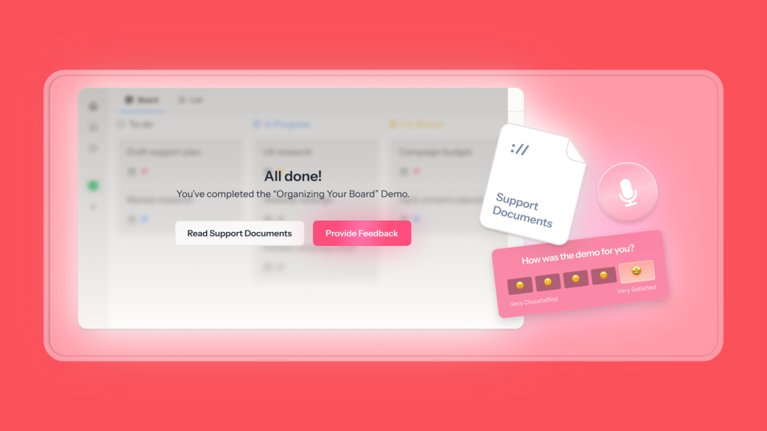
Unlike those demos that die on your marketing site, Chameleon's Demos actually track what matters. Did viewers activate? Did they upgrade? You can trigger in-app tours based on what they clicked, follow up where they dropped off. Finally, prove that your launches actually work.
Our CEO and Co-founder, Pulkit Agrawal, just spilled all the secrets in a workshop. This guide has everything—from recording Demos that don't suck (please stop narrating every button) to distribution that actually drives adoption.
Ready to ship your next feature in the time it takes to explain it? Let's go.
Summarize this article with ChatGPT
It's a long one, but it's packed with tips. We get it if you prefer the TL;DR
Why Interactive Demos belong in a PM's toolkit
You're not measured on how pretty your help docs or in-apps are. You're measured on activation rates, feature adoption, or the number of support tickets you prevent.
Videos? Users skip them. Screenshots? They show what, not how. Long docs? Nobody reads those unless they're already frustrated.
Demos are different because users actually do the thing. They click through at their own pace, build muscle memory, and see their future successful state. It's the difference between reading about riding a bike and actually getting on one.
But here's where Chameleon changes things: our Demos don't just live in a vacuum. You can track if Demo viewers actually used the feature. Trigger in-app tours for people who dropped off halfway. Prove that your premium Demo drives upgrades.
It's the full adoption loop; show value before signup, guide them to success after. Finally, a way to connect the story you tell to the outcomes you need.
Where Demos pay off and why
Demos hit different depending on where you drop them:
On your websites: They replace those sad static screenshots with something people actually want to click. Prospects feel the product in 30 seconds instead of imagining it.
In-app empty states: Turn that sad blank dashboard into "here's what success looks like." Users see the destination before starting the journey.
Locked features: Stop explaining what premium users get. Show them. Watch upgrades happen when people can play around with what they're missing.
Feature launches: Your announcement becomes an experience. Instead of "we built X," it's "try X right now."
Support docs: Delete that wall of text. One clickable Demo answers the question better than 500 words ever could.
The trick isn't just placing Demos everywhere; it's knowing what happens next. Every Demo needs a clear bridge to the real product.
View Demo → try feature.
Try a walkthrough → upgrade account.
See the possibility → take action.
Once you know where Demos move the needle, the question becomes how to create them fast and keep them focused on value.
What makes Chameleon's Demos different?
These are the first Demos built for product teams, not marketing.
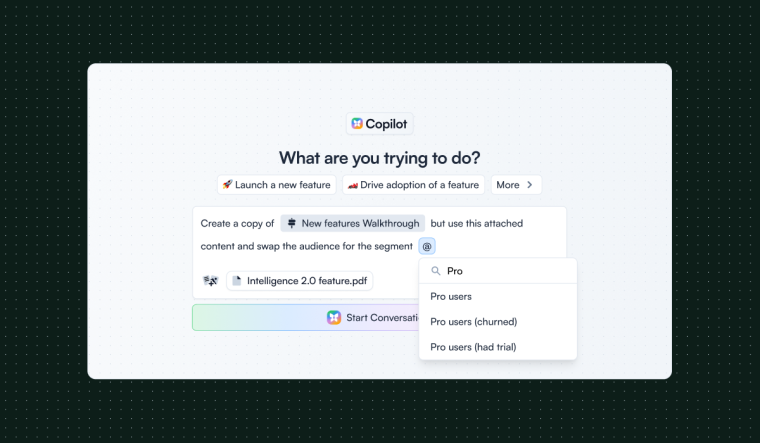
When you record with Chameleon, you explain the feature naturally while clicking through. The AI understands what you're trying to show and turns your explanation into smart annotations—focused on outcomes ("unlock bulk processing"), not UI labels ("click here").
The real difference: these Demos live where adoption happens. Launch them in-app from product tours, empty states, or your HelpBar. Track if viewers activate. Trigger follow-up tours. Connect Demo engagement to real product usage.
This matters because onboarding is shifting left—users now expect to feel value before they sign up. While other Demo tools stop at your marketing site, Chameleon Demos bridges the journey from first impression to power user.
The result? Record once while explaining naturally. Ship everywhere your users are. Finally, prove that you're driving product adoption.
How to record a Demo with Chameleon in six steps
Prepare your environment. Sign up for Chameleon with a company email, enable the 30-day Demos AI+ trial in Settings → Billing, and install the Chrome extension. Record in staging with realistic but fake data. If you need to tidy copy or placeholders, turn on your browser’s Document Design Mode to edit text directly on the page before recording. Those changes won’t persist after a refresh but will appear in your Demo.
Choose a single, crisp outcome. Decide on one feature or flow that reveals value quickly—a generated report, a one-click integration, an automated insight. Plan to reach that moment in under two minutes. The best first Demos are not comprehensive tours; they’re purposeful vignettes.
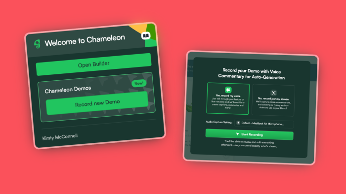
Start the recorder and enable audio. Open the Chrome extension, select Record Demo, and allow microphone access. The AI will use your narration to create annotations that match your actions.
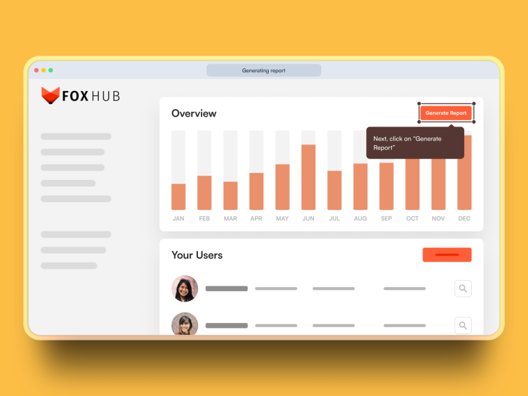
Click first, then speak. Act, then say what happened and why it matters: “Generate Report… now we have a month-over-month view with anomalies flagged automatically.” Background chatter can confuse the transcript; keep the environment quiet while recording.
Keep it moving; avoid UI play-by-play. Don’t narrate labels or cursor motion. Aim for three to five decisive interactions that lead to a clear benefit. If you need to type or scroll, do it smoothly—the recorder will capture a short video snippet.
Finish with a clear next step. End by pointing to the action you want in the live product: “Try this on your data,” “Enable this integration,” or “Start a free trial to unlock this view.” Stop recording; Chameleon compiles your draft with steps, text, and media.
That’s your first cut—fast to produce, annotated by AI, and ready for a light polish.
Editing like a pro: from draft to a Demo that converts
Start with structure. If your flow divides naturally into phases—setup, generate, interpret—use Chapters to frame those stages. Chapters are more than headings; they set expectations and can offer choice. Many teams add branching buttons in a chapter so viewers can choose their path (“See reporting” vs. “See admin controls”). Keep labels specific so users feel confident when they click.
Then tighten focus.
Use Hotspots to add context where the UI alone isn’t self-explanatory, and resist annotating the obvious. If your annotation repeats a visible label, delete it.
Use Pan & Zoom to guide attention, but never zoom into an area you’ve blurred; it creates a jarring mismatch.
Use Blur & Crop to remove noise and protect sensitive information. Aim for visual calm: each step should make one idea unmissable.
Decide how you’ll capture interest. If you aim to start conversations, you can collect an email as a lightweight gate—after you’ve shown value. When you do gate, explain the payoff (“Email me this setup + a checklist”). If your goal is to accelerate sales or onboarding, consider action buttons that launch a Chili Piper booking modal or open a Figma prototype for deeper exploration.
Finally, preview and align. Misplaced tooltips break the magic. Drag hotspots into position, check contrast (white on white is a common offender), and skim for consistency in tone and CTA style. Mixed button styles or vague labels erode trust; your Demo should feel like your product—intentional and predictable.
Mini style guide to help your Demos shine
Write for outcomes, not interfaces
❌ Click Generate to run the report
✅ "Generate" surfaces trends and anomalies so you know where to investigate
Your user can see the button. You need to tell them why they should care.
Keep it tight
2 mins recording length max (seriously, time yourself)
One concept per step (don't cram)
3-5 key interactions (not a full tutorial)
18-25 words per tooltip (front-load the value)
Make your CTAs work harder. Use power verbs: Generate, Unlock, Enable, Activate
Never: "Click here" or "Next" or "Submit"
Your CTA should promise value, not describe mechanics.
Don't break trust
Blur sensitive data (customer names, revenue numbers)
Record in staging environments
Gate emails strategically—after showing value, not before
Structure for scanning
Chapters = major phases ("Setup → Customize → Analyze")
Branches = different user paths ("New user" vs "Migration")
Progressive disclosure = complexity on demand, not upfront
Remember accessibility. Contrast ratios matter (WCAG AA minimum). Don't put a white tooltip on a light background.
The Demo vibe check. Your Demo should sound like your smartest customer success person explaining to a friend: confident but not cocky, clear but not condescending. If you're using words that aren't in your product, you're probably overthinking it.
Deploy Demos with intent and flow
With a tight narrative and clear end-state CTA, the last decision is placement—because context determines whether viewers act. Think of deployment as a journey, not a menu.
Start on the website by replacing static screenshots with a Demo in your hero or feature section so evaluators grasp the promise in seconds.
Follow up via email on day one of onboarding with the same Demo, now framed as “see this on your data,” creating a bridge from evaluation to action.
Inside the app, trigger the Demo from a Chameleon tooltip, banner, modal, or checklist the first time a user lands on the relevant tab; target by page, role, plan, or behavior so the right people see it at the moment of need.
Add the Demo to your resource center or Command-K search so motivated users can pull it on demand, and embed it in your help center to answer common questions with clicks instead of paragraphs.
On social, use it to turn a launch post into an experience rather than a static video, then route engaged prospects to the feature page or trial.
Crucially, Demos never auto-launch themselves. You decide where and when they appear, which prevents noise and lets you sequence thoughtfully: start with a short, universal Demo that proves core value, then layer in advanced variations for power users who signal interest. The same asset can live in multiple places, but its copy and surrounding message should reflect its job in that context.
With Chameleons's AI+ Demos add-on, you get access to the Campaign Kit. This gives you a ready made in-app tour, Microsurvey, and other launch materials, all automatically generated from your Demo narration. Sign up free to start your trial.
Measuring What Matters (and What to Do Next)
Treat your Demo like any other product asset: hypothesize, ship, observe, and iterate.
The metrics that matter:
Completion rate → Is it too long?
Drop-off points → Where do they bail?
Post-Demo actions → Did they try the feature?
Conversion lift → Do Demo viewers upgrade more?
When numbers tell you to act:
High drop-off mid-Demo: Cut the middle or make it punchier.
Finished the Demo but didn't try the feature: Your bridge to the product is broken. Move the Demo closer to the actual feature or trigger a checklist: "Try what you just learned."
Completed upsell Demo but don't upgrade? Your value story needs work. Also test timing – asking right after the "aha" beats asking tomorrow.
Quick testing without the overhead: Ship two versions. Compare completion rates. See which drives more feature usage. No complicated A/B setup needed.
NB: Native Demo A/B testing coming very soon!
Remember: placement matters as much as content. A perfect Demo in the wrong spot (or with weak framing) will still flop. Test where you surface it and how you introduce it. Sometimes changing "Learn how" to "Unlock this" changes everything.
Best practices and common pitfalls
Keep it under two minutes; respect the viewer’s attention.
Focus on the “aha,” not the UI—annotate outcomes and benefits, not labels.
Build a library of small, purposeful Demo instead of one kitchen-sink tour (like we have on our website)
Use Chapters to frame, not stall; a chapter that orients is helpful, but don’t stack gates before users see the product.
Mind your visuals: avoid low-contrast tooltips and mismatched CTAs; never zoom into blurred content.
If you gate for email, do it after value and explain the payoff.
And always preview for alignment—misplaced hotspots are worse than none at all.
Finally, consider variations by segment: evaluators need reassurance and a fast path to “try it,” while existing users may need advanced patterns or admin context. Tailor cuts rather than stretching one Demo to fit everyone.
Once your first Demo is live, make it a program. Name the Demo by job-to-be-done (“Create first report,” “Invite your team,” “Automate review”), store a short rationale with the metric it aims to move, and track a simple version history so you can update alongside product changes. Write in the same editorial voice you use in-app—concise, friendly, value-forward—and apply your design system to CTA styles so the demo feels native to your brand.
As you expand, add localization and accessibility checks so international audiences have an equally polished experience. Most of all, integrate Demo into the rhythms you already run: add a Demo review to your launch checklist, pair major features with a two-minute evaluator Demo and a one-minute existing-user Demo, ship upsell demos alongside the paywall, and replace long help articles with Demos where confusion begins.
A one-hour plan to ship your first Demo
Minutes 0-10: Pick your target
Choose one underused feature that delivers obvious value. Write its promise in one sentence: "See your revenue trends with anomalies auto-flagged in 60 seconds." Don't overthink this—you know which features aren't getting the love they deserve.
Minutes 10-15: Record with Demos AI
Hit record, click through the feature, and explain it like you're showing a colleague. Three key interactions, one natural take, done. The AI needs about a minute to work its magic, transforming your explanation into everything you need.
Minutes 15-30: Review your Campaign Kit
While you were recording those 5 minutes, you actually created an entire launch campaign. Your Demo with smart annotations, an in-app announcement modal, follow-up microsurvey, email copy, release notes, and social posts—all generated from your voice. Everything's already written in your product's language, formatted, and ready to ship.
Minutes 30-45: Quick polish
Now for the cleanup. Blur any sensitive customer data, make sure the CTA bridges smoothly from Demo to real feature, and tweak any copy that needs more of your voice. Most of it will already sound like you because, well, it came from you explaining naturally.
Minutes 45-60: Ship everywhere
This is the fun part. Embed the demo on your feature page, schedule the in-app announcement for tomorrow morning, queue a launch email for your customers, and drop the update in your changelog. Maybe even post to LinkedIn while you're at it.
Tomorrow: Check and iterate
Look at the data. Where did viewers drop off? Did they try the feature? Make one improvement based on what you learn. That's how you build Demos that drive adoption, not just views.
One recording becomes a whole campaign in an hour. This is what shipping at the speed of explanation looks like.
Troubleshooting issues and fast fixes
If you don't see Record Demo in the extension, check that your Demos AI+ trial is enabled in Settings → Billing. Don't worry about surprise charges—when your trial ends, you'll automatically move to the Free plan with all your Demos intact. You won't lose anything. To keep the AI features after the trial, talk to Sales about adding it to your current Chameleon plan.
For recording issues, grant Chrome microphone permissions and reload the page you're recording on. If hotspots drift out of place, just drag them back into the editor. Is background noise messing with your narration? You can tweak the copy when you edit your Demo.
For sensitive data, the best fix is prevention: switch to staging before recording, use Document Design Mode to swap in clean examples, and lean on Blur & Crop for anything you missed. It's way faster than trying to fix it afterward.
Why use Chameleon Demos?
Plenty of tools let you stick a Demo on your website. Only Chameleon makes Demos that drive adoption.
Here's what that looks like: Record once, explaining naturally. Watch AI transform your voice into a complete campaign—Demo, in-app tours, emails, everything. Launch Demos inside your product where users actually need them. Then track the only metric that matters: did viewers use the feature?
That closed loop—from homepage curiosity to in-product activation—separates pretty screenshots from real product momentum. It's why PMs use Chameleon to ship faster, prove impact, and connect the story they tell to the outcomes they need.
The "shift left" in onboarding isn't coming. It's here. Users expect to feel your product's value before signing up. Whether you'll meet them there with fragmented tools and manual processes, or with Demos that flow seamlessly from first impression to power user.
You can start for free today. Record your first Demo in 5 minutes. Ship a whole campaign in an hour. And finally, prove that your product education works.
Ready to drive adoption just by talking? Let's ship something real.


