


Chili Piper's Trial Conversion Launcher
When a user signs up for a feature trial, they need to understand what they've signed up for and know where...
Existing customer? Sign in
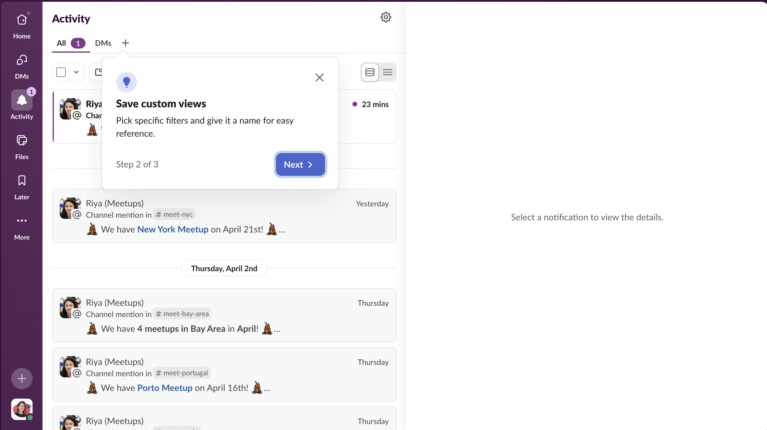
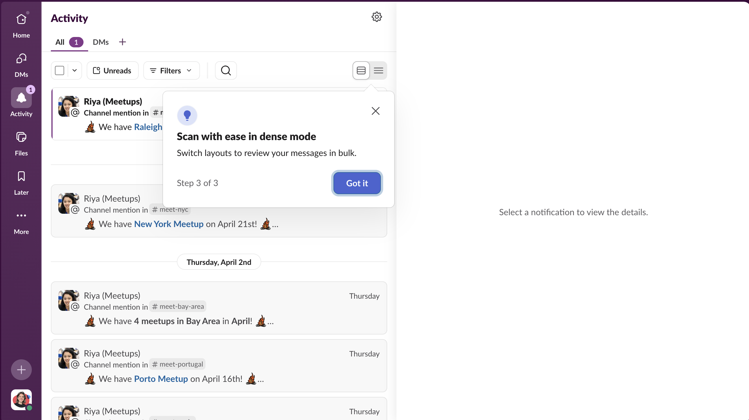
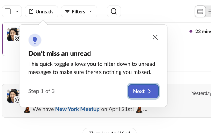
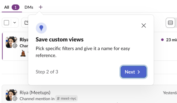
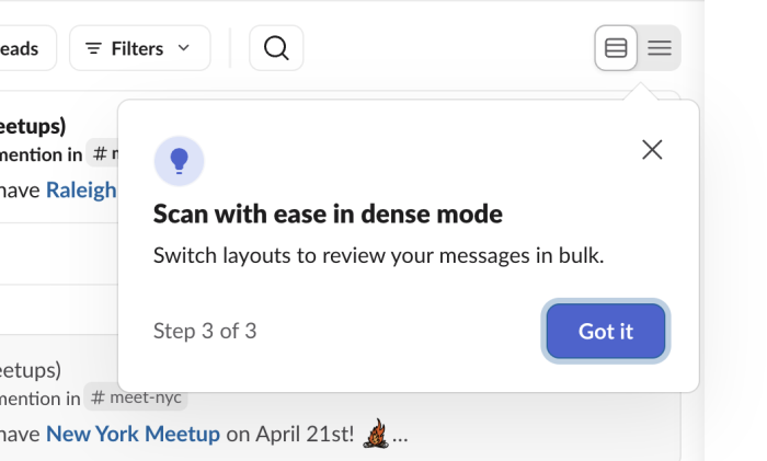
Redesigns create a peculiar onboarding problem: the user already knows how to use your product, but not this version of it. Sending a welcome tour feels patronizing. Doing nothing leaves them confused. Slack addresses this on the redesigned Activity feed with a compact three-step tooltip tour that fires on first visit. Each tooltip parks next to the exact UI element it describes, covers one feature in two sentences, then moves on. The sequence ends with "Got it" rather than "Next," a small signal that the orientation is complete and the user is ready to explore on their own.
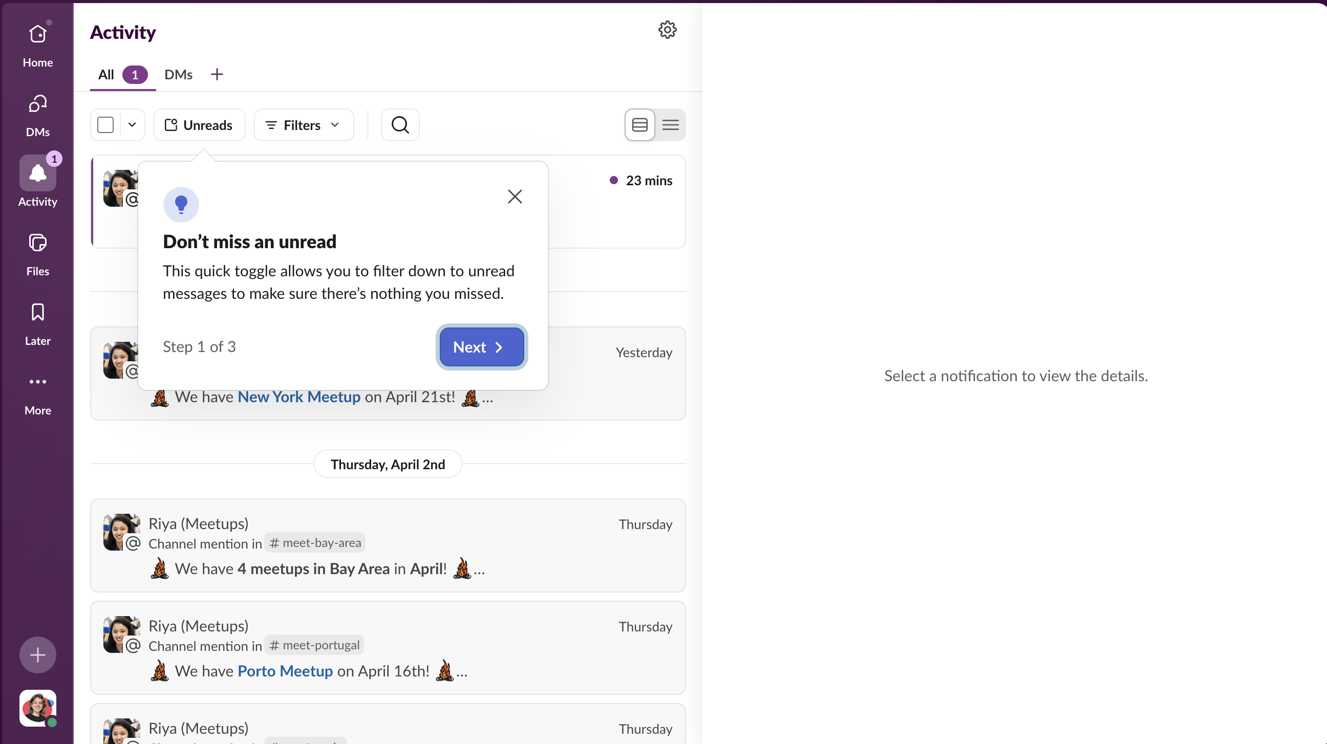
The first tooltip doesn't open with a feature name. It opens with a user fear: missing something. "Don't miss an unread" names the anxiety that anyone managing a busy notifications inbox already carries. The feature explanation follows, but only after the headline has earned attention by speaking to something the user feels.
Step 2 introduces the ability to name and save filter combinations for quick reference. This is deliberate sequencing: step one establishes that filters exist and are useful; step two reveals that those filters can be made permanent. The upgrade from "useful this one time" to "useful every time" is what converts a feature into a habit. Many users would apply the unread filter once and never realize they could save it. This step exists to close that gap.
Dense mode is the feature most likely to matter to heavy users of an activity feed: people who need to triage a high volume of notifications quickly. By step three, users are already oriented and primed to engage with the most advanced feature in the sequence. Swapping the CTA from "Next" to "Got it" at this point signals that the tour is complete and hands control back to the user, rather than leaving them wondering if there's more to come.
Build a tour to orient users to a redesigned section of your product on their first visit.
More Tour, Redesign, & User Onboarding examples
Get started free in our sandbox or book a personalized call with our product experts
