


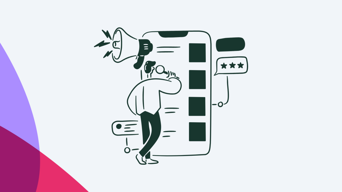
Imagine you’re entering a new product. You are welcomed with a nice tour of the core features. Great, now you’re ready to go. But wait, there’s more. Another tour starts, this time regarding more advanced features. Fair enough, you get through that too, and prepare to explore the product on your own.
But then a modal pops up, asking if you’re interested in transitioning to a premium plan. Nope, you’re not ready for that. Then a slide-out asks if you’re having any trouble using the product. And then a banner shows up from the top telling you about the new feature. Before you know it, you close the product altogether just to make it stop.
You might look at that and think, it’s way too overboard. But, unfortunately, this is the stark reality for quite a number of products. Which begs the question, are your users being overwhelmed with your own in-app messaging?
Pushing too many in-app messages toward the user, or repeatedly showing various in-product experiences without regard to context or relevancy, could backfire. It could irritate users, potentially to the point where they drop out.
So let’s talk about how not to do this, and how to ensure that your in-app communication is being delivered to the right users at the right time in the right places.
Your in-product messages should be what drives your growth, not what turns people away.
Every message needs to be super relevant for users throughout their journey. It needs to offer actionable insight and help users accomplish their goals.
If you present messages with no regard to context, audience, and frequency, you may be spamming your users and causing them to drop out.
Here, we present five ways to configure in-app messages to be more useful to the user and not be seen as spam.
Are your users overwhelmed? Here’s how you can find out
First, try to examine how your in-app messages flow and interact with your users. There are four main hints you can turn to when checking whether you’re spamming your users or not.
Context
Context is critical when it comes to communication, and it’s the same for in-app messages. If a piece of information is relevant to the user and their experience, then it’s likely perceived as helpful. If it’s not, then it’s more likely to be ignored, or worse, a user might see it as annoying.
Always think about whether the information fits each user’s situation when you create a new piece of in-product communication or evaluate an older one.
For instance, if you show a tooltip for an advanced feature upgrade the very minute a new user signs up, that information will probably have zero value to the user. It could only cause confusion.
Audience
Do you send in-app messages to the same audience segment – all the time? Or do you, perhaps, simply send all your messages to all users?
Treating your users as a monolith is never a good thing. Each user’s journey is different from another and comes with a distinct set of goals and jobs to be done.
To better understand different journeys, you can ask questions like these:
How did this user find your product?
What type of subscription plan does the user have?
Where in the customer lifecycle is the user?
What actions have the user taken already?
What messages have the user already seen?
By all means, this is not an exhaustive list, but it should give you a good start on thinking about how to segment your audience to provide a personalized experience that clearly outlines value for each user.
Frequency
In-app messages are supposed to help the user understand the product’s value and get to that "aha!" moment faster. But when they are stacked one after the other throughout the user’s journey, then it might cause blockage and friction. In-app messaging is supposed to gently nudge at the right times, not lecture endlessly.
So try to see if you’re presenting too much information in a given period of time. A simple way to do this is to test it out. Step into the user’s shoes. If you’re getting annoyed by how incessant your in-app communication is, chances are it could also frustrate your users.
Metrics
Finally, where can you find evidence-based indications that your messages are coming across as spam to your users? For that, dig into your metrics.
Anywhere you find that users are dropping out or turning away from your product could be a sign that your messages are causing high friction.
Look for signs such as:
High churn rates
Low user activation rates
Low engagement rates
Too many dismissed messages
High drop-off rates
Be strategic about it: Don’t show everything to everyone
Your in-product communication should be what drives your growth, not what turns people away. This should be a core aspect of your product-led growth strategy. So be strategic.
The general rule of thumb should be this: if a message provides clear and immediate value to the user, go for it.
For each new message, ask yourself and your team the following questions:
Who needs to see this?
Why is this relevant to the user?
Why does it need to be shown now?
Where does it need to be shown?
What is the best way to show this?
Remember, every message needs to be super relevant for users throughout their journey. It needs to offer actionable insight and help users accomplish their goals, complete their tasks, and keep moving towards success with your product.
5 ways to configure your in-app messages to avoid overwhelming users
Now that you know why it’s important not to spam users with in-app messages, let’s take a look at how you can go about configuring them the right way.
Show the right message to the right users
Imagine that you’re an active user of a product, and while you’re going about your usual work, you suddenly get an onboarding message asking if you know how to perform a very basic feature. It’s of absolutely no use to you.
Different users need different information. This is why user segmentation is a must. Dig into your product analytics. Group users by key factors such as what actions they have taken and which in-app experiences they have already seen. Then, personalize messages to relevant cohorts and configure each to show only to relevant users.

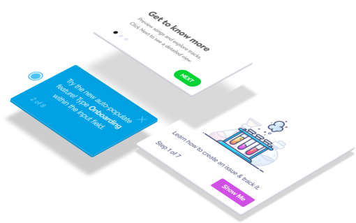
Trigger the message at the right time
Let’s say you have a product tour that is supposed to talk about a certain feature. What do you think will happen when the walkthrough is up, and that feature is nowhere on the screen? It will confuse the user, and increase friction, leading to more likelihood of churning.
This is a common problem with in-app messages. If done without accurate configurations, they can be shown at the wrong stages of the user’s flow.
As a solution, set contextual triggers. Make sure that certain elements are visible when the message shows so that it is relevant to the user’s immediate experience.
For example, Chameleon allows you to configure specific Element Rules so that a message only shows when certain element(s) are present or not present on the page.

You can also set different triggers in Chameleon to show a message when a user clicks on or hovers over certain elements of the page. Such contextual settings ensure that your in-app messages are truly relevant and helpful, instead of being a cause of friction.
Make your messages unobtrusive
Perception is key when it comes to spam. If the messaging constantly blocks the user and is far too ‘in their face’, then there is more chance that the user will see it as spam or a distraction. So make sure your users don’t feel this way by making in-product experiences as unobtrusive as possible while still keeping them noticeable.
For instance, a pop-up modal that goes right in the middle of the screen and blurs the background can be very obtrusive. It literally blocks everything and demands the user’s attention. Depending on the importance of your message, you could use a pop-up modal, but keep in mind the modal UI design best practices.
On the other hand, a banner at the bottom of the screen can be much more subtle. The user can still go about their business in the app, even if the banner stays there, and they can choose to pay attention to it when they want to.
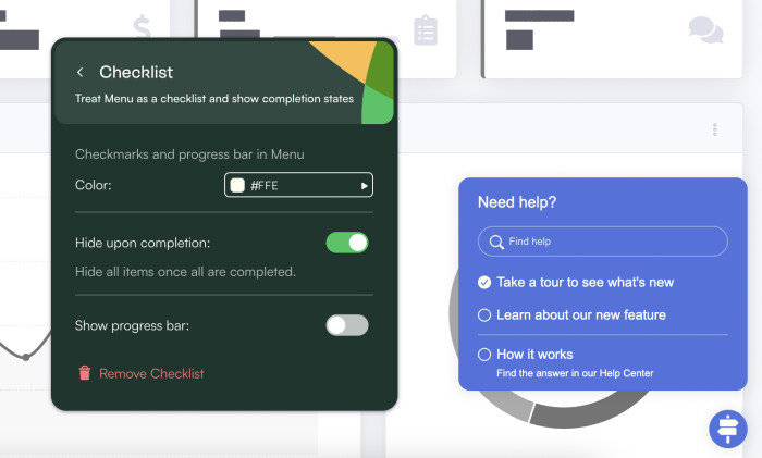
One way to create unobtrusive in-product experiences is to use customizable in-app widgets like Launchers. With Chameleon, you can configure them to open from an icon on the page so users can go back to them at their own convenience.
This way, you can offer onboarding checklists, a list of additional resources with links to relevant help docs and product tours, or anything else that fits your users’ needs. Here’s an example of what it could look like.
Make it easy for users to exit – and come back
Never hold your user hostage at any point. No matter how important a message is, you must always make it super easy for the user to opt-out. Ensure that there’s a clearly visible option for dismissing or exiting the tour or the walkthrough.
What if the user wants to get the in-app message, but just not now? You can simply let them snooze it and come back later at a more convenient time for them.
This way, you give users much more control over what messages they see within your product, which automatically means less frustration. Moreover, it’s less of a headache for you because you’re allowing the user to self-regulate how many messages they see.
For example, with Chameleon, you can choose to set a Dismiss option as well as a Snooze button for your Tour, and set how long it’ll snooze for, whether it’s for hours, days, or even months.

Control the frequency of each message
Finally, you can control the frequency of how often your messages are shown by rate limiting, also known as experience throttling. This is where you set a certain number of times for an in-app message to show in a certain period of time.
For instance, you might want your users to see only three messages in the product per day. So after each user sees any three messages while they’re using your product, they won’t see another until the next day. Of course, you could also exclude certain critical messages from this limit so you can make sure that a user sees them.
Such a limit ensures that your users will not be bombarded with in-app messages that are blocking them from actually using your product.
You can also take it a step further and tune the limit depending on how different users behave. For instance, more experienced users will naturally find onboarding messaging much less useful than first-time users. So it would make more sense to target those users for rate limiting than the newcomers.
The best way to do this is to use a Product Adoption Platform that has this feature built-in. As an example, Chameleon has a Rate Limiting feature that allows you to set which types of in-product experiences you want to limit, which audience segment will have this limit, what the frequency will be for each, and which time period it will cover.

Conclusion: Provide nothing but the value
Let’s recap. You can find out whether you’re spamming your users or not by looking at four elements:
Context: are all your in-app messages relevant to your users?
Audience: are you showing the right messages to the right users?
Frequency: are you showing too many in-app messages in a given period of time?
Metrics: are there signs of high churn and low activation, adoption, or retention?
In case you discover that you are, indeed, spamming and overwhelming your users, establish a strategy to fix it.
Remember the five best practices:
Show the right messages to the right users
Set contextual triggers for your messages
Make your messages unobtrusive
Make your messages easy to dismiss
Control the frequency of your messages
And finally, when in doubt, always look to provide value – and nothing but the value – to your users. What makes a message spam is in the eye of the beholder, so make sure you’re conscious of the cognitive load that your users have while interacting with your product at different stages of their journey.
Looking to be more effective and efficient with your in-app messaging? Chameleon has everything you need to configure your in-product communication with precision and accuracy.
Build in-app guides to retain users
Chameleon makes it easy for product teams to create product tours, tooltips, onboarding checklists, and in-app surveys without code.


