


"Product tours are dead!" You've probably heard it. You may have even said it. But Ramli John—founder of Delight Path and author of Product-Led Onboarding—is here to make a compelling (and delightfully spicy) case for why they’re not just alive, but thriving… when done right.
In this guest post, Ramli unpacks what the best product tours are doing differently, using data from Chameleon’s onboarding benchmarks and examples from top-tier SaaS teams. If your tour feels more like a hostage situation than a helpful nudge, this is your sign to rethink things.
"Product tours are dead. They don't work!"
I hear this all the time. And I can't blame them. Most product tours make me want to crawl through broken glass just to escape the "Next" button marathon.
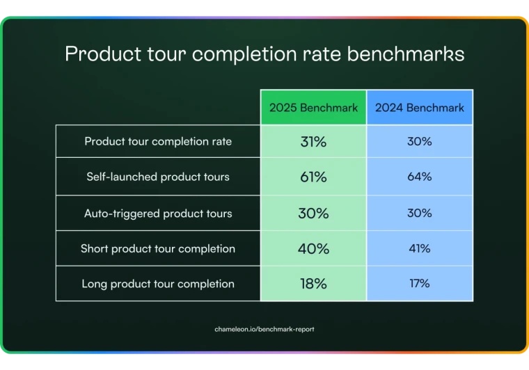
But here's the thing: the top 1% of product tours are very much alive. According to Chameleon's latest user onboarding benchmarks, the best ones hit completion rates as high as 61%. Even better? Users actually enjoy them.
Here's the uncomfortable truth: Tours aren't the problem. Bad tours are. Those 20-step modal marathons that hijack your screen? Yeah, those need to die. But smart, user-led experiences that respect people's time? They're thriving.
So what do they do differently? Let's take a look at what the top performers do differently and how you can steal their playbook.
1. Keep it under 5 steps (or watch users flee!)
Here's a sobering stat from Chameleon's benchmarks: completion rates nosedive after five steps. We're not talking about a gentle decline—we're talking about users abandoning ship like it's the Titanic.
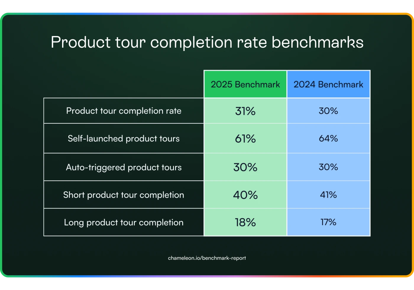 The magic number isn't arbitrary. Five steps is roughly the limit of what users will tolerate before their patience evaporates. Go beyond that, and you've lost more than half your audience.
The top 1% of tours? They never cross this threshold.
Take Slack's legendary 4-step tour. Instead of drowning new users in feature explanations, they focus on the essentials: channels vs. direct messages. That's it. Four tooltips, bright and impossible to miss.
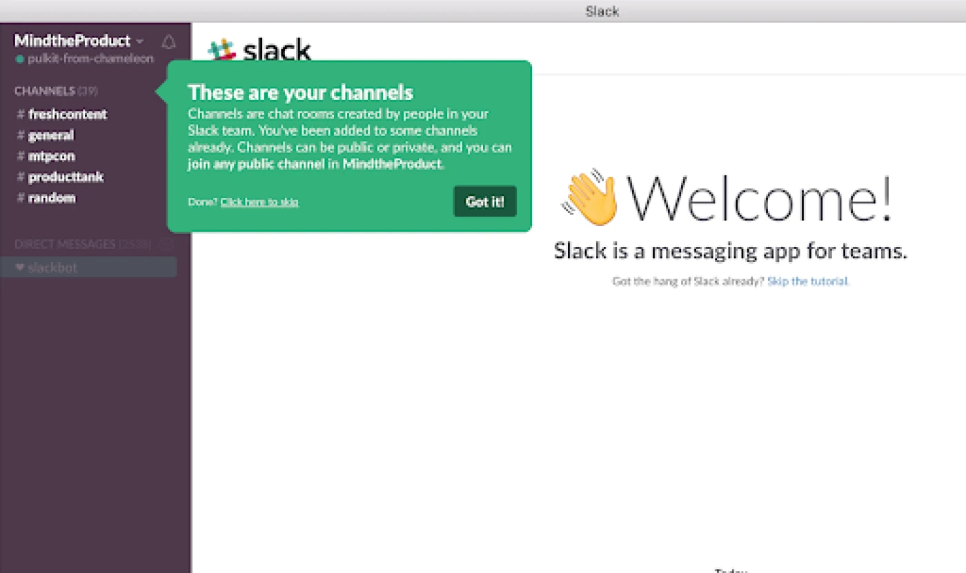 The tone matters too. Slack's casual, almost irreverent voice ("Hey there! This is where the magic happens 🎉") transforms what could be a boring tutorial into something that actually matches how people use Slack: informally, conversationally, humanly.
Your action plan:
Audit your current tour. If it has more than 5 steps, it's too long. Period.
Pick your top 3-5 features. Everything else goes in contextual tooltips or help docs.
Make at least one step interactive. Don't just show; make users do.
Write copy like you're explaining to a friend, not presenting to a board.
Ready to build a Slack-style tour that users complete? Watch how to create one with Chameleon in under 5 minutes .👇
2. Let users choose their adventure
Self-triggered tours get 2-3x higher engagement than forced ones. The reason is simple: autonomy. When users choose to explore, they're mentally prepared to learn. When you ambush them? They're just looking for the exit button.
Dropbox Paper nails this with their hotspot approach. Instead of forcing a traditional tour, they embed their onboarding into a real, working document: "Getting Started with Dropbox Paper." The page is sprinkled with pulsing hotspots that users can click when curious.
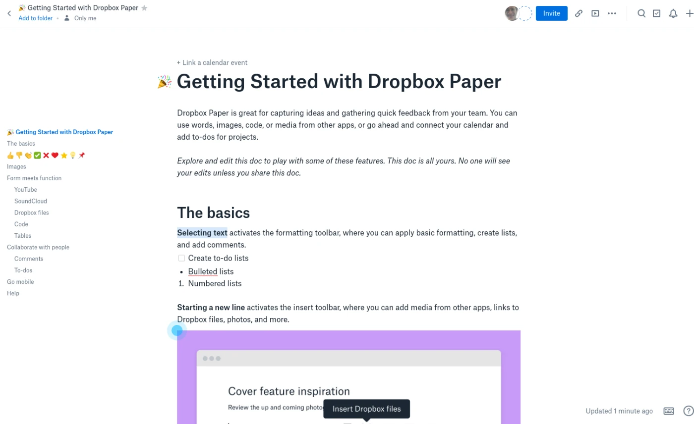 Each hotspot triggers rich video tooltips showing exactly how features work: formatting text, embedding files, and (yes) inserting emojis. The emoji tutorial comes early because Dropbox knows their creative audience. They're not building for stuffy enterprise; they're building for teams who 💜 what they do.
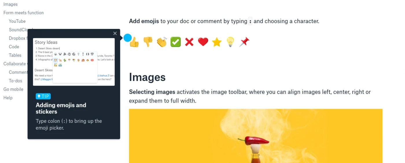 The brilliance? Users experience the product while learning it. They're reading a real document, seeing real formatting, clicking real hotspots. It's learning by exploring, not learning by following orders. And if users miss a hotspot? No problem—the document stays accessible, letting them return whenever they want to discover more.
Your action plan:
Kill the auto-launch tour. Embed learning opportunities in your actual interface:
Use hotspots or tooltips that users can explore at their own pace
Create a playground environment where learning happens through doing
Make guidance persistent. Users should be able to return and explore missed features
3. Show progress (users need to see the finish line)
Here's a psychological truth bomb: Progress indicators boost completion rates by 12%. Why? Because uncertainty kills motivation. When users don't know how long something will take, their brain assumes the worst. "Is this 3 steps or 30?"
Loom gets this. Their AI features tour hits you with a simple "1/4" indicator right from the start. No mystery, no anxiety—just crystal-clear expectations.
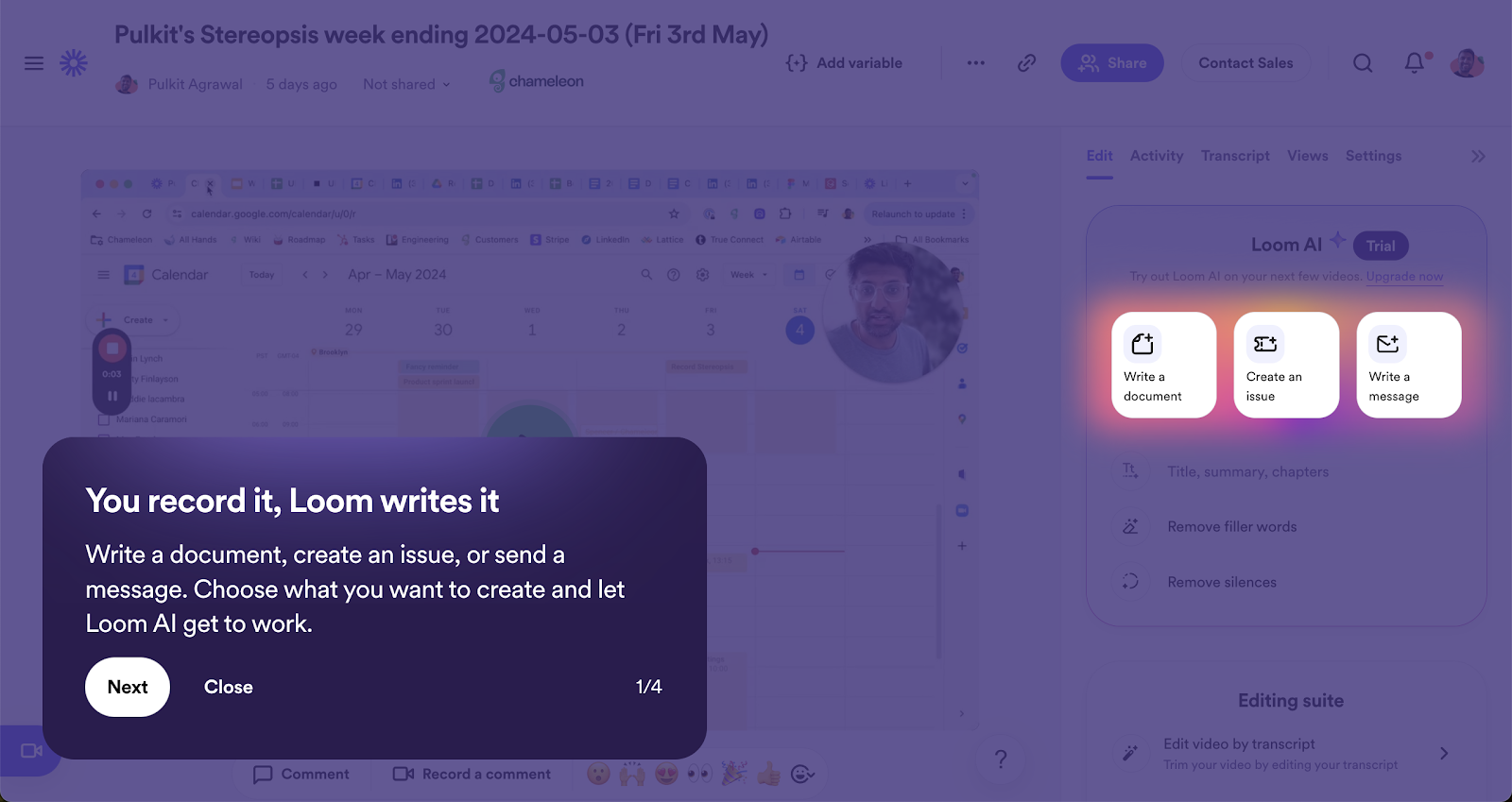 But Loom's tour does more than just count steps. Each screen reinforces that their AI is doing the heavy lifting for you. "Write documents with one click." "Create Jira tickets instantly." "Share messages effortlessly." The progress bar isn't just showing steps completed; it's showing value delivered.
The messaging stays laser-focused on transformation: manual work becomes automated magic. By step 4/4, users aren't just done with a tour—they're believers in a productivity sidekick that delivers. The progress indicator transforms from a countdown to completion into a buildup to "wow."
Your action plan:
Add step counters to every tour ("Step 2 of 4" beats mystery every time)
Show progress visually: dots, bars, or numbers all work
Make each step title preview the value ("Set up your workspace" > "Learn about workspaces")
Consider time estimates for longer flows ("2 minutes to awesome")
4. Make it action-focused (not informational)
Here's the dirty secret about product tours: users don't want to learn your product—they want to use it. The best tours understand this fundamental truth and design accordingly.
Traditional tours are information dumps. "This is the dashboard." "These are your settings." "Here's where reports live." Snooze. The top 1% of tours flip the script entirely. Instead of telling users what things are, they get users to do things.
Canva's tour is a masterclass in action-first onboarding. No lengthy explanations about what a whiteboard is. Instead? "Drag an element." Boom. You're creating.
The genius is in the sequence: Pick a template → Add images → Edit design → Download. In under 2 minutes, users haven't just learned Canva, they've also created and downloaded their first design. That's not a tour; that's an accomplishment.
Notice what Canva doesn't do: explain layer theory, detail every toolbar option, or showcase advanced features. They focus ruthlessly on one job-to-be-done: helping users create something beautiful and fast. The tour feels more like playing than learning, which is exactly why it works.
This approach works because of the "generation effect.” We remember things we actively do 50% better than things we passively read. When users create their first project, send their first message, or customize their first dashboard during the tour, they're not just learning features—they're building muscle memory.
Your action plan:
Make users complete one real task during onboarding (not a fake demo task)
Build tours around user goals, not feature lists
If you must explain, do it after they've done it. Context sticks better post-action
5. Make it modular (Netflix-style onboarding)
Here's a reality check: B2B products have multiple paths to value. You can't force everyone through the same activation journey. The solution? Break tours into specific activation tasks that users can complete as needed.
Folk's CRM ditches the one-size-fits-all tour for modular activation steps. Instead of overwhelming users with everything at once, they break onboarding into digestible actions:
Connect your Google account ✓
Import your first file ✓
Authenticate your domain ✓
Invite team members ✓
Each mini-tour focuses on one concrete activation step. Users see exactly what they're accomplishing and can tackle them in whatever order makes sense for their workflow.
The genius? Folk presents these as checklist items, not mandatory steps. Users who need to import contacts immediately can start there. Solo founders can skip team invites entirely. It's like Netflix for onboarding—watch what you need, when you need it.
This approach works because it mirrors how users adopt products—one feature at a time, as needed. The user who needs to import data right away can jump straight to that tour. The solo user can skip "invite team members" entirely. Everyone gets to their first moment of value faster.
Your action plan:
List your 3-5 key activation steps (what must users do to get value?)
Create a mini-tour for each activation step (2-3 steps max)
Present them as a checklist, not a sequence
Track which combinations drive the most successful users
So there you have it. Product tours aren't dead; they've evolved. What's the difference between the tours people abandon and the ones that reach 61% completion? It's not luck. It's design philosophy.
The old way was simple: force-march everyone through your entire feature set and hope something sticks. The new way? Respect user autonomy, focus on actions over information, and meet people where they are.
Here's your starting point: Audit your current tour today. If it has more than 5 steps, cut it. If it auto-launches, kill it. If it only talks to users without prompting them to take action, rebuild it.
The future of onboarding isn't about showing users around—it's about getting them to value, fast. Because at the end of the day, the best product tour is the one users finish.
Ready to join the top 1%?
Start with one simple rule: If you wouldn't want to sit through it, neither do your users.
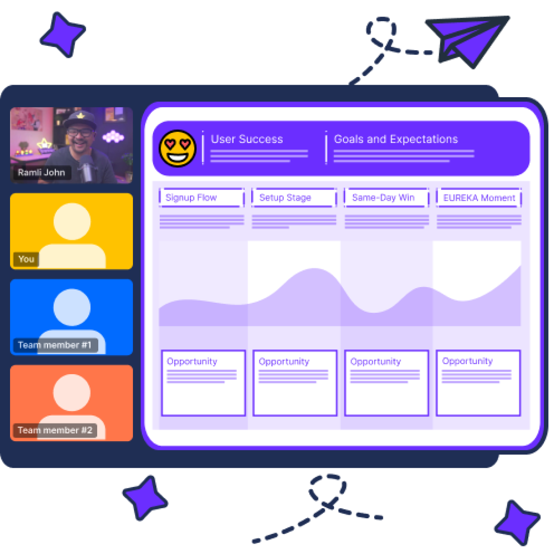
Ramli John is the Founder of Delight Path, where he helps B2B companies fix their leaky onboarding and turn more users into lifelong customers. He's the bestselling author of Product-Led Onboarding and EUREKA: The Product Onboarding Playbook for B2B Companies.


