


Modal windows can be intrusive. Whether it's a sudden pop up message or a modal dialog that is difficult to exit, they can disrupt your users’ flow, and can massively manipulate the reputation someone holds of your SaaS website or product.
However, they’re also extremely valuable—if done right. A modal window can work effectively to deliver just what the user wants. This article is about to showcase how you can do modal UI/UX design right.
A modal is a product or website element that typically pops up on top of on-screen content.
Modals are a valuable tool in user interface design that can help you grab users’ attention and win their engagement.
Though effective, modal windows are suited for more bite sized information such as warning messages or onboarding flows. They are less suited for longer pieces of information.
Read on to learn 12 best practices for creating great modals that capture the user’s attention.
Want an easy way to design and deploy great modals in minutes? Watch this short video:
Sign up to try Chameleon for free or play in our sandbox environment!
What is a modal?
A modal is a ui pattern or website element that typically pops up on top of on-screen content, creating a child window above the parent page. Modals often disable the content on the screen and require additional user input—click on a button or close/dismiss the modal.
A modal is also known as an overlay, pop-over, pop-up, or dialog window, but it doesn’t necessarily block the screen. Depending on how you configure it, it can appear as a slide-in or a pop-up triggered by clicking on or hovering over a page element.
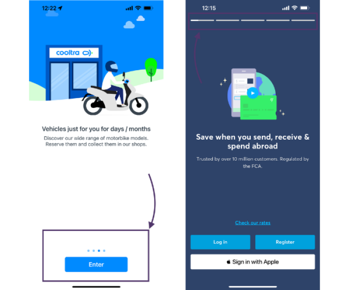
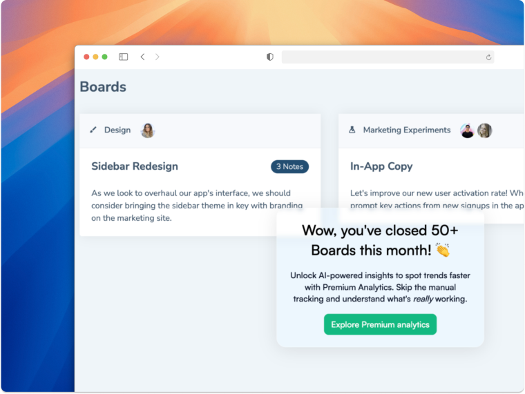
Used carefully, modals are a valuable tool in user interface design that can help you grab users’ attention and win their engagement. For example, you can create a welcoming (and personalized) product tour with modals. Here’s what the first step could look like.

Why modal UI design matters so much
Modals are an effective way for your brand to communicate with your users. They are a method to present “not-to-be-missed” information, and they often garner higher impressions than emails or other forms of communication.
However, modals are also in the way of your user’s job-to-be-done. Even if the information you’re presenting will help users, at that moment it’s causing them extra work and time.
Therefore, the user interface design of your modal is absolutely critical to communicating your message while keeping your users happy.
When to use modals
So, when should you use a modal window? And, when are you better off communicating via email, chatbot, or another communication channel?
A modal window is a great way of giving the user important alerts regarding the product, such as reminding them of important features they should try, or giving announcements that you want to direct their attention toward.
Let’s map out some occasions when you should and shouldn’t use a modal.
A modal overlay is best for:
Error messages
Success messages
Event announcements
Must-have data collection
Sign up CTAs
Warning messages
We’ll get to some top modal examples later. But, before we do, let’s look at those cases where you’ll want to use a modal and really shouldn’t.
When not to use modals
There will be moments when your team wants to communicate with a user and will jump to the conclusion of using a modal. Always consider if a modal is relevant and beneficial to the user experience before you activate it.
A few tempting comms to avoid in modals are:
Offering additional information: a tooltip is definitely better!
If the user hasn’t triggered them: prompting users to complete unrelated tasks, out of context to the actions they’re taking on your website or in your app
To communicate a large amount of information: an email or a blog post is better for this
Activating a modal over another modal: never overlay on an overlay!
Fab, we’ve covered when you should and shouldn’t implement a modal pop-up. Let’s get into some best practices and SaaS brands leading the way with stellar modal UX examples.
12 best practices for better modal UX/UI design
Right, let’s explore some modal best practices for UX/UI elements.
1. Start with a clear modal title 💎
First up, you’ll want to ensure your modal title clearly explains why the modal is there. Users want to know why their session has been interrupted as quickly as possible. Make sure to write a descriptive title that delivers the point quickly.
2. Use explanatory graphics 🎨
Where words fail you, graphics and GIFs won’t. The modal dialog box is limited. So, for what you can’t say in words, showcase it with visuals. You can also use video to explain even more details and effectively educate your users.

Above, Mixpanel uses video to better communicate their new update. Did you know? Our Benchmark Report shows that in-app messaging with video increases engagement by around half a minute.
3. Work on sharp body copy 🤌
Writing modal content is the perfect time to showcase your UX copywriting skills and kill those darlings. You’ll need to be explicit, cut the magic, and get straight to the point. Don’t be afraid to use emojis where they make sense and if your brand guidelines allow them.

The above example from Miro is great in many ways, however, there is room for improvement! The body copy is a little too long, and the title: “Let’s make meetings better” is too vague. Plus, there’s no clear CTA. Talking of which…
4. Give an explicit call to action 🆓
A modal’s main focus is to provoke an action from your users. So, make their job easier and give them a clear call to action. If possible, this should be a button or input box within the modal. A user cannot interact with your modal if you don’t provide the option to do so.
Keep in mind the actual CTA button design, too. Think about the colors, color contrast, sizing, and button copy. You’ll want the button to stand out, but not jar the reader or break your branding guidelines.
5. Craft an escape hatch 🏃
If you’re going to interrupt users, you’ll need to give them a quick way out. Give your modal a clear escape hatch, come back later, or snooze option as a basic usability principle. This ensures you’re focussing on the user experience and functionality, and avoids frustration from your users.
Your escape hatch can be:
A clear ✖️ in the top corner of the modal
An option to click outside of the modal window to exit
Another exit CTA underneath the action you want the user to take
Hitting Esc on the keyboard
This is also known as a cancel button / dismiss button.
Below is an example from Degreed. This modal has two choices, one of which is actually equivalent to a dismiss button in the form of 'Wait for the Update'. But it also gives you a clear X for just closing the modal.

With Chameleon, you can easily configure and customize the Dismiss button. Or you can offer the “Snooze” option to help users get back to the tour at their convenience. Will they come back? Yes, they will! Our benchmark data shows that 18% of users choose to snooze in-app prompts when given a chance.
6. Pay attention to sizing and location 📍
It’s important not to overwhelm users with your modal taking up their entire screen, especially if you are interrupting the user's current task. This gives them little screen space to click out and exit and makes them feel as though they’re no longer on track to their goal.
You’ll also need to keep this area of your modal design responsive to mobile or desktop and take up enough space so your content grabs the user's attention and is legible, while not overpowering your user’s flow.
7. Implement action-triggered modal windows 🧑💻
There’s nothing worse than a modal that springs up out of the blue and sends users recoiling in their seats. These are known as system-initiated modal windows. They’re often irrelevant and most probably comms that should have been delivered on another channel.
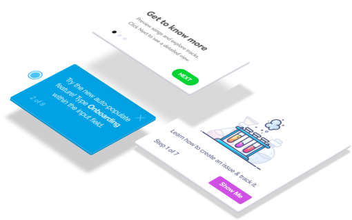
Instead, make sure your modals have relevance based on each user action and where they are in the customer journey. In other words, go for user-initiated modals. For example, it can be an onboarding checklist triggered by a hover over an icon, and it could look like this.

8. Trap keyboard navigation within the modal window 📱
This is especially important when designing modals for mobile devices. You’ll need to ensure you trap keyboard navigations within the modal window. This will especially help with quick-win activations and smoother new feature adoptions.
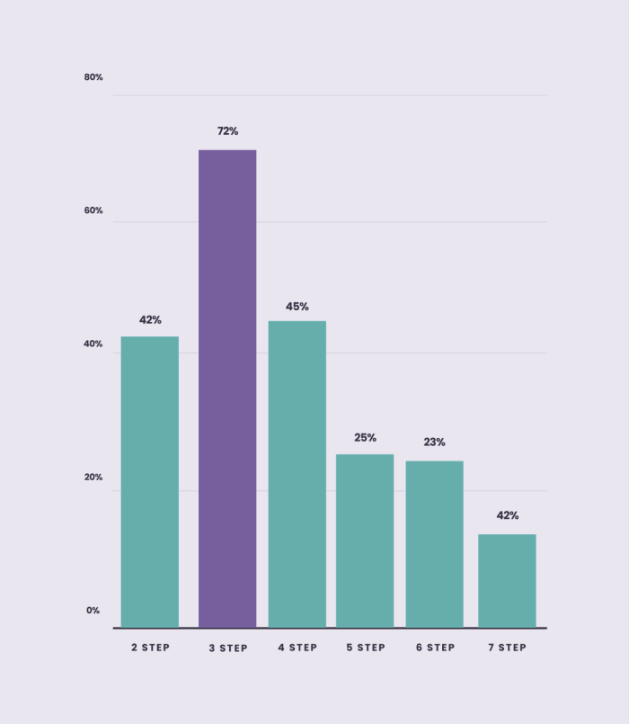
9. Use progress bars for modal tours ⏳
Progress bars are so crucial for completions, especially if you’re running a product tour via modals for user onboarding. They keep the user engaged through multiple steps via employing gamification. Progress bars can take various forms, such as the two example below.
Remember, keeping your onboarding tours short and to the pint is crucial for success. For the latest Chameleon Benchmark Report, we analyzed over 300 million in-product Experiences and found that three-step Tour modals get the highest completion rate at 72%.
10. Stay consistent with what users know 👨🏫
Stay consistent with modal window design trends and UX/UI patterns that users are already familiar with—there’s no need to reinvent the wheel.
Tony Gines, Founding Designer at Scribe, explains more:
“Stay consistent with conventional controls for a modal. Users will want to look for those. So, keeping the Close button in a familiar place, having clear CTAs and choice options is crucial.”
– Tony Gines, Founding Designer at Scribe
Looking to improve your in-product experiences while maintaining a unified look? Try one of these 10 free UI kits 👇
11. Design for different devices 🤳
Web vs. mobile modals is something you’ll need to care deeply about to if you want to retain your user's attention as well as their satisfaction. Keep your users’ devices in mind and ensure your modal is responsive depending on this.
Tony Gines shares questions you should be asking in the modal prototyping stage.
“Account for different types of screen real estate. Does the modal’s content require a scroll on mobile screens? Are the controls relying on aspects that don’t exist consistently across devices, like hovering your cursor over something for tooltips?”
– Tony Gines, Founding Designer at Scribe
12. Focus on… focusing 🔍
Lastly, find ways you can draw immediate attention to the modal, without it covering an entire screen.
Tony Gines shares some UI tactics for doing this.
“Make sure you’re showing the user that this modal is clearly something that needs attention, so bringing it further to the foreground with design elements like shadows, background dimming or blurring helps set the modal apart from the rest of the page layout.”
– Tony Gines, Founding Designer at Scribe
Noted these 12 modal UI design best practices? Then it’s time to keep this ball rolling with our top modal design examples.
4 fabulous modal dialog examples for their UI/UX design
The moment we’ve all been waiting for—which SaaS brands are out there doing modals best? Which leaders are implementing our 12 modal design best practices? Let’s find out.
Example #1: Google

If anyone’s going to do modals right, it’s Google. We applaud Google here for a few reasons:
It’s unobtrusive: This design acts more like a tooltip pop-up than a whole screen modal.
It’s clear: The arrow to the left of the modal helps to showcase the exact product update they’re referring to.
The body copy is concise: It quickly explains exactly what the user can do in Gmail because of this update.
How can this modal be even better? The title is a little inconspicuous, darlings were not killed here. The graphic visual—although it looks great—doesn’t help educate the user.
Example #2: Linktree

Next in our modal hall of fame is Linktree. Used by many small businesses, Linktree is a great way for brands to share multiple links with just one. Why did it make the list?
A clear title: this product update modal clearly communicates to the user what’s new from the word go.
Use of emojis: Emojis are on-brand for Linktree while helping to guide the user’s eyes. 👀
Clear CTA: This screenshot was part of a three-step product update modal, and the two CTAs are very clear, you can either upgrade to unlock the new feature or jump to the final product modal slide.
How can this modal design be even better? The body copy didn’t need so many examples, users know what video content they have access to. A progress bar would have been beneficial in this instance as well.
Example #3: LANDR

LANDR, music software for creators, built their onboarding tour with Chameleon. It makes the list for a couple of reasons:
Action-triggered: After the initial tour, users can trigger smaller product tours as they navigate through the platform.
The title is clear: LANDR knows the importance of fighting customer churn. Despite the user already being in the product, this tour comes before activation: they’re delivering product benefits and addressing pain points as they onboard.
Progress bar: In the bottom left corner, you can see the user progress bar “2 of 4”, encouraging a higher completion rate.
How can this modal be even better? The body copy could be refined and made a bit shorter to fit one paragraph of text. It would provide room for a larger font size or for more white space, which would improve readability for the user.
Example #4: Airtable
Last on the list for a fabulous modal window design example is Airtable. Here, they’re introducing a product update that enables users to build interfaces from various in-app data points.
So, why did this modal dialog make the list?
Show, don’t tell: Airtable expertly uses video to highlight what the user can do, saving their precious lines of in-app messaging copy for other things.
Clear escape hatch: the top left-hand corner of the model gives users an easy-to-spot ✖️ to click out of the tour if they don’t feel like taking it right now—an essential modal usability principle.
How can this be even better? This modal product tour would definitely be improved with a progress bar.
Closing out on popping up
That’s everything on modals. Whether you call them a pop-up, pop-over, dialog window, or something else, hopefully, you’ll be designing modals better thanks to this guide.
A big thank you to our contributor for this piece, Tony Gines, Founding Designer at Scribe, and to those brands that made our examples so easy to showcase: Airtable, Google, Linktree, and LANDR.
Bookmark this page, come back to it when you need it. If you’d like to start building stellar modals for your products, sign up for Chameleon and try it out in our sandbox environment for free!
Create in-app experiences that retain and convert users
Chameleon makes it easy for product marketers to create tooltips, modals, and product tours without code


