


Chili Piper's Trial Conversion Launcher
When a user signs up for a feature trial, they need to understand what they've signed up for and know where...
Existing customer? Sign in
When an account is approaching its usage limit, the people who can act on it are often the ones least likely to see it. Chameleon solves this by showing the banner to every user in the account, not just admins, and giving non-admins a direct path to surface the issue internally. The 'Notify Admin' button turns passive observers into active messengers. Surfacing this at 90% is deliberate: urgent enough to prompt action, early enough to leave room for a real conversation.
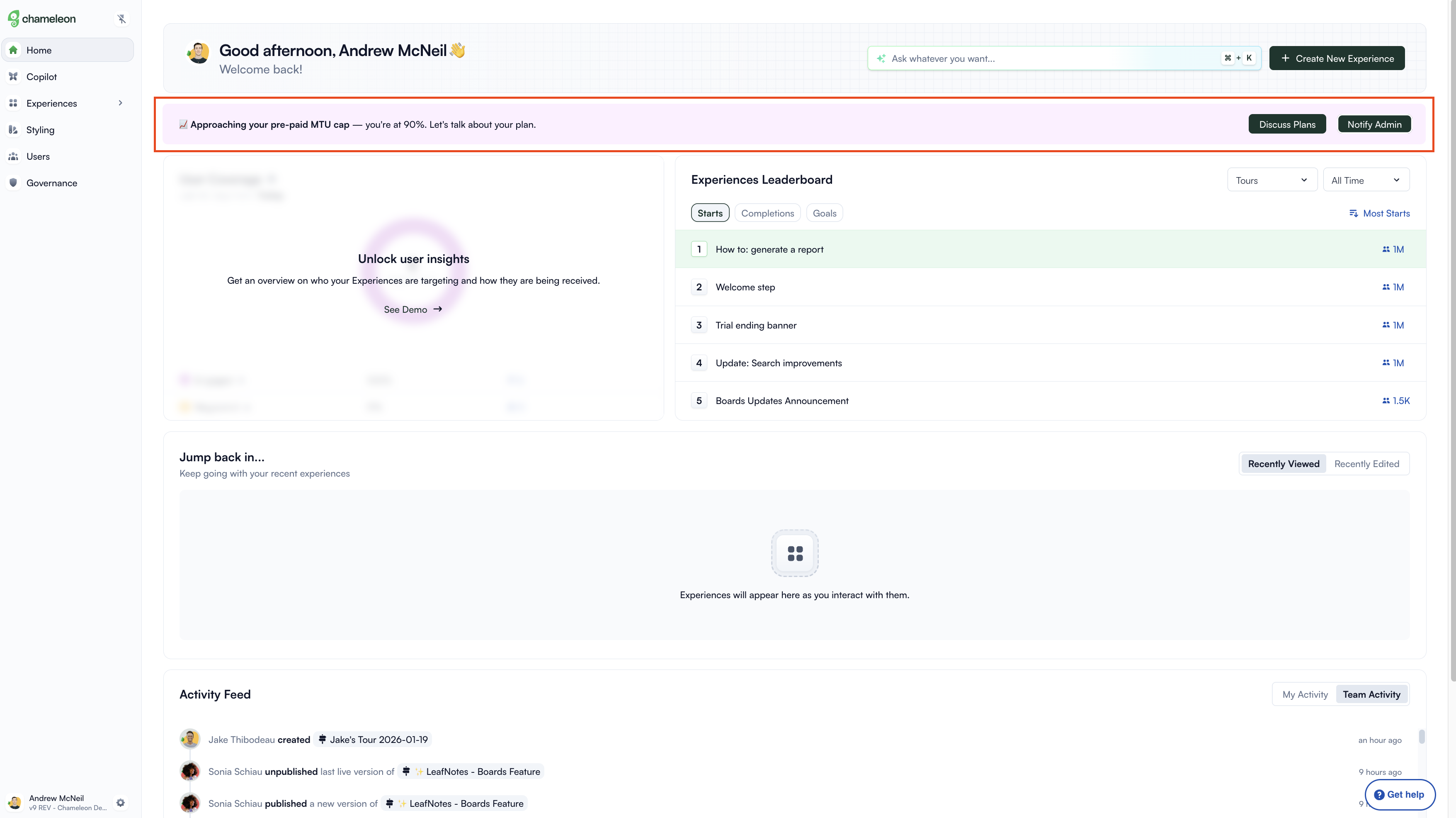
Most usage warnings assume only admins will see them. This one accounts for the reality that day-to-day users spend far more time in the product than the people who manage the account. By giving non-admins a 'Notify Admin' button, the experience turns passive observers into a distribution channel. The information reaches the people who can act on it, even if they never log in themselves.
Showing this at 90% is a deliberate choice. At 50% or 60%, the warning feels abstract. There's still plenty of runway and it's easy to dismiss. At 100%, the conversation becomes a crisis. 90% is the point where urgency is real but the problem is still solvable, and there's still time for a proper conversation rather than an emergency response. The specific number in the copy matters too. 'You're at 90%' reads as information. 'You're getting close' reads as noise.
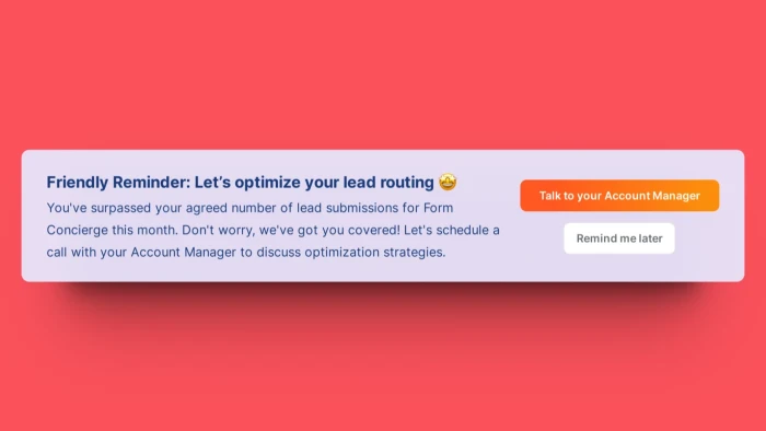
The copy doesn't say 'Upgrade Now.' It says 'Let's talk about your plan.' That's a meaningful distinction. 'Upgrade Now' positions the interaction as a transaction. 'Let's talk' positions it as a conversation between two parties who both have something to gain from finding the right fit. For a product where plan changes involve a sales conversation, this framing makes the CTA feel less like a wall and more like an open door. It also takes the pressure off the user: they're not being asked to decide anything yet.
Build an Embeddable to alert users when their account is approaching a usage limit.
More Banner, Embeddable, Built with Chameleon, & Upsell examples
Start a free trial or talk to our team.
