


You’ve got users signing up daily but never fully engaging with your product. They’re ghosting your product, and you can’t figure out why for the life of you (pun intended).
Onboarding is the one part of your product almost every user will experience. Even if they choose to skip it, they’ll still see the first step. Getting SaaS onboarding right determines if a new user sticks around or not. If it’s confusing, boring, or off the mark new users will say goodbye quicker than you can say hello. But, get it right, and they’ll stick around, turning curious sign-ups into loyal customers.
In this guest post from Mike Fiorillo, he shares his 5-step process for designing a highly optimized user onboarding flow. Mike is an experiment-led growth expert at Temporal.io, and previously led product growth at companies like DuckDuckGo and InVision.
Mike digs into how to understand each user’s goals, how to spot sources of friction, and some useful tactics for designing an onboarding flow that delivers value quickly.
What Is SaaS user onboarding?
SaaS user onboarding is the process of guiding users through your product, highlighting key features, and helping people understand its value. It helps your users reach that moment where they think, “Ah, this is exactly what I’ve been looking for!”
These "aha” moments in a new user onboarding process can make all the difference, and they can happen on multiple occasions; here are some examples:
First login: When you greet people with a welcome message and a quick tour of your product’s core features. Account setup: When you follow up with a helpful welcome email after they set up their account that includes resources like video tutorials or documentation to walk them through the next steps.
Interacting with key features: when users first interact with essential tools (like creating their first report or dashboard), in-app tooltips are a best friend. An “aha moment” could happen when you guide users through these features right when they need it most, as it lets them see the value without feeling overwhelmed.
Completion of the first big task: Once users complete an important task, like sending an email campaign or uploading a project, and you celebrate it before giving them a checklist for their next steps. Early momentum is crucial in feeling successful.
When users go inactive: when you automate reminders or in-app nudges to re-engage them. It reminds them of the value they’re missing and how you can help them achieve their task.
Let’s dig into why onboarding matters so much.
Why is SaaS user onboarding important?
Here’s the thing—your product could have the best features, but if users don’t know how to use it, it might as well be invisible. 👻 Without a solid onboarding strategy, you’re risking high churn rates and missed opportunities to build long-term relationships.
With SaaS onboarding, you can:
Boost activation rates: the quicker a user can realize the core value of your product, the more likely they are to stick around. Onboarding reduces the time users take to reach that "aha" moment. This fast-tracks product adoption, increasing engagement from ahh scared emoji” to ahhh happy emoji*
Reduce churn: Well-designed onboarding reduces cognitive load and helps keep people from giving up on more complex products.
Create loyal customers: Users that have positive early experiences are more likely to become loyal users, which are in turn more likely to upgrade to paid plans, renew subscriptions, or recommend your product to others—driving both customer lifetime value and organic growth.
You don’t just want users to get through the process—you want them to be engaged, excited, and set up for long-term success. Let’s explore how user onboarding optimization can bring this to life.
12 Strategies to help you optimize SaaS user onboarding flows
The key is finding the right balance between guiding users and giving them room to explore. If the flow is too rigid, users get frustrated. Too open, and they may drift away without fully grasping the value of the product. So, how do you improve user onboarding and find the middle-ground?
To help you hit that sweet spot, here are 12 strategies to improve your onboarding, boost product adoption, and minimize churn.
1. Understand users painpoints and goals
You should have a clear sense of the main goals or outcomes users are looking to achieve with your product. This will help you determine the actions users need to take first.
One quick way to figure this out is to run an in-app survey targeting your most successful new users. Usually, success means users who have signed up recently, experienced a ton of value, and decided to upgrade to a paid plan.
Ask them a question like, “What were you trying to achieve when you first signed up?” Use open-ended questions, and then bucket responses into 3-5 value themes. You could also include an open-ended survey question into the onboarding experience, or even ask via email!
2. Create a user journey map
After identifying your users' pain points, it's time to map out their journey. A user journey map breaks down the steps your users take from sign-up to success, showing you exactly where things can go wrong—and where you can swoop in to help.
Make sure your journey map includes lower-friction actions users can take that help them visualize the value they’ll ultimately receive.
A "Shift Left" approach takes this a step further by starting the onboarding process earlier in the user journey, even before they sign up. This means introducing users to the product’s value through educational content, free tools, or interactive demos during the discovery phase.
The idea is to deliver value upfront, so by the time users are ready to sign up, they already understand how the product can benefit them. This reduces friction later on and makes the entire onboarding process smoother.
Then, start by breaking the journey into stages:
Discovery: This is where users first learn about your product. Make it easy for them to understand its value with clear messaging and calls to action.
Sign-up: Simplify the sign-up process to minimize friction. The goal is to get users onboard quickly, without overwhelming them with too many steps.
Onboarding: Guide users through the initial steps of using the product. Offer them helpful prompts and tutorials to ensure they understand how to get started.
Activation: This is the stage where users experience the core value of your product. Focus on helping them complete key tasks that will showcase the product’s benefits.
For each stage, think about the user’s goals and what they might be feeling or thinking. Include specific actions they take (e.g., filling out forms, exploring key features, and playing with a demo dataset) and the support they might need (e.g., tooltips, emails).

If you need a customer journey map template, there are some free ones available from Miro, Figma, and InVision.
3. Identify and remove sources of friction
Go through each step in your journey map and think about what might be causing users to get stuck. Unnecessary steps, confusing UX, and complicated language all increase the user’s cognitive load–the mental effort required for the user to understand how to use your product.
Go through each step and ask yourself questions like:
Does this help users experience value quickly?
Is this copy clear, relevant, and persuasive?
Is anything superfluous or distracting?
Can this be broken down further?
Use product analytics data like session duration or feature engagement to identify any drop-off points. Then, layer in qualitative data from surveys, user testing, or support tickets to understand why users are dropping off. This combination helps you pinpoint problem areas and make targeted improvements to enhance the user experience.
You’ll also want to provide users with feedback and reassurance throughout the onboarding process to increase confidence. Even seemingly trivial details like showing password requirements can reduce frustration–every little piece adds up.
Once you have identified some potential sources of friction, you’ll likely have ideas for design changes to optimize conversions at each step. You’ll now be ready to...
4. Break up complex steps using progressive disclosure
People often become overwhelmed when they’re asked to do too many things at once. One useful trick is to break up complex tasks into smaller, more manageable chunks. If you’ve ever used a step-by-step onboarding or checkout flow, that’s progressive disclosure in action.
Another way to use this principle is to only ask users to use more advanced features at the moment they need them. For example, when a new user shares a Google Drive link on Slack, they’re asked to install the Google Drive integration. If Slack had instead asked users to set up this integration when they first signed up, this would have added to the user’s cognitive load.

5. Use templates to reduce cognitive load
For products that require a lot of upfront customization, templates can help new users get up and running much faster. Some of the fastest-growing product-led companies, like Canva, Webflow, and Airtable, leverage the power of templates to make their new user experience as frictionless as possible.

6. Leverage the power of smart defaults
The truth is, users rarely go through the trouble of changing the default settings for a new product they sign up for. So as product designers, we can help users get the product tailored to their needs by providing smart defaults when they first sign up.
For example, when you sign up for Arc browser, their onboarding walks you through a series of choices to set up defaults; selecting your favorites, turning on ad blocking, and more.

Some other friction reducers you might consider:
Adding OAuth (Google, Facebook, Microsoft) if you don’t have it already
Making it easy for new users to import data
Providing an immersive walkthrough that helps you avoid overwhelming users with too much functionality all at once (more on this later)
7. Create a tailored onboarding experience
One of the most effective onboarding tactics is to tailor the new user experience to the specific needs of your users. The more a product is personalized to the needs of a new user, the more engaged they’re going to be.
A really effective way to do this is to have users tell you what their main goal is, and then use the knowledge to guide users to the right place. For instance, when you sign up for Miro, you’re first asked to choose your main use case.

Once Miro has this data, they display a set of highly relevant templates.

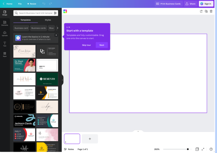
Ideally, you should also do this personalization without the user even realizing it. For instance, if a user is looking at business cards on Canva’s website and decides to sign up, they’re immediately taken to Canva’s editor where they can select from various business card templates.
8. Create an immersive walkthrough
One common tactic that’s becoming popular among project management apps is creating an immersive onboarding wizard. This is a focused onboarding experience that guides users towards setting up their first project.
For example, when a new user signs up for Airtable, new users are guided through the process of creating their very first base. The onboarding wizard allows them to customize the theme, which types of data to track, and even add automations. For Airtable, this experience led to a 20% lift in activation compared to their old tooltip-heavy design.

The immersive wizard is very powerful because it combines several onboarding best practices into one experience (reducing friction, smart defaults, and a tailored experience). It also leverages the “Ikea Effect” – once users put a little effort into creating/customizing something, they value it more!
9. Use persuasive copy to communicate value
Too many companies think the marketing website is the place to be persuasive, and the product is the place to be clear (and often boring).
❌ This is a mistake.
Just because a user clicked a signup button, you shouldn’t assume they are already convinced of the value your product can deliver. You need to be persuasive at every step. Adopting a new product is hard, and users need all the motivation they can get.
The simplest way to do that is to leverage some basic conversion optimization tactics. Make sure your homepage clearly showcases the product’s features, benefits, use cases, and social proof. Make sure everything is clear, focused, and relevant. And don’t forget to optimize your signup page – a commonly overlooked component of the onboarding flow.

Take these examples from Krisp and WorkOS – they reinforce the benefits on their signup page and add some powerful social proof in the form of customer logos.

Other places to reinforce value include:
Onboarding tooltips and product microcopy
Lifecycle emails (showcase one clear use case or benefit per email)
Knowledge base / support content
10. Offer clear signs of progress
We know from the goal-gradient effect that user motivation increases with proximity to completing a task. So if your onboarding uses a multi-step flow, make sure to always show the number of steps remaining.
Another common pattern is to use an in-app onboarding checklist, like this example from Webflow. Checklists are effective because not only do they signal clear progress towards a goal, but also incorporate the Ziegarnik effect – the tendency for users to recall unfinished tasks more easily than finished ones.

Don’t forget the importance of celebrating small victories along the way. Every time a user completes a step, consider offering a small reward or positive feedback to encourage them to keep up their progress. By keeping users engaged and motivated throughout the onboarding process, you’ll increase their chances of sticking around for the long haul.
11. Have users learn by doing
Letting users learn by doing is an effective onboarding tactic that has been popularized by mobile games (Candy Crush, Cut the Rope, etc). The idea is simple: rather than explaining every feature or function of your product upfront, you let users learn by actually using it.
One way to implement this tactic is by using interactive tutorials or walkthroughs that guide users through the key features of your product step-by-step. This can be done through the use of tooltips – but you’ll want to use these sparingly and always allow the user to skip the tour if they’d prefer to explore on their own.
Superhuman, a popular email client, is a great example of using the "learn by doing" approach. You learn to use time-saving keyboard shortcuts by practicing on your live inbox.

You can even use this tactic before users even sign, like this example from Grammarly’s homepage showing how it works.

12. Test, learn, repeat
By following these steps, you should have a lot of ideas for designing a more impactful onboarding experience. If you have enough traffic, you should A/B test your new onboarding flow against your control version.
Come up with a bunch of experiments and prioritize your list by impact and effort. Even if you don’t see a significant result, keep trying several different approaches until you find one that works. Onboarding is such a powerful growth lever – trust me, you don’t want to give up on it too early!
And remember to keep fine tuning your onboarding as your product evolves – this is not a one and done effort.
Now, you’ve put the right onboarding steps in place, but how do you know if they’re effective? In the next section, we’ll explore how to track the effectiveness of your SaaS user onboarding, ensuring your hard work translates into real results.
Want more user onboarding tip and examples? Check out our inspiration gallery!
How to track SaaS user onboarding effectiveness
When you monitor key metrics, you can see how users interact with your product and where you might need to make adjustments.
Here’s how you can track it effectively:
Set key onboarding milestones: identify key points like sign-up completion, first login, and first use of core features. Tracking these helps you spot drop-off points.
Use in-app tracking and analytics: track where users spend the most time and where they struggle. If they linger too long in one area, it may need simplifying.
Heatmaps and session recordings: ask users for feedback at different stages—quick micro-surveys can highlight pain points without slowing them down
Customer feedback loops: integrate micro-surveys or feedback pop-ups at different stages of the onboarding process. Ask users how easy or difficult they find specific steps and gather insights on where they feel lost.
A/B Testing: experiment with different onboarding flows by running A/B tests. For example, test whether a shorter or longer onboarding flow works better for activation rates.
Track drop-off points: identify exactly where users drop off during the onboarding process. Use user onboarding tools that offer funnel analysis to visualize how many users complete each stage. Knowing where users give up can help you optimize or simplify those areas.
5 Key metrics to track for improving user onboarding
Tracking is just the first step—understanding the right user onboarding metrics is where you get real insight into how well your onboarding process is working. Let’s break down the most important metrics you should keep an eye on to ensure your onboarding drives results.
Free trial to paid conversion: measures how many users move from the free trial to a paid subscription. A low rate suggests users aren’t seeing enough value during the trial period.
Completion rate: tracks the percentage of users who fully engage with the onboarding process. The average onboarding checklist completion rate across industries is 19.2%, with a median of 10.1%. This suggests that while most users start onboarding, many drop off before completing all steps—often because it’s too long or not engaging enough. Higher rates indicate that users are progressing through key steps and fully interacting with your product.
Retention rates: shows how many users stay engaged with your product after onboarding. Retention rates are critical for understanding if users find long-term value in your product.
User drop-off points: identify where users abandon the onboarding flow. Knowing these points helps you optimize the process to reduce friction and keep users moving toward activation.
Time-to-value: measures how quickly users experience the core benefit of your product. A shorter time-to-value means users quickly see the benefits, which increases the likelihood of conversion and retention.
Now that you know how to measure the effectiveness of your onboarding process and which metrics matter most, it's time to apply these insights and start optimizing your onboarding for better results.
6 Examples of smooth SaaS customer onboarding experiences
Here are six user onboarding examples of SaaS companies that have nailed their onboarding processes. They demonstrate a variety of effective techniques— from interactive product tours to personalized onboarding flows—ensuring users are engaged from the moment they sign up.
1. Airtable
.gif)
Airtable’s onboarding process is a great example of how to personalize the experience while keeping it simple and effective. It starts with asking users key questions, like what team they are part of (e.g., marketing, product, etc.).
This allows Airtable to offer relevant templates and use cases based on their role, such as blog post calendars for marketing or product roadmaps for development teams.
Once users pick their role, they are given two options: use a pre-built template or create something from scratch. This helps new users feel like they’re immediately achieving something useful, which accelerates their time to value.

Airtable also uses in-app tooltips and slideouts to guide users through complex tasks, ensuring they understand how to use the product without needing heavy documentation. If users skip steps or need extra help, these features remain easily accessible on the dashboard.
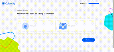
2. Calendly

Calendly’s onboarding process is designed to be simple, intuitive, and focused on getting users to experience value quickly. The first step is minimal friction: users are asked to sign up using their email or a connected calendar account (Google, Microsoft).
This removes the need for extensive form-filling, allowing users to get started right away. Once signed up, Calendly immediately links the user’s calendar, showcasing its key benefit—scheduling automation without back-and-forth emails.
Next, users are presented with a quick setup checklist, guiding them through essential steps like creating their first event type. This checklist helps reduce cognitive load by ensuring that users aren’t overwhelmed with too many options at once. By focusing on step-by-step actions, Calendly keeps users on track and helps them see the value of the platform early on.
Calendly also makes use of tooltips and brief walkthroughs, offering guidance on key features such as setting availability and sending event links. The focus is on showing, not telling—users are encouraged to take actions that lead to faster adoption of the product.
3. Calm

Calm’s onboarding process is designed to create an immediate sense of value and personalization from the very start. As soon as you open the app, Calm introduces a calming experience (what a surprise! ha), focusing on why you’re using the app, whether it’s for better sleep, managing stress, or meditation. The app tailors its suggestions based on your goals, making the onboarding process feel personal and relevant.

Source
Calm uses social proof during onboarding by showcasing how many people have benefited from the app, which encourages users to continue the setup and reassures them they made the right decision.
The process includes step-by-step guidance without overwhelming the user. Calm’s onboarding also includes brief, relaxing exercises that users can complete immediately, allowing them to engage with the app’s core features quickly.

4. Chameleon

Our onboarding process is built to be structured, efficient, and user-focused. For example, we suggest spending around 10 minutes to customize your default style and another 10 minutes to build your first in-app experience.

These estimates aren’t rigid, but they serve a key purpose: they help users pace themselves and make the onboarding process feel manageable rather than overwhelming.
We also provide helpful resources such as quick help and a Chameleon 101 guide with a help bar throughout the process. This way, users can easily access support when they need it most.
This guided, yet flexible, approach ensures users quickly reach that all-important "aha" moment where they realize the value of the product without feeling bogged down by complexity.
What happens after you sign up? See what you'll get access to after you create an account.
5. Grammarly

As soon as new users sign up, they are asked a few basic questions about how they plan to use Grammarly—whether it's for personal writing, work, or academic purposes.
The onboarding includes an interactive product tour, which provides users with a demo document to play around with. As they work through this document, Grammarly highlights errors in spelling, grammar, and style, offering suggestions for improvement through tooltips.
These tooltips explain not only what’s wrong but also why, creating a learning-by-doing approach. This helps users see immediate value by correcting their writing while getting comfortable with the platform’s features.
Grammarly also offers an intuitive editor walkthrough, helping users quickly understand how to make the most of suggestions and edits without overwhelming them with too much information at once.
The entire process, from sign-up to using Grammarly in real scenarios, is streamlined, ensuring that users can start improving their writing almost immediately.6. Loom
6. Loom

What’s noteworthy is Loom’s ability to integrate asynchronous onboarding. Loom’s value proposition centers on reducing meetings with asynchronous video, and they mirror that approach in onboarding.
One of the standout aspects is how Loom integrates hands-on interaction right after sign-up. Instead of overwhelming users with a long introduction, Loom gets them directly into creating their first video.
This hands-on approach is key because it reduces the learning curve and gets users familiar with the core feature—video recording and sharing. By doing, not just watching, users grasp the value of Loom much faster.

Additionally, Loom employs a "Get Started" checklist to ensure users hit key milestones, such as recording, sharing a video, and inviting teammates. This keeps the onboarding structured and goal-oriented.
The checklist approach is critical in avoiding user drop-off, as it offers clear tasks that provide a sense of accomplishment, encouraging users to keep going.
Another strength of Loom’s onboarding is its focus on collaboration. Throughout the process, Loom encourages users to invite teammates. The more teammates onboarded, the more likely the product becomes embedded in the team’s daily workflow, driving long-term adoption.
Build beautifully optimized SaaS user onboarding flows with Chameleon
A well-designed onboarding flow is critical for any SaaS company looking to retain users and drive long-term growth. You can follow our five-step process to improve the onboarding flow of any SaaS product.
First, you’ll want to understand your user's goals and learn what key actions help them realize value. Next, you create a customer journey map to pinpoint sources of both friction and delight. With your map complete, you can begin brainstorming ways to optimize conversion at each step – this might include offering templates, more helpful defaults, or tailoring your flow to the user’s needs.
It's important to remember that onboarding is an iterative process, so be sure to continuously test and improve your flow over time. By investing in onboarding, you can increase activation rates, reduce churn, and leave users ghosting you as a fading bad dream.
Build beautiful onboarding flows fast with Chameleon
Create memorable first experiences that nudge new users to become long-term customers. Start building for free.


