


Onboarding is where your product either wins a potential product ambassador or loses them.
If users don’t see the value right away, they’re not sticking around. Simple as that. The key? Make them see why your product matters to them, and do it fast.
But, here’s the thing: onboarding is a constant process. Every time a user logs in, you’re onboarding them to something new, whether it’s a feature they missed or a shortcut they haven’t figured out yet.
We’re breaking down 21 onboarding examples that get it right. They’re real-world strategies you can apply to your own onboarding process and keep users engaged for the long-term.
Duolingo: personalized language learning paths
X: simplifies social network integration for immediate use
Canva: directs users swiftly to their ‘aha’ moment
Ecosia: encourages usage with real-time environmental impact stats
Airtable: provides a thorough walkthrough of database functionalities
Carrot: demonstrates immediate value with actionable insights
Levity: adapts onboarding to a user's technical comfort level
Google Calendar: uses microsurveys to refine the user experience
Apple Music: curates music based on individual tastes
Pipefy: employs checklists for clear, actionable steps
AvidXchange: uses engaging videos to explain features
Fivetran: showcases updates through interactive tours
Segment: alerts users to feature changes with modals
Moz: engages users with an interactive product tour
Thistle: uses banners for timely announcements
Highspot: encourages feature adoption with guided tours
SendGrid: offers beta test insights through tooltips
Gusto: engages trial users with informative tooltips
Joy: promotes feature discovery with interactive modals
Segment: guides users through beta features with tours
GameRefinery: improves UI understanding with video tours
9 best onboarding examples
No two onboarding strategies are the same, because no two products are the same. Your onboarding experience should highlight the uniqueness of your product, and why users can’t do without it.
Let’s take a look at eight brands getting SaaS onboarding right.
Example 1: Duolingo sets users up for success
Duolingo offers a modern approach to learning another language, and their onboarding process encourages you to get started straight away.
Duolingo’s onboarding flow starts when you select a language to learn. It then guides you through a simple onboarding questionnaire to gather details on why you're learning a language and how you plan to go about it.
For example, it gives you the option to select a daily goal for time spent practicing your chosen language.

This onboarding flow sets you up for success by asking all the right questions and nudging you towards your first lesson.
The onboarding questionnaire finds out why you’re learning a language, how committed you are to learning it, and what level you’re starting at. It even enables you to set up reminders for your daily lessons—keeping you engaged from the get-go.
Why it’s a good onboarding example?
Customize onboarding questions to shape a learning path that matches new user goals
Use visual cues like a progress bar to indicate how far the user is in the onboarding process; helping to manage expectations
Include an option for users to set their learning preferences respecting their autonomy
Example 2: X (formerly Twitter) offers quick and easy set-up
Signing up for an account on X (formerly Twitter) couldn’t be easier; the onboarding flow is super simple. It’s a brilliant example of making life easy for your users.
If that wasn’t enough, it’s also entirely skippable—ensuring users aren’t forced to make big profile decisions all at once. The only mandatory step in the entire onboarding process is following another account—be that your bestie or Beyoncé.

X knows their product is easy to use, so they don’t waste time running you through the details. Instead, they provide a simple flow with minimal copy that encourages users to take the steps necessary to enjoy the platform.
Why it’s a good onboarding example?
Offer flexibility during onboarding by allowing users to decide whether they want to complete it now or later
Explain the reasoning behind the questions you ask: give context
Consider a zero-distractions onboarding experience with a clean background
Example 3: Canva guides users to their “aha!” moment
Canva’s onboarding flow does a great job of getting users to their “aha!” moment, which—in the case of Canva—is the realization that anyone can create dazzling designs.
It’s a great mix of showing and doing. It shows users how easy Canva is to navigate and how expansive the collection of design tools is. It then enables the user to have a go at it themselves—this is the do.

The final step in their onboarding process encourages users to try a variety of tools and resources to create a design alongside one that’s already been made.
This enables them to put everything they’ve learned into practice, without feeling like they’re swimming in the deep with no floaties. It’s a great example of an interactive onboarding flow that encourages users to keep going.
Why it’s a good onboarding example?
Lead users quickly to the product value for their JTBD
Provide templates or examples as starting points, so users can practice and experiment confidently
Combine demonstrations with complimentary, hands-on learning
Example 4: Ecosia keeps users motivated
Ecosia is an environmentally-conscious way to search the web. Unlike other search engines, Ecosia uses its profits from ad revenue to plant trees all over the world.
This is something they highlight throughout their onboarding process. Most people who start using Ecosia do so in an attempt to contribute to a greener world—Ecosia knows this.
After downloading the Ecosia search extension, you’re met with congratulations and reassurance that you’ve made an environmentally conscious decision. This is continually reinforced by the constantly increasing tree count that’s featured on the search page.
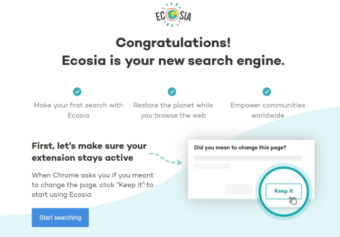
Ecosia knows what you love about their product—and they drive it home at all stages of the onboarding process.
Why it’s a good onboarding example?
Acknowledge the user's motivation for choosing your product, as Ecosia does by applauding users for making an eco-friendly choice
Encourage users to start using the product right away with a clear call-to-action, like Ecosia's "Start searching" button
Provide guidance for any technical steps users must take to enjoy functionality
Example 5: Airtable offers a comprehensive onboarding
Airtable walks users through the core features with well-placed modals that explain how the tool can help your organization. In-app messaging—such as tooltips, launchers, and more—is used to ensure new users get a full understanding of the tool’s functionalities and empowers them to learn as they go.
Following this, users are encouraged to watch an onboarding video that goes into even more depth. This is optional—not all users will want to watch the onboarding video. Giving options is key.
Finally, their onboarding is always accessible via the Help? button—which brings up a complete set of self-serve support options via a knowledge base. There, users can retake the onboarding tour, watch in-app tutorials and GIFs, and find more in-depth support articles.

Airtable’s onboarding experience ensures users always have access to onboarding materials that enable them to better use the tool. It’s simple, intuitive, and full to the gunnels with important information.
🦎 Tip: Find out how to use tooltips the right way to make better onboarding flows with tooltips.
Why it’s a good onboarding example?
Integrate in-app messages like tooltips to guide new users through your product’s features
Offer optional, in-depth onboarding materials like videos for users who want more guidance
Provide a self-serve knowledge base to empower users to learn at their own pace
Example 6: Carrot highlights value from the get-go
Carrot does a great job of showing you exactly why you need it by starting the onboarding flow with a flex.
The first thing Carrot shows you is its ability to find all your abandoned shopping carts ever. That’s likely quite a shocking introduction and one that shows you the problem you didn’t know you had—a brilliant contextual onboarding experience.
The onboarding process then continues by showing you how easy it is to add items to your Carrot basket. It then summarizes the tool's key offerings to remind users about the value of the product.

The entire onboarding process is about highlighting Carrot’s value to users during their first-time user experience and helping to guide them towards their “aha!” moment.
Why it’s a good onboarding example?
Start onboarding with a standout feature that solves a common but (potentially) unrecognized problem
Show the ease of integrating your tool into a user’s existing workflow
Reiterate the core functionalities and benefits throughout the onboarding
Example 7: Levity provides high- and low-touch onboarding
Levity is an AI solution that enables users to build their AI flows without the need for coding knowledge or expertise. For many users, AI can be a confusing concept—Levity does a great job of taking things step by step.
Alongside a useful onboarding tour, upon a user's first steps within the product, Levity also provides plenty of video tutorials and demos to help guide users through the process. Users aren’t made to sit through onboarding videos, but they’re available whenever they encounter an issue within the product.

Ensuring users know how to make the most of your product is an essential part of user onboarding—but they don’t have to take every step at once. Providing optional onboarding resources that dive deeper into the specifics of your product helps users take control of the learning experience.
Plus, a friendly face never hurts! In fact, using real-life humans in your onboarding videos helps increase familiarity and build stronger connections with your users from the get-go.
Why it’s a good onboarding example?
Simplify complex concepts with step-by-step video onboarding tutorials
Make advanced help resources optional, allowing users to learn at their own pace
Use real people in onboarding materials to personalize the experience and build trust
Example 8: Google Calendar's microsurvey
Good user onboarding isn't only about making users complete actions and showing them how the product works with onboarding elements. It also collects user feedback, so that you can improve the user onboarding process as well as optimize the product.
Here, Google Calendar's Microsurvey modal does exactly that.

What's really great about this feedback modal is that it also allows people to include a screenshot, so that both the senders and the receivers of the feedback are clearly on the same page.
Why it’s a good onboarding example?
Incorporate feedback modals within the product to gather user insights for improvements
Enable users to attach screenshots in feedback to provide clear context for support teams
Ensure feedback opportunities are non-intrusive and integrated naturally within the user journey
Example 9: Apple Music personalizes the onboarding UX
Last but not least on our onboarding example’s list is Apple Music. It’s no surprise that an Apple product has ended up here—they’re known for sleek design and intuitive products. Their onboarding is no exception—it’s very on-brand.
Following the sign-up form and payment page, Apple Music walks users through an onboarding flow that gathers insights on what sort of music they’re into. This data then fuels recommendations and ensures users are shown relevant suggestions and releases.

Personalizing your onboarding flow enables you to provide a better product experience. It shows users you care about their unique interactions with your product.
Why it’s a good onboarding example?
Design onboarding flows to collect user preferences for customized experiences—without feeling like a survey
Let users know they can easily modify their preferences later, so their choices aren't locked-in forever
Show immediate value of your product by providing personalized recommendations or content
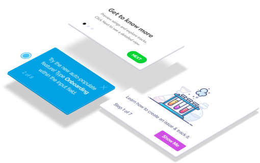
12 User onboarding examples made with Chameleon
Now, let's look at some of the best onboarding examples that were easily made with our no-code builder. These are simple yet effective UX patterns that can boost product adoption.
Example 10. Pipefy's user onboarding checklist
Pipefy is a workflow management tool that empowers users to design and automate business processes with its no-code platform. Initially, Pipefy used a one-size-fits-all, horizontal onboarding approach.
In horizontal onboarding the same introductory process is used for all new users, regardless of their role or use-case. So while users are quickly introduced to the product, it may not address their unique needs.
However, as Pipefy grew and sought to improve its Product-Led Growth (PLG) strategy, the need for a more tailored, verticalized onboarding approach—which is tailored to a specific type of user or use-case—became evident.
That’s when Pipefy partnered with Chameleon to create targeted and contextual onboarding tours. A key feature of Chameleon's offering was its capability to create detailed onboarding checklists.
These checklists were carefully designed to guide users through the platform's functionalities in a way that was both engaging and aligned with Pipefy's brand aesthetic. The customizability extended to styling and UI/UX mechanics, allowing Pipefy to present these checklists in a manner that resonated with the customer journey so far.
With Chameleon, Pipefy saw an increase in customer retention from 7-12% to an impressive 20-30% within just 6 days post-implementation.

Why it’s a good onboarding example?
Implement a visible progress bar or completion percentage to motivate users
Include modals, like the checklist in the bottom-right corner, that are easily accessible yet non-intrusive
Provide users with a clear and simple way to exit the onboarding flow
See how Pipefy increased user retention to 30% in 6 days
Explore how Chameleon helps SaaS platforms like Pipefy drive retention rates and user engagement with smart, step-by-step onboarding
Example 11. AvidXchange's video modal
AvidXchange is a leader in accounts payable automation software and payment solutions, catering to middle-market businesses. As AvidXchange expanded, so did its customer communication needs.
The heavy reliance on email, with low open rates and engagement, resulted in critical information being overlooked by new users. This gap in communication meant they needed a more direct and effective method to reach users within the product itself.
AvidXchange used Chameleon to build an in-house messaging system with their Chrome extension and JavaScript snippet (one of many Dopt alternatives). With this solution, Chameleon empowered AvidXchange to deploy in-app messages and product tours directly within their applications—deflecting nearly 20,000 support tickets!

Why it’s a good onboarding example?
Embed educational content like tutorial videos directly into your product to simplify user onboarding and cater to users who find visual learning more engaging or easier to understand
Use modals and pop-ups for on-the-spot, relevant guidance
Tailor onboarding content to user behavior and context for a personalized learning experience
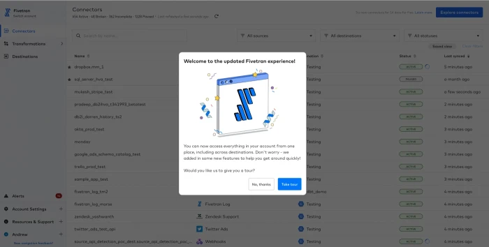
Example 12. Fivetran's new update tour
Fivetran provides automated data integration solutions for synchronization and transfer of data across multiple cloud environments. The product team at Fivetran wanted to understand user interactions within their platform to pinpoint what attracted users and identify any friction points within the product experience.
A key part of this challenge was communicating product updates and gathering insightful user feedback, especially during beta tests of new features and UX improvements.
Chameleon’s tour launcher and in-app messaging capabilities helped Fivetran to design targeted in-app messages, product tours, and microsurveys that were engaging and provided valuable data back to the team.
Fivetran managed to identify and address 15 product bugs during the beta phase of a UI redesign, thanks to the feedback collected through Chameleon Microsurveys.
Why it’s a good onboarding example?
Use guided tours to familiarize users with new features or updates, ensuring it’s easy to start or come back to
Integrate microsurveys at critical interaction points within the app, like after a new feature is used, to gather instant feedback and understand user satisfaction
Use the feedback from engagement data and microsurveys to quickly iterate on features, address bugs, and improve the user experience before a full-scale rollout
See how Fivetran squashed 15 bugs before launch with in-app messaging and microsurveys
Turn your insights into action and watch your product satisfaction and engagement metrics soar with Chameleon
Example 13. Segment's feature change modal
When it comes to effective user onboarding, timing and relevance are everything. Segment, a leader in customer data integration, showcases this principle through their onboarding strategy.
With an interface rich in functionalities, Segment's platform risked having its new or improved features overlooked by users. This underutilization could lead to a lack of awareness about the platform's full capabilities, reducing the overall user experience, product value, and increasing customer churn rates.
To tackle this, Segment turned to Chameleon to deploy contextual onboarding embedded cards that trigger when a user interacts with a recently updated or new feature. The embedded cards were designed to be informative yet concise, with accompanying media that visually highlighted the changes or new functionalities.

Why it’s a good onboarding example?
Deliver onboarding messages right when users engage with a feature to boost their attention and adoption
Use visuals in onboarding to clearly show where and how new changes are applied, making it easier for users to understand
Always include a simple way for users to exit the onboarding modal, allowing them to proceed at their own pace without disrupting their workflow
Example 14. Moz product tour
Moz, a leader in SEO software, faced a common SaaS challenge: how to effectively showcase premium features to users, especially during a free trial period when the potential for conversion is high.
With Chameleon, Moz designed the onboarding tour as a choice, not a requirement, by allowing users to opt out at any stage. This respects the user's job-to-be-done. It simply points to a feature, explains what it does, and moves on.

Why it’s a good onboarding example?
Use Gestalt’s grouping principle of the focal point to spotlight new features. A modal window or lightbox effect to dim the background draws attention directly to what matters
Provide a clear and immediate opportunity for users to engage with new features—or explore them later
Offer the flexibility to dismiss or skip the tour, respecting the user’s JTBD and avoiding disgruntled engagements/rage clicks
Example 15. Thistle's health and safety announcement banner
Onboarding isn't just about letting people know what the product is about. It can also be a tool for responding to changing situations. For Thistle, a company committed to delivering healthy meals to its customers, the challenge was to distribute critical information regarding operations and safety measures during unstable times.
Thistle's challenge wasn't just about a one-time user introduction; it was about keeping their community informed and up-to-date in a rapidly evolving situation.
To address this need, Thistle collaborated with Chameleon to deploy a site-wide top banner. With this, Thistle ensured that every user visiting their platform became immediately aware of Thistle's health and safety response and any operational changes. The top banner served as an ongoing onboarding tool, orienting users to new protocols and reassuring them about continuing service.

Why it’s a good onboarding example?
Use banners for quick, widespread messaging to ensure every user is informed
Win user trust with transparent and consistent communication of operational updates
Offer users the option to engage with or dismiss informational banners to respect their preference for receiving updates
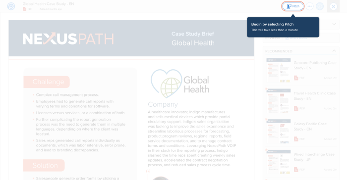
Example 16. Highspot's feature adoption tour
Highspot, an award-winning sales enablement platform, is transforming how modern sellers engage with their buyers by providing AI-powered, predictive content and analytics.
As Highspot expanded, they faced challenges in scaling product adoption across their diverse user base. The complexity of their platform, combined with the variety of user personas, made it increasingly difficult to ensure effective onboarding and adoption, particularly in larger organizations.
To address this challenge, Highspot turned to Chameleon, to create customized onboarding flows, specifically targeting key features like the ‘Pitch’ functionality. This feature allows sales reps to directly deliver content to buyers through Highspot, bypassing the need to download and email content.
Chameleon's 'on-page trigger' functionality guided users towards more efficient workflows when they attempted less optimal actions, like downloading content for offline use.
Why it’s a good onboarding example?
Use in-product guidance tools to create interactive tutorials that teach users how to make the most of your platform's features
Personalization can lead to a more intuitive and relevant user experience, encouraging deeper product adoption
When users encounter challenges or adopt sub-optimal workflows, use these moments as opportunities to guide them toward more efficient and valuable features within your product
Example 17. SendGrid's beta test tooltip
SendGrid, a cloud-based email delivery service, specializes in ensuring that transactional and marketing emails reach their recipients' inboxes. Their primary challenge was advancing user onboarding to educate and actively engage new users.
The challenge emerged from the need to covert committed users—those already using SendGrid—into power users—those that want to use advanced features to optimize their email campaigns for the highest efficiency.
SendGrid partnered with Chameleon to create targeted prompts and tutorials and invited them beta test new products. This approach made users feel more involved with the product and gave SendGrid feedback to improve their services.

Why it’s a good onboarding example?
Engage committed users directly in product testing to generate a sense of ownership and contribution to product growth
Make the most of user feedback channels to inform and prioritize product development roadmaps
Offer easy-to-follow engagement options, like ‘Notify Me’ for updates or ‘Get Started’ for new features
Example 18. Gusto's trial user tooltip
Gusto provides cloud-based payroll, benefits, and human resource management solutions for businesses. They wanted to communicate the value of their features to free trial users to convert them into paid customers.
The challenge was to educate users about the benefits of Gusto’s offerings in a way that was engaging and directly relevant to the user's current interaction with the product.
With Chameleon, Gusto designed a tooltip to pop up at strategic points during the trial user’s journey: delivering concise information about the features and benefits of Gusto's platform.

Why it’s a good onboarding example?
Introduce tooltips during the trial phase to highlight key features and simplify complex processes
Use clear, contextual information within tooltips to demonstrate the value and ease of new features, enhancing user experience
Design tool tips that lead users to additional resources, like a help center, for a more in-depth understanding of the product
Example 19. Joy's feature discovery modal
Joy faced the challenge of convincing users to try out new features. It's a common issue for SaaS platforms—mainly due to a user’s hesitation to step out of their routine or a lack of awareness about the benefits of new way of doing things.
To overcome this, Joy implement a feature discovery modal: a pop-up that uses effective copy to pique user interest at the right time, with Chameleon.
The modal's design was based on the principles of curiosity and brevity, with the goal of creating a invitation for users to explore what's new—without overwhelming them with information.

Why it’s a good onboarding example?
Create engaging copy for feature announcements that spark curiosity without overwhelming users
Design discovery modals to feel personal and exclusive, making users feel tied to the opportunity to try something new
Measure the effectiveness of your discovery modals by tracking how many users engage with the new feature post-prompt
Example 20. Segment's beta feature tour
Segment’s challenge was to get users to test and adopt new beta features. The benchmark for a good feature adoption rate in B2B SaaS is 28%.
In other words, only 28% of a product’s features are regularly used which means lower adoption rates for newly developed functionalities.
Segment addressed this challenge by implementing a beta feature tour using Chameleon. This tour serves as an interactive guide that directly communicates the benefits and functionalities of the new features.
Designed to be user-friendly, the tour includes concise messaging, and offers users the option to explore the feature immediately or decline the invitation altogether.

Why it’s a good onboarding example?
Clearly communicate the benefits and functionalities of new features through an interactive beta feature tour to increase adoption rates
Give users a choice to try the new feature or opt out and get on with their task
Use feedback and engagement metrics from beta feature trials to refine and improve the feature before a full-scale rollout
Example 21. GameRefinery's UI video tour
Videos are a great way to inform visual learners among your user base. The challenge for the gaming platform GameRefinery was ensuring that users fully understand and use the features available to them.
GameRefinery tackled this challenge by creating a UI video tour within their platform using Chameleon. The tour video guides users through the functionality step-by-step, mirroring their current engagement within the platform for maximum relevance and impact.
Users were not left to figure things out on their own; instead, the video provided a clear, visual walkthrough that aligned with their real-time experience.

Why it’s a good onboarding example?
Integrate tours to guide users through new features in a step-by-step visual format directly within the user interface
Tailoring educational content to the user's current task can lead to increased engagement and smoother adoption of features
Implement visual aids like video tours to reduce user confusion and ease a learning process
Learnings from our user onboarding examples
There’s an art to user onboarding—it’s not as simple as a quick product guide to get users on their way. You don’t want to do too little, but you also don’t want to do too much.
Here's why some users walk away during onboarding:
29% find there are too many steps to complete
26% struggle with identity proofing and verification
26% get turned off by too many manual tasks
That’s why product tours need to strike the right balance of product guidance and user discovery and friction.
How? By ensuring your user onboarding experiences are user-centric.
Ask your product team:
What does the user want to do with your product?
How can you guide them to important features that help them with their day-to-day tasks?
How do we get them to their ”aha!” moment as seamlessly as possible?
What features are going to be most beneficial to your users?
Answering these questions reveals some key considerations for your user onboarding experience that can be turned into best practices. Let’s take a look at some key considerations for designing best onboarding experiences.
Separate your user onboarding flows by personas
How do you expect to create a personalized, user-centric, onboarding experience if you don’t know your users? User personas are key for identifying the types of users that need your product.
This helps you ensure you can build a tailored onboarding experience. A quick onboarding questionnaire gets you the answers you need to create a user-specific onboarding flow.
Alternatively, you can also segment them based on their profiles and behaviors, like this:

For example, let’s say you’ve created the next big online graphic design studio. It’s got all the bells and whistles, without the in-depth knowledge required to use traditional digital design studios—think Canva meets Adobe Photoshop.
How users engage with your product depends on their jobs to be done—the marketing interns aren’t using it to complete the same tasks as the finance team. Identifying your users, and creating flows that highlight the main features that help them, ensures you’re giving users a personalized experience right from the get-go.
This is also key for guiding them to their "aha!” moment as smoothly as possible.
Guide users to their “aha!” moment quickly
The “aha!” moment is an essential part of a better user onboarding process—it's the moment your users encounter a feature that highlights exactly why they need your product.
Helping guide users towards their “aha!” moment is a key step in your onboarding process, and you need to do it fast. Onboarding tour completion drops below 50% for any tour under or over three steps in length. A three-step tour is your sweet spot with a 72% completion rate.
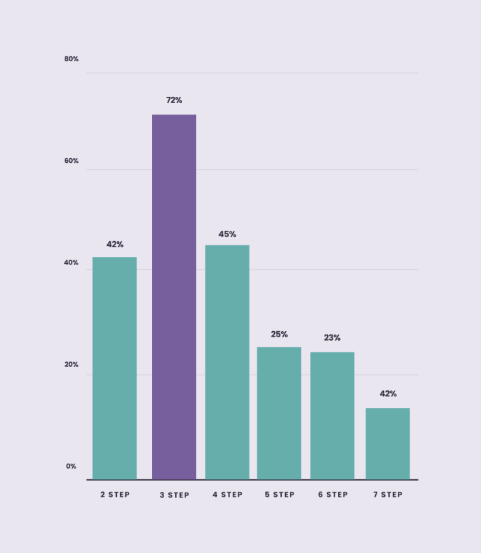
So, you’ve got three steps to get users to their “aha!” moment—you need to make them count. Keep UX principles of design in mind when designing your onboarding steps, and ensure you build your steps following onboarding UI patterns.
Keep it short and sweet
We just spoke about tour length—now, we’re talking about tour step length. Are you with us?
User onboarding tours should be straight to the point—your users don't want to spend ages reading your copy. They want snappy copy that gives them the info they need to take their next steps. This allows users to move quickly, making the onboarding process seamless.
Here’s an example, and you can find more info about the importance of copy for product tours in our Benchmark Report.

Never stop onboarding users
User onboarding is an ongoing process that enables you to continually highlight and deliver value to users—whether they’re new or old.

You’ll likely introduce new features as your product evolves—meaning you’ll require new feature onboarding for users. An awesome user onboarding experience doesn’t stop after the first steps—it continues to guide users throughout their time using your product.
🦎 Tip: Check out our user onboarding checklist to ensure you’re hitting all the key points with your onboarding flow.
Use these examples to fuel your user and product onboarding strategy
User onboarding has a lot to do with user psychology—understanding your users and their needs enables you to best serve them. The best user onboarding experiences make the first impressions count. You want your user onboarding flow to make users excited to use your product.
It doesn’t end there though—you're continually supporting and guiding users through your product. Whether it’s videos, tours, self-serve onboarding, or more—make sure there’s always a safety net in place to catch confused users.
Consider these key takeaways from our top eight onboarding examples when creating your next onboarding flow:
Set users up for success by showing instead of telling
Ask users questions throughout the onboarding experience to gather better user insights
Highlight your product's key value as soon as possible, and remember this could be different for your different user personas
Provide comprehensive self-serve support options to help guide users when they’re stuck
Make user onboarding interactive with launchers, tooltips, microsurveys, and more
Build in-app guides to retain users
Chameleon makes it easy for product teams to create product tours, tooltips, onboarding checklists, and in-app surveys without code.


