


Tooltips are everywhere, from onboarding guides to quick tips on hidden features. But too often, they’re either poorly timed, overloaded with text, or simply irrelevant—making them easy to ignore when focusing on in-app tooltips UX.
Tooltip design done right can transform your UI by guiding users where they need to go and nudging them toward the right actions. Done wrong, they can clutter the screen, frustrate people, or even block the view of important features. Focusing on better tooltips improves clarity, enhances visibility, and makes user interactions smoother.
In this post, we reveal what makes a tooltip “terrible,” explore SaaS tooltip best practices, show real SaaS tooltip examples, and share how to approach tooltip design for user onboarding so you can deliver a smoother user experience. You’ll also learn how better tooltips can drive engagement and ensure users actually benefit from the guidance they provide.
Let’s dive in!
What is tooltip design?
Tooltip design is the process of crafting concise, context-sensitive pop-ups that give users new information or guidance without interrupting their flow.
Tooltips are short, contextual pop-ups or callouts that appear when users hover, click, or otherwise interact with an element in your product. These small but mighty messages aim to clarify and explain product features or offer additional guidance—right at the moment users need it most.
Proper tooltip design ensures your tips are helpful, not irritating. It’s about timing, clear language, and placing just the right amount of info to guide users without overwhelming them. When done right, better tooltips enhance visibility and improve the overall user experience.
Prefer to watch a video? Here's a quick take on what makes tooltips terrible and how you can avoid these mistakes to make yours truly great!
What makes a tooltip terrible?
A poorly executed tooltip can do more harm than good by annoying or confusing users. Some common pitfalls include:
Overly long text: Users shouldn’t have to read a mini-novel just to figure out what a button does.
Wrong timing: If a tooltip pops up too soon or lingers too long, it disrupts the user experience.
Cluttered interface: Multiple tooltips appearing at once can block essential UI elements, leaving users unsure where to click.
Irrelevant or obvious info: If the tooltip simply restates what’s already on the label, it’s not adding any value.
Poor accessibility: Tooltips that rely solely on hover behavior can frustrate mobile or assistive technology users.
When tooltips fail in these ways, they undermine trust, reduce product adoption, and can spark higher churn if users repeatedly can’t find what they need. Instead of adding random tooltips, focus on creating better tooltips that provide true value and improve usability.
An example of a terrible tooltip
The tooltip design below gives tooltips a bad rep. 😱 Why is this tooltip bad? Because it's clear from the design that the + icon is there for users to manually add new people.
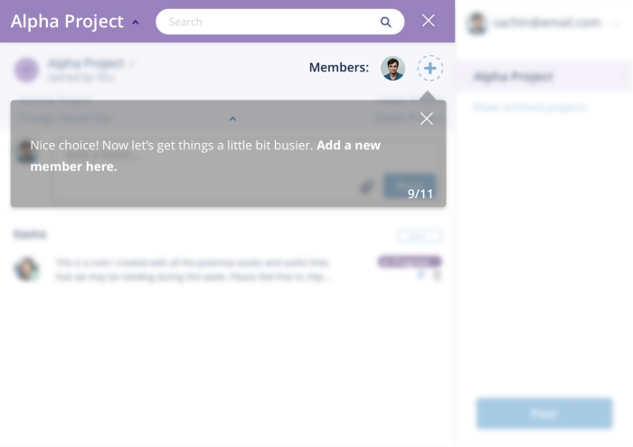
The tooltip here is being used as a shortcut to prompt users to do what the product manager wants (they want users to send invites)—but it doesn’t necessarily benefit the user in any way. Unfortunately, it's not as easy as that—you can’t simply add tooltips to create engaged users.
This tooltip doesn't provide any new value; the interface element is already easy to understand, making the tooltip redundant and annoying.
Users take action because they’re motivated, have the ability to interact, and are clearly prompted by a trigger, which means tooltips will only succeed when the user understands the value proposition and the interface is easy to use.
💡 The psychology behind this is from the BJ Fogg’s Behavior Model which analyzes three core elements of user behavior – motivation, sufficient ability, and relevant prompts.
Understanding the key principles of tooltip UX
When it comes to tooltip UX, the magic is in the details. Well-designed tooltips feel effortless, guiding users exactly when and where they need help. Below are some key principles for product tooltip design you can put into action:
Keep content concise and clear: No one likes walls of text, especially in a tooltip. Aim for a sentence or two that clearly explains the feature or next step. Clarity beats cleverness every time.
Time the appearance to user actions: If your tooltip pops up before users actually engage, it risks being ignored or dismissed. Tie your tooltip triggers to meaningful events—like clicking a button or hovering over an icon—so users are in the right mindset to read it.
Use consistent styling that complements your UI: Tooltips should match the look and feel of your product. Use consistent colors, fonts, and spacing so the tooltips blend in neatly instead of distracting users.
Adapt tooltips for different devices: Tooltip UX on mobile devices needs special care—hover states don’t work on touchscreens, and screen real estate is limited. Consider tapping or swiping interactions, and test on multiple screen sizes.
Keep up with UI/UX design trends: Design evolves quickly. If your tooltip style dates back a decade, it may clash with modern UX standards. Stay current on best practices for hover vs. click activation, transitions, and accessibility features.
Use a tooltip library: If you’re short on dev resources, look into a pre-built tooltip library or no-code solutions like Chameleon for creating and deploying tooltips. This helps you maintain consistency and speed up your workflow.
👉 Check out this interactive demo and see how easy it is to deliver in-app value with better tooltips using Chameleon.
👉 If you want to try Chameleon out and save time, get started for free and enter the Chameleon Playground where you can play with different tooltip UI designs and see how they’ll look in your product.
Don't waste time building Tooltips from scratch
Chameleon lets you design and change tooltips on the fly, without code.
3 Great tooltip design examples
Before we dive into the examples, know that tooltips can be more than just bubbles of text. In the best cases, tooltips step in at the exact moment users feel unsure, nudging them forward without breaking their flow.
Below, you’ll see how LinkedIn, Google Drive, and Segment weave tooltips into their interfaces to gently guide, teach, and sometimes wow users—without overwhelming them. These examples show that tooltip design isn’t just about throwing up a line or a label; it’s about delivering real value at the right time. Let’s take a look at how it’s done right:
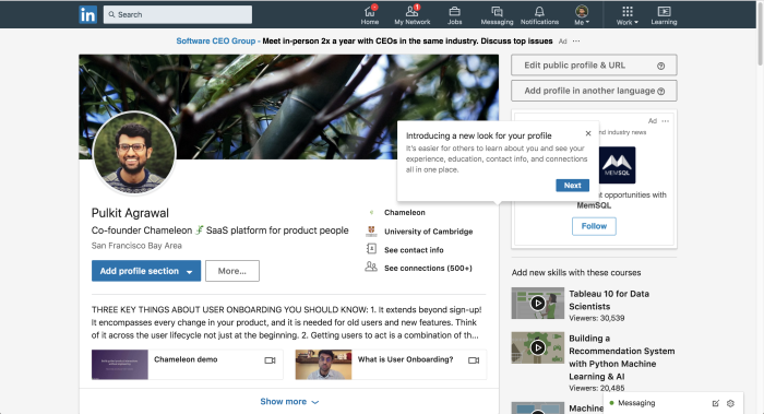
1. LinkedIn’s design change tour
When LinkedIn rolls out a version with a new interface, it can throw off even its most seasoned users. To smooth the transition, LinkedIn uses a tooltip tour that explains the updates and highlights the benefits of the redesign. By immediately addressing potential confusion—and showing how the new look helps users—LinkedIn keeps everyone on board with minimal friction.
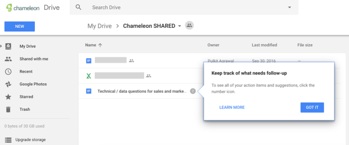
2. Google Drive’s feature discovery prompts
Google Drive has powerful collaboration features that some users never stumble upon on their own. To fix that, Drive serves up subtle, contextual tooltips whenever there’s a chance to use advanced features like action items or suggestions. This approach gently nudges users to explore more, turning everyday tasks into deeper, more productive workflows—a prime example of smart tooltip UX.
3. Segment’s terminology helpers
Many SaaS tools introduce unique or technical terms that can overwhelm new users. Segment tackles this head-on by offering on-demand tooltips that explain complex concepts (like “Sources” or “Destinations”) without cluttering the interface. Users only see the details when they need them, making the tooltip design both unobtrusive and incredibly helpful. This is a win-win for user education and overall UI clarity.
Each of these tooltip design examples follows tooltip best practices: they’re concise, timely, relevant, and seamlessly integrated into the UI. Most importantly, they show how simple, well-timed tooltips can drastically improve the user experience—especially when used to clarify big changes, highlight advanced features, or decode product-specific terminology.
From terrible to terrific tooltips: how Chameleon helps
Whether you’re dealing with tooltips UI design on a desktop application or optimizing for mobile, Chameleon offers no-code tools to make building and testing better tooltips straightforward. Easily set trigger events (like hover, click, or page load), pick a style that matches your product’s UI, and control how long the tooltip stays visible.
Chameleon also supports advanced features like user segmentation, A/B testing, and event tracking so you can measure how well your tooltips are performing. If a tooltip isn’t helping users complete an action or find what they need, you’ll see it in the data—and can adjust the timing, text, or placement of your tooltip accordingly.
By focusing on creating better tooltips, you ensure they aren’t just tiny pop-ups, but actually help users take meaningful actions.
Ready to turn your tooltips from a nuisance into a must-have UX element? Start a free trial of Chameleon to deploy tooltips that actually help your users succeed. Or book a demo to see real-life examples of how great tooltip design can drive engagement and adoption.
