


Only 35% of viewers complete the average Interactive Demo. That means nearly two-thirds abandon ship before seeing your product's full value. This isn't a technology problem – it's a storytelling problem that starts at creation.
During a recent workshop on Demo optimization, we shared that most teams make the same fundamental mistakes. They treat Demos like user manuals instead of narratives. They bury their best features three clicks deep. They forget that every extra step is another chance for prospects to leave.
Interactive Demos are a new tool in the adoption kit for product teams. You're used to building in-app tours where users have already committed. Demo viewers haven't signed up or invested anything and will leave when they're confused.
This guide shows you exactly how to build Demos that get completed, using Chameleon's editing features to craft experiences that hold attention from the first click to the final CTA.
Summarize this article with ChatGPT
It's a long one, but it's packed with tips. We get it if you prefer the TL;DR
Start With the Ending: Your Three-Moment Framework
Before opening Chameleon, before recording anything, answer this: What’s the one belief viewers must hold after your Demo?
Not ten benefits. Not every feature. One belief.
Now work backwards. Which three moments create that belief?

Think about what the one to three key things are that you want to show off; don't show everything at once
Moment 1: The Transformation (what becomes possible)
This is the promise in plain English. It should read like an outcome, not a feature.
Headline test: “Go from [pain] to [outcome] in [time].”
Examples: “Cut response time by 70%.” “Ship a report in 60 seconds.”What viewers should feel: “This is for me.”
Pitfalls to avoid: greetings (“Welcome to…”), navigation tours, or jargon that hides the payoff.
Deliverable: 1–2 screens that state and show the result at a glance.
First impressions matter. Put the good stuff in the beginning. Don’t make people sit through a long introduction to the point of the story
Moment 2: The Proof (seeing it actually work)
Make the promise tangible. Show the state change that proves it.
Proof types: a number updates, a status flips, a chart appears, a file is created, a field auto-fills—anything undeniably changed.
Clarity test: If viewers looked without reading, they’d still notice the win.
Common miss: narrating steps without a visible “before → after.”
Deliverable: 2–4 screens that move from before to after with a clear, visible improvement.
Moment 3: The Simplicity (how easy this was)
End by lowering the effort intuition: “Oh, that’s all I have to do?”
Ease cues: one obvious click, one short form, one drag-and-drop.
Copy frame: “To do this yourself, you’ll just [single action].”
Guardrail: if it takes more than 2–3 small actions, you’re teaching a workflow, not demonstrating simplicity.
Deliverable: 1–3 screens that make the path feel within reach today.
Recording Your Demo: Talk Through It Like You Mean It
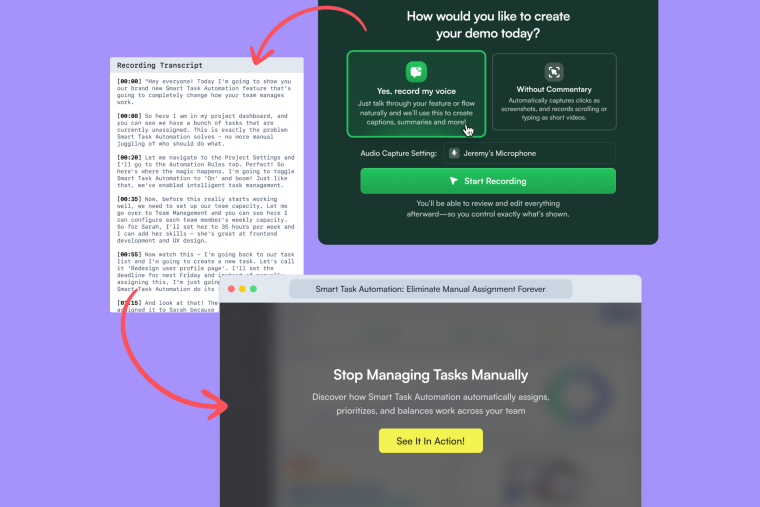
Chameleon's AI-powered recording starts with your voice. Here's how to use it effectively:
Navigate to the starting point of your feature
Open the Chameleon Chrome extension
Select "Record with voice"
Talk naturally as you click through – explain like you're showing a colleague who's never seen this before
The AI transforms your narration into hotspot annotations. But here's what the workshop revealed: timing matters.
Speak about each element AS you click it, not before or after. The AI links your words to your actions. Your annotations will be misaligned when discussing Feature A while clicking Feature B.
As you click around, Chameleon is going to take captures, and it's going to let our algorithm know where to focus... try to align what you're saying with what you're doing
Your Talk Track Formula
For each click, explain:
The problem: "You know how [specific pain]?"
The action: "Here's where you [do thing]"
The outcome: "Now you've got [result]"
This keeps narration focused on value, not mechanics.
Recording Tips
Pause between clicks. The AI needs gaps to separate steps. Click, speak, brief pause, next click.
Use real data. Clear test data before recording. Viewers spot fake examples immediately.
Record in segments. Don't capture all three moments in one take. Record each separately, then combine in the editor.
Avoid UI descriptions. Don't say "click the blue button." Say what the button accomplishes.
Pre-Flight Check
Clear browser tabs
Hide customer data (or you can blur it later)
Position screen to avoid scrolling
Do a quick verbal run-through
The Editing Tools: What Each Does and When to Use It
Once recorded, you'll land in Chameleon's Demo editor. Every tool here serves a specific purpose in the viewer's journey.
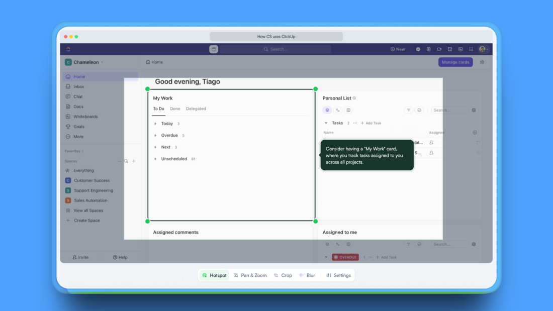
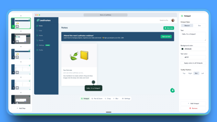
The Hotspot Editor: Your Primary Storytelling Tool
Hotspots guide attention and deliver context. Click any hotspot to edit both position and copy.
When to use: Every step needs a hotspot – it's how viewers progress through your Demo.
How to optimize:
Position hotspots where users naturally look first
For buttons: center them on the element
For results: place them on the outcome, not the action
Choose colors that contrast with your UI (blue UI = yellow hotspots)
Copy that converts: Delete any text that describes the UI. If viewers can see it's a "Submit" button, don't tell them. Tell them what happens after: the transformation, the time saved, the problem solved.
Pan and Zoom: Directing Focus Without Losing Context
When to use: Dense interfaces, data tables, small UI elements that need emphasis.
When NOT to use: First appearance of any screen, simple forms, or more than twice in a row.
How to implement:
Show the full screen first (context)
On the NEXT step, zoom to 150% on the critical area
Never exceed 200% zoom – viewers lose orientation
The workshop revealed that teams love the Zoom feature, but we should be cautious about disorienting viewers who don't know where they are in the product yet.
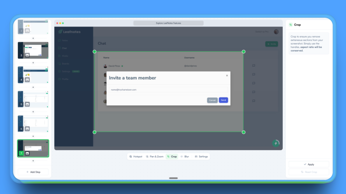
Crop Tool: Removing Distractions
When to use:
The browser and bookmarks are visible
Irrelevant sidebars clutter the view
Empty space draws attention from your focus area
How much to crop: Keep enough UI to maintain context. Viewers need to understand where this screen exists in your product.
Blur Tool: Privacy and Visual Hierarchy
When to use:
Protecting sensitive data (customer names, revenue numbers)
Reducing visual noise around your focal point
De-emphasizing sections without removing them entirely
Pro tip from the workshop: Light blur for de-emphasis, heavy blur for privacy. The tool is adjustable – use it subtly.
Video Steps: When Motion Matters
Chameleon automatically creates video steps for specific actions:
Scrolling through content
Typing in forms
Drag-and-drop interactions
Hover states
The five-second rule: Keep video steps under 5 seconds.
Longer videos can cause confusion, as viewers worry they're missing something important. Instead, break long sequences into multiple short videos with annotations between them.
For video steps, keep them very short. Show one visible change and bookend it with static steps. Show context before and a takeaway after.
Chapters: Creating Decision Points
Chapters aren't just dividers; they're moments for viewers to choose their path.
Your opening chapter sets expectations:
What they'll learn (one sentence)
How long does it take ("2 minutes")
What they'll be able to do after
Mid-Demo chapters maintain momentum: After showing a key feature, add a chapter: "You've just seen how [feature] works. Ready for the next level?"
Primary CTA: "Show me more"
Secondary CTA: "Skip to pricing"
The closing chapter drives action: Never end abruptly. Provide multiple next steps:
High commitment: "Start your trial"
Medium commitment: "See it with your data"
Low commitment: "Read customer stories"
The Ruthless Editing Phase
Your recorded Demo probably has 15-20 steps. Cut it to under 10.
Delete these immediately:
Login screens (start inside the product)
Loading states (unless speed is your differentiator)
Navigation clicks (jump directly to destinations)
Success confirmations (unless they contain key information)
Any step that doesn't advance your three core moments
The "So What?" Test: Read each annotation aloud. If you can't explain why a prospect should care in one sentence, delete that step.
My recommended framing, as you edit your Demo, is that a user spends a maximum of three minutes on it. If it takes longer than that to complete, you need to cut.
The Merge Technique
In Chameleon's editor, combine related steps:
Multiple form fields: Show the empty form → Show completed form (delete the typing)
Multi-step workflows: Show starting point → Show end result (delete the middle)
Progressive reveals: Show the final state only (delete the build-up)
The Context Preservation Rule
When you delete navigation steps, viewers lose context. Add a brief annotation to the remaining step: "Inside your analytics dashboard" or "In your team settings." This prevents the disorientation that the workshop identified as a major cause of drop-off.
Order Your Steps by Impact
After deleting, reorder what remains:
Highest value first - Your most impressive transformation
Proof in the middle - Show it handling complexity
Simplicity before CTA - End with how easy it was
You can reorder the steps in Chameleon's sidebar by dragging them. The psychology is critical: viewers who see value early are likelier to continue.
The Final Count Audit
Count your remaining steps. More than 10? Apply the "representative example" principle:
Instead of showing three features, show your best one
Instead of multiple use cases, show the most common
Instead of every integration, show the most popular
The workshop clarified this: viewers who complete a focused 7-step Demo are likelier to take action than those who abandon a comprehensive 15-step Demo.
Writing Copy That Creates Desire
You've got to set a scene. You've got to explain the problem... Think of a Demo as you telling a story rather than creating a user manual.
Transform feature explanations into outcome narratives:
🙅♀️ Instead of: "Click the Analytics tab"
✅ Write: "See which campaigns actually drive revenue"
🙅♀️ Instead of: "Enter your data here"
✅ Write: "Connect your entire tech stack in seconds"
🙅♀️ Instead of: "View your results"
✅ Write: "Every answer you need, updated live"
Each annotation should add information viewers can't get from looking at the screen. Focus on outcomes, time saved, problems solved – not UI mechanics.
Common Pitfalls to Avoid
The workshop revealed consistent mistakes teams make:
Starting with login flows: You've already lost them. Start inside the product at the moment of value.
Over-zooming: A focus that is too intense will cause your users to lose the context from which this appeared.
Describing the visible: If viewers can see it's a filter button, don't say "click the filter button." Say what filtering accomplishes.
No clear ending: Always close with a chapter that provides multiple next steps. A dead end kills conversion.
Assuming context: Demo viewers know nothing about your product's navigation, terminology, or value. Explain everything as if they're seeing it for the first time—because they are.
Your Demo Editing and Creation Checklist
Before Recording:
Define one core belief viewers must have
Identify your three key moments
Start screen is inside the product (not login)
During Recording:
Speak AS you click, not before or after
Keep the flow under 10 clicks total
Focus on outcomes, not navigation
While Editing:
Delete all unnecessary steps (aim for <10)
Rewrite annotations to focus on transformation
Add pan and zoom only AFTER showing context
Include a chapter with CTAs at the midpoint and end
Test hotspot color contrast
Before Publishing:
Watch three people try it
Confirm it takes under 3 minutes
Verify all CTAs work and lead somewhere valuable
The Path Forward
Interactive Demos are a new and exciting tool for product teams. They're not in-app tours for committed users or marketing videos for passive viewers. They're the critical bridge between interest and activation.
Your Demo has seconds to prove its worth. Use Chameleon's editing tools not to show more, but to show better. Focus relentlessly on your three core moments. Delete everything else.
Build lean. Test manually. Ship fast. When analytics launch, you'll have data to optimize further. But starting with these principles ensures your Demo works from day one.
Remember: viewers don't need to see every feature. They need to believe your product solves their specific problem better than alternatives. Your Interactive Demo has three minutes to create that belief.
Make them count ⏰
Turn viewers into do-ers with interactive demos
Create engaging, clickable product demos in minutes—no prep needed. Show, don't tell, and drive 200% higher conversions like our customers.

