


In-app tutorials are your product’s first handshake with users. It’s the first time your product is stripped free of the bells, whistles, and kind words of your marketing or sales team. It's out on its own, and it needs to impress.
How can your product ensure love at first use? Vía in-app tutorials.
It’s time to play cupid and couple your product with users in a way that’s authentic, useful, and winning for the increase in product adoption, customer retention, lifetime value, NPS scores, and other relevant metrics.
Let’s dive into first impressions of in-app guides.
**Offers a firm handshake**🤝
Also known as in-app walkthroughs, product tours, product walkthroughs, or in-app guides, in-app tutorials are walkthroughs of what users need to know when they're first left alone with your product
In-app tutorials have plenty of valuable benefits such as faster time to value, self-paced learning, higher user engagement, improved feature discovery, and just plain better user onboarding
The best practices for creating in-app tutorials include using modal backdrops, giving clear CTAs, staying on-brand with design, managing user expectations, and letting users opt-out
What are in-app tutorials?
In-app tutorials are (interactive) walkthroughs of what users need to know when they're first left alone with your product.
Also known as in-app walkthroughs, product tours, product walkthroughs, or in-app guides, these help users reach an "aha!" moment, uncover a job-to-be-done, and often encourage a self-serve onboarding approach to your product.
We want our users to fall in love and live "happily ever after" with our products. Plus, if that minimizes customer support team tickets along the way, it's a win-win.
This all starts with hello 👋 Onboarding guidance sets users up for complete success. A successful walkthrough can help your users find value in your product faster, enable self-paced learning, and drive user engagement.

User Onboarding Handbook: Craft Exceptional Flows
It's your go-to guide to user onboarding – backed by behavioral science and packed with tips, tools, and tactics you can use to level up your onboarding game. We'll send the eBook straight to your inbox.
Why your product needs in-app tutorials
In-app tutorials aren’t just a bunch of regular old prompts and progress indicators to slap over your product’s interface. Their key components can provide tons of benefits for your user onboarding. Take a look ⬇️
1. Faster time to value
The sooner you can give users “Aha!” Moments when they’re setting out to complete their goals, the sooner they’ll realize just why they need your product.
By introducing in-app tutorials, users will faster understand your app’s value and benefits. Think of it as a way to drastically reduce your product’s learning curve and, consequently, the time it takes for users to get what they came for.
2. Enabling self-paced learning
Some users may want to take their time learning to navigate your product. Others will want to zip through your features and functionalities faster than a Zapier integration (high expectations—but still possible).
Whatever their preferred pace, in-app tutorials let users learn your app as slowly or as quickly as they want. You’re making onboarding about them—and they’ll thank you for it.
3. Higher engagement rates and less churn
It’s rare that users will enter your app and start investigating every nook and cranny of your interface. They have a job to do, and they want to do it fast.
If you want your users to stay around and explore, you’ll need to keep them engaged by prompting scrolls, clicks, and navigation.
Effective in-app tutorials make exploration easier, keeping users interacting with your app for longer, finding more benefits, and affirming they’ve made the right decision in investing in your SaaS. In other words, the more you keep users engaged with in-app tutorials, the less likely they are to churn.
Speaking of turning, in-app tutorials are also a crucial part of the activation stage in the product led growth (PLG) flywheel, setting it in motion beyond retention and toward referrals.
4. Maximizing feature discovery
Imagine if your app had a feature that could make your users’ task 10x easier. If you don’t have an effective in-app tutorial to make it apparent, your time-saving functionality just might go over someone’s head.
In-app tutorials help ensure your users discover the features that can help them complete tasks, ultimately increasing the value of your product and heightening customer satisfaction scores (CSAT) along the way.
Absolutely love what in-app tutorials can bring to your product? So will your users—given you create and adopt them in your onboarding correctly. Let’s find out how.
How to create in-app tutorials to drive product adoption and delight your users
Having a poor in-app tutorial can frustrate your users more than no in-app tutorial at all—they’re crucial to getting right.
Here’s how you can create highly engaging in-app tutorials your users will love in five steps.
1. Conduct user research to find gaps in your feature adoption
Before you can create a stellar in-app tutorial, you need to research and analyze your user’s behavior. The insights you gather from methods like interviews, usability tests, focus groups, and surveys help you pinpoint gaps in your feature adoption.
For example, some of your core features might be hard to find, or users might struggle to use them effectively. Think of yourself as a detective following clues to solve the mystery of where users struggle with features. 👣👣 🔎
2. Create a user journey map
Got those insights? Good. Now all you need to do is map out the process users currently take to activate your product. You can do this with a user journey map.

(source)
To create a user journey map, you’ll need a foundational understanding of your users and the entire journey they undertake to and within your product. We’re talking all the way from first sight to ongoing usage.
Visualizing your user’s entire experience lets you quickly pinpoint the opportunities to introduce in-app tutorials, and will help dictate what they need to include too as you’ll have a clearer idea of what they already know.
3. Design and build an in-app tutorial for your product
Now for the fun stuff! You know what users are struggling with and where those struggles appear in their journey. It’s now time to design your in-app tutorial.
Once you’ve identified features where users need additional guidance, design by:
🎯 Setting an objective: determine what you want users to achieve by the end of the tutorial.
Understand core features?
Complete a specific task?
Fall in love with your product forever?
📲 Choosing your tutorial type: select the best formats to help users smoothly glide through your app at a specific point and on a specific device. For example, guided tours are better for complex workflows, while tooltips are better for quick contextual help.
🎬 Creating a storyboard for your tutorial: plan out your entire in-app tutorial, including each screen, step, and sequence of instructions. Make suret to include copy to communicate the steps users need to take.
🎨Designing the visual elements for your tutorial: including visual aids like progress bars, highlights, arrows, and pop-up bars
Or, instead of designing the visual elements yourself, you could go for a no-code solution for building beautiful brand experiences, AKA Chameleon. And drag-and-drop your tutorial into place.

Once you’ve settled on a final design, you’re clear to start building your walkthrough. The strategy you take to implement your blueprint is ultimately up to you and your team.
There are two main ways to go about it:
Using no-code, third-party tools for creating in-app guidance, walkthroughs, and tutorials, such as Chameleon 🦎
Build the patterns with your team using code 🧑💻
Whichever strategy you choose, it's crucial to ensure your in-app guidance elements fit seamlessly into your product without disrupting the user experience.
Build in-app tutorials your users will love
Chameleon lets you create and manage in-product guidance with modals, walkthroughs, embedded patterns, surveys, and in-app menus.
4. Test your in-app tutorial
Testing is a foolproof way of evaluating the effectiveness of your in-app tutorial before launching it with your entire user base. It also saves you time from correcting costly onboarding mistakes. The last thing you need is a stray tooltip or an annoying pop-up to put your users off using your product.
We recommend doing at least two rounds of testing before you’re ready to roll out your brand-new in-app tutorial.
Start by trying the walkthrough yourself. Note any inconsistencies, clunky elements, or out-of-place UI. Change your browser size, play around on different pages—check everything is as expected.
For the second round, share your in-app tutorial with your team. See if they have any final feedback or suggestions for changes. You never know where typos might be hidden.
🥁 Finally, launch your in-app tutorial for your users. Bonus points if you A/B test your in-app tutorials to determine what resonates most with your audience.
Testing doesn’t stop after launch. After rolling out your in-app tutorial, continuously monitor interactions and gather feedback to identify areas for improvement. Use your data to refine your tutorials and ensure they stay relevant and effective. 📈
“The most successful teams have established an in-app tutorial review flow so that this review cycle runs independently. Try using different ‘roles’ for users within your product adoption tool to ensure that tours don’t get launched without feedback.”
5 Types of in-app tutorials with examples
Need a little inspiration for planning out your own in-app tutorials? We’ve scoured the web (and the market) to bring you some of the smoothest in-app tutorials to grace user onboarding journeys. Let’s take a look at five in-app tutorial examples.
1. Slack’s Canvas interactive tutorial
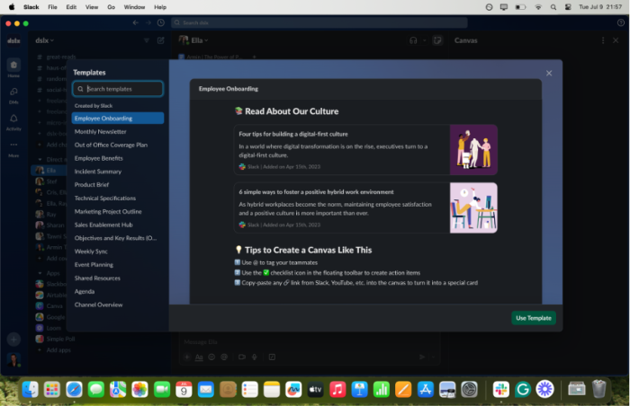
While most teams can easily navigate Slack’s core features, the collaboration tool offers extra guidance for Canvas. This functionality allows users to collaborate and brainstorm ideas in a shared space. Think of it like GDocs but in your chats.
To make adoption easy, Slack integrated multiple pop-ups demonstrating the feature’s benefits while allowing users to interact directly with it. Slack even demonstrated exactly how Canvas can fit into team workflows.
2. Mixpanel’s dashboard

Imagine paying for an important product analytics tool, only to be met with a barren, empty dashboard. It’s like walking into a ghost town, and it definitely doesn’t inspire sterling first impressions.
Mixpanel does the exact opposite. As soon as you sign up, it sweeps you off your feet by starting the onboarding flow. Mixpanel outlines steps for implementing data and lets you quickly start training to familiarize yourself with the app and its analytics capabilities.
3. Pipeline’s in-app video tutorial and tooltips
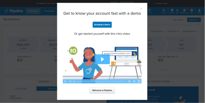
Pipeline is a CRM solution with plenty of useful features for lead, sales, and customer management. The platform reduces the curve (to about 60 seconds) with a screencast video animation offering step-by-step guidance for performing tasks.
Pipeline users can close the video, explore the app for themselves, and interact with the many tooltips sprinkled throughout the interface and core features. It's an onboarding process that’s easy, personalized, and comprehensive.
4. Notion’s tooltips

The note-taking and productivity app Notion is known for its versatile text pages, allowing teams to draft, collaborate, and brainstorm for a wide range of projects. It sports multiple starting templates such as weekly schedules, calendars, and quick notes.
However, this broad range of features is far from overwhelming thanks to Notion’s various in-app guide elements. The productivity app helps users get a quick start on how to use various formats with non-invasive but helpful tooltips on the sidebar. They also let users complete a task such as sorting page elements.
5. Deel’s feature update tours

The HR tool Deel simplifies global hiring through a suite of payroll, compliance, and contract management tools. While the platform has a pretty intuitive interface, it still offers simple and contextual tours after rolling out new features or updating existing ones.
Take Deel’s navigation bar update as an example. As soon as users log in, they’re prompted to take a tour and explore the updated feature’s capabilities.
How to choose the right in-app tutorial for your product
Picking the right type of app tutorial ultimately comes down to your resources, onboarding goals, and promises to users.
What resources do you have? Some of these types of onboarding tutorials require SaaS solutions like Product Adoption Platforms; some require people and time. Figure out the solution your business can achieve. Start with these questions.
What do you need your users to achieve during the onboarding?
How will tutorials help them complete tasks and reach activation milestones?
How will that affect other product metrics that are important to you?
When you’ve identified this, you can pinpoint the best method to help you achieve your goals.
Keep in mind the different user personas you have, and if they have a preference for onboarding. Perhaps your users get enough emails a day and don’t want a single email more in their inbox—if this is the case, your onboarding emails will swiftly be bumped to trash before they can even say hello. Stay customer-centric and keep the onboarding in-product.
5 Best practices for creating stellar in-app tutorials
1. Use modal backdrops
(Source)
A new UI can be a little overwhelming, especially if your product has many moving parts like Airtable. However, never miss a chance to climatize users to your product in their onboarding.
Just like Airtable has done here, their onboarding modals don’t block out the product interface. By having the interface as a backdrop to the onboarding walkthrough the initial "shock" of a new interface is lessened for new users.
2. Give clear CTAs
(Source)
Even if your CTAs are simply allowing a user to click out of a modal or tooltip, put them there and make them clear. This encourages user engagement in the right places and introduces users to how they should be navigating your tool.
Plus, introducing CTAs as early as onboarding makes users more likely to click on them when they see them elsewhere, be it in-product, email, or somewhere else.
3. Stay on-brand with design

(Source)
We won’t teach you how to suck eggs (is that still a saying?). We all know the importance of branding and consistency. It builds trust and loyalty, and it heightens a user’s experience.
Stick to your branding throughout the onboarding experience. Even if you’re using a third-party tool to create no-code flows, find workarounds to remain consistent with your brand.
In this example, PandaDoc has kept things simple and on-brand by providing a brand green overlay to their video tutorial.
4. Manage user expectations

(Source)
Time is a precious commodity today. Show users you respect their time and manage expectations by including a checklist or completion bar to let users know how they’re progressing throughout their onboarding.
Our In-Product Experiences Benchmark Report shows that users spend an average of 119 seconds on a product Tour. Using a completion bar in the onboarding process will not only help users navigate more easily, but also improve the overall user experience.
5. Let users opt-out

(Source)
Last but certainly not least, allow your users to opt-out of onboarding flows. Perhaps they already know what they need to do and how, or perhaps they want to learn as they go.
The Dismiss button is a must, but you can also use a Snooze option to set your tours and tutorials to reappear after a certain time period.
Whatever reason a user has for not wanting to go through your onboarding, respect it and let them click away as Slack does in the above example.
Improve User Onboarding with the JTBD Framework
Download the Jobs-to-be-Done cheatsheet packed with resources, tips, and worksheets.
How to keep users engaged throughout in-app tutorials
Product adoption is a constant balance of optimization and customization. It’s something you need to work tirelessly at to keep users content and engaged. Let’s explore a few engagement methods to practice throughout your in-app tutorials and onboarding flows.
1. Highlight a user’s job-to-be-done
One of the most crucial methods for in-app tutorials is getting a user to do the job they hired your product for. Once a user realizes your product is worth its cost, they’re more likely to stick around.
However, if you don’t get them to that moment quickly enough, they’ll jump ship—this is especially important if you’re hoping to convert users from a free trial.
Be explicit about a user’s job. This may come down to saying something along the lines of: “Look, you’ve achieved what you wanted.” Feel free to be more creative with the wording, but hopefully, you get our point. Remind users what they came to do and celebrate the success when they’ve done it.
Take Fathom for example, the AI notetaker checks in after your first call with a quick congratulatory message and even asks for feedback.

2. Build knowledge with tooltips
It’s a good idea to use a method like product tours for an initial onboarding focused on the "aha!" Moment, and use tooltips to accompany this flow.
Different from an initial onboarding flow, tooltips continue to guide users through your product, even when they’re advanced users. They’ll enable feature discovery, continuous learning, and help increase CLTV.
3. Shift your strategy depending on your NPS score
This is especially relevant for guiding existing users through new, underused, or advanced features. Your NPS survey results are crucial to how you communicate and guide users. As a reminder, your NPS results will divvy up your users into three cohorts, depending on their response on a 0-10 scale.
Detractors (0-6): These are users you need to be wary of. These users have a higher risk of churn and may be more reluctant to engage with your product. Saying this, you don’t want disengaged or unhappy users to still be paying for your product. When it comes to new feature adoption and tutorial efforts with these users, remember how they feel about your brand and message them accordingly.
Passives (7-8): These users are exactly what it says on the tin. They’re neither over the moon about your product nor too likely to stop using it. It does the job it’s hired to do. How can you woo these users to become true fans of your product via a new feature tutorial? They know what your product can do; let’s show them what they don’t know—and didn’t know they needed.
Promoters (9-10): Cupid has done its job, and these users are in love with your product. Capitalize on this! Use an onboarding opportunity for a new feature to win referrals and give these users something to shout about within their communities.
4. Speak to your customers
Onboarding doesn’t need to be a one-way street. Open the playing field up to collecting feedback from your customers.
Show customers that you’re listening to what they have to say. Their input and feedback can help your team streamline user onboarding, highlight problem areas, tweak product messaging, and even build new products and features.
Use in-app tutorials to kickstart long-term relationships with your users
In-app tutorials aren’t just patterns that assist your users in using your product. They're one of the main driving forces for effective onboarding and, by extension, increased feature adoption. Getting them right leads to loyal customers who love using your product to solve their problems.
Hopefully, you’re walking away from this article with some fresh resources and perspectives for your in-app tutorials and onboarding flows. Remember to stay customer-centric, design in your brand style, and don’t settle for anything less than breezy. Happy onboarding!

Create impactful welcome flows with Chameleon
Get started free and build a welcome page that inspires users to take their next steps


