
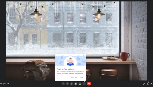
Bonusly's Feature Tooltip
This tooltip is like a helpful nudge from a friend who knows exactly what you need. In just a few words, it...
Existing customer? Sign in
Guide new users through key features step-by-step, helping them quickly get started and build confidence, while offering both immediate action and the option to learn more at their own pace.
In-app onboarding tooltips are contextual guidance elements that appear at precisely the right moment to help new users navigate your product successfully. These small but powerful UI components reduce time-to-value by providing just-in-time information exactly when and where users need it most. Unlike intrusive pop-ups or lengthy product tours, tooltips offer gentle, non-disruptive guidance that enhances user confidence during initial product exploration.
For product teams focused on user adoption and activation, in-app onboarding tooltips serve as essential tools for feature discovery and workflow guidance. They bridge the gap between a user's current understanding and the actions they need to take, making complex products feel more approachable and intuitive from the very first interaction.
An in-app onboarding tooltip is a small, contextual message that appears near specific interface elements to provide targeted guidance during the user onboarding process. These tooltips deliver information at the moment of need, supporting progressive disclosure principles that prevent cognitive overload while ensuring users have the context they need to succeed.
While product tours guide users through predetermined sequences and modals demand immediate attention, tooltips offer a more flexible, user-controlled experience. They appear when users hover over or interact with specific elements, allowing for self-paced exploration without forcing a rigid learning path.
Tooltips excel when you need to: - Explain individual features without disrupting workflow - Provide optional context that users can access on-demand - Support both new and returning users with contextual help - Maintain interface cleanliness while offering guidance
Choose tooltips for explaining specific features, buttons, or interface elements that might not be immediately obvious. They work best for supplementary information rather than critical onboarding steps. For comprehensive feature introductions or multi-step processes, consider combining tooltips with Chameleon's Tours or Interactive Demos for a more robust onboarding experience.
Effective tooltip implementation starts with understanding your users' journey and identifying moments where contextual guidance adds the most value. Map out key decision points, feature discovery moments, and areas where users commonly experience confusion or hesitation.
1. Identify Key User Actions and Decision Points Analyze user behavior data to pinpoint where tooltips can reduce friction or increase feature adoption. Focus on high-impact areas where small guidance improvements yield significant user experience gains.
2. Map Tooltip Placement to User Workflow Position tooltips strategically within natural user workflows rather than forcing artificial interaction patterns. Consider the user's attention and cognitive load at each step.
3. Craft Clear, Actionable Messaging Write concise, benefit-focused copy that explains not just what a feature does, but why users should care. Use action-oriented language that encourages engagement.
4. Set Up Targeting and Triggering Conditions Define precise audience segments and trigger conditions to ensure tooltips appear for the right users at the right time. Consider factors like user role, product usage stage, and previous interactions.
5. Test and Iterate Based on User Behavior Monitor tooltip performance through engagement metrics and user feedback, then optimize messaging, timing, and placement accordingly.
Chameleon's visual editor enables no-code tooltip creation with extensive customization options. You can adjust positioning, styling, and behavior to match your product's design language while maintaining optimal user experience. Advanced targeting capabilities allow you to show different tooltip variations to specific user segments, ensuring relevance across diverse user groups.
Effective tooltip copy focuses on immediate value and clear next steps. Avoid lengthy explanations—instead, provide just enough context to build confidence and encourage action. Use active voice and specific verbs that guide users toward desired behaviors.
Layer information strategically, revealing complexity gradually as users demonstrate readiness for more advanced concepts. Start with essential information and provide pathways to deeper learning for users who want additional context.
Timing determines tooltip effectiveness more than any other factor. Show tooltips when users are most likely to need guidance—typically during first encounters with features or when approaching decision points that could lead to confusion or abandonment.
The most effective tooltip templates include both immediate action options and pathways for additional learning. A primary CTA like "Start your journey here" encourages immediate engagement, while secondary options like "Learn more" accommodate users who prefer comprehensive understanding before taking action.
The dual-CTA approach addresses different user preferences and learning styles. "Start your journey here" messaging taps into users' desire for progress and achievement, while offering alternative learning paths prevents users from feeling pressured into immediate action. This psychological balance increases overall engagement rates and reduces onboarding abandonment.
Use tooltips to introduce recently launched features to existing users without disrupting their established workflows. Position tooltips near new interface elements with messaging that highlights benefits and encourages exploration.
For multi-step processes, tooltips can provide contextual assistance at each decision point. Rather than overwhelming users with comprehensive tours, tooltips offer just-in-time guidance that supports natural workflow progression.
Strategic tooltip placement at key activation moments can significantly impact user retention. Guide users toward high-value actions that demonstrate product value and encourage continued engagement.
Target specific user segments with tooltips that promote underutilized features relevant to their use cases. Chameleon's advanced segmentation capabilities enable precise targeting based on user behavior, role, or product usage patterns.
How do I customize tooltip appearance and messaging? Chameleon's visual editor provides extensive customization options without requiring code. You can adjust colors, fonts, positioning, and CSS to match your product's design system while maintaining optimal readability and user experience.
What's the ideal frequency for showing onboarding tooltips? Balance guidance with user autonomy by showing tooltips primarily during first encounters with features. Use Rate Limiting to avoid overwhelming users with in-app messages.
How do I measure tooltip effectiveness? Track engagement rates, click-through rates on CTAs, and subsequent user actions to gauge tooltip impact. Chameleon's real-time analytics and integrations with product analytics tools can be used to get detailed insights into tooltip performance across different user segments.
Can I target tooltips to specific user segments? Yes, Chameleon's advanced targeting capabilities allow precise audience segmentation based on user attributes, behavior patterns, product usage stage, and custom properties. This ensures tooltips remain relevant and valuable for each user group.
What's the difference between tooltips and product tours? Tooltips provide contextual, on-demand guidance for specific elements, while product tours guide users through predetermined sequences. Tooltips support self-paced exploration, whereas tours ensure comprehensive feature coverage through structured walkthroughs.
Chameleon's comprehensive platform combines tooltips with Interactive Demos, Surveys, Embeddables, and Tours to create cohesive onboarding experiences that adapt to individual user needs and preferences, ensuring every user receives the right guidance at the right moment.

Start a free trial or talk to our team.