


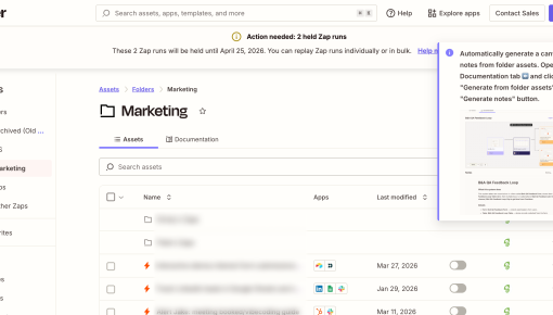
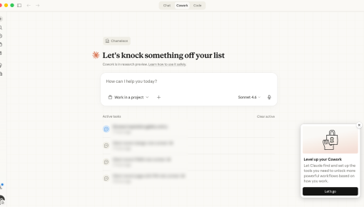
Zapier's Feature Announcement Modal
Announcing a new feature without hijacking the screen is a hard problem. Zapier's modal appears only inside...


Existing customer? Sign in
Instagram uses a modal leveraging FOMO to persuade users to turn on notifications for new activity. This modal appears on app open, timed to capture attention when user intent is high. The goal is to encourage users to enable push notifications, which is a critical engagement loop for habit formation. Let’s see this in more detail:
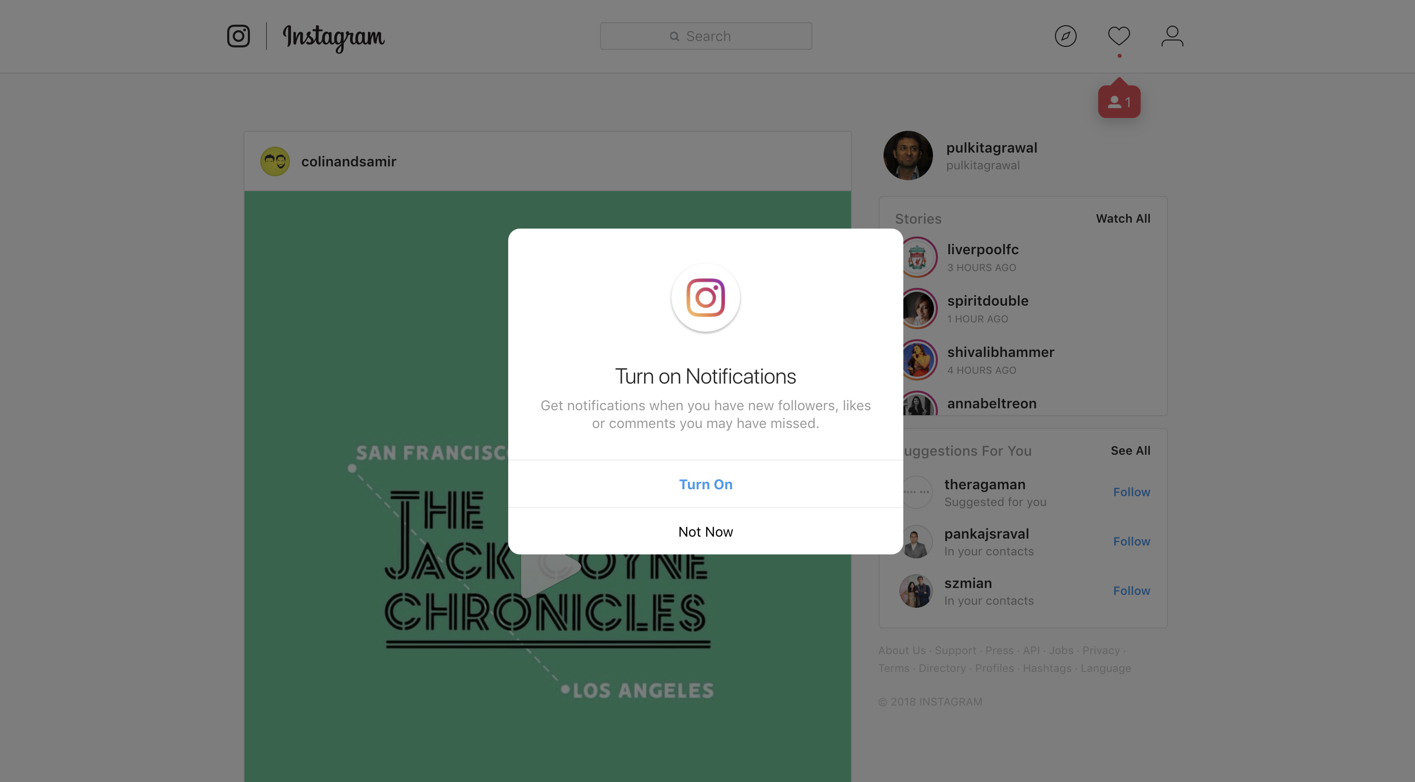
Focus on benefit, not just function : The copy communicates exactly why notifications matter: “get notifications when you have new followers, likes or comments you may have missed.” this taps into fomo (fear of missing out), making the user feel like they might lose something valuable if they skip this step.
Simple and frictionless interaction : Users don’t have to think—there are only two options: “turn on” or “not now.” this reduces decision fatigue and nudges users toward the default action.
Primary cta is emphasized: “Turn on” is styled in blue, drawing immediate attention and acting as the visual default. the placement and color encourage users to proceed without hesitation.
Secondary cta is de-emphasized: “Not now” is placed below in smaller font and less prominent styling. users still retain the option to skip, but the ui gently nudges them toward enabling notifications.
Central placement in modal: The modal is center-aligned and framed in white against a darkened background, ensuring users are not distracted and focus entirely on the decision.
Timing aligned with user re-engagement - Instagram triggers this modal at a moment when users are likely to care about their activity—right as they return to the platform. this increases the chance that they opt in.
Notifications as a reactivation tool - Enabling notifications drives long-term retention by bringing users back into the app whenever they receive social signals like likes, comments, or follows.
The modal is lightweight, value-oriented, and psychologically timed to boost opt-ins.
The copy is clear, relevant, and emotion-driven, reinforcing why users should take action.
Visual hierarchy nudges users toward the preferred action while still offering control.
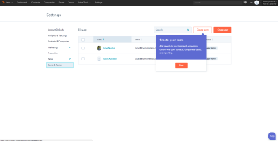
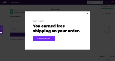
More Modal examples

Get started free in our sandbox or book a personalized call with our product experts
