


Your new user signed up three days ago. They clicked the welcome email, landed in the product, poked around for six minutes, and left. Your activation rate hasn't moved in a quarter.
Most onboarding failures trace back to a mismatch: the pattern chosen for each step doesn't match what the user needs to do next. A twenty-step tour where a three-item checklist would've worked. A welcome modal firing before the user has any context for what they're being shown (the most common one, and the most avoidable too). A personalization screen collecting company size from someone who came in to solve a specific problem and now has to sit through intake questions.
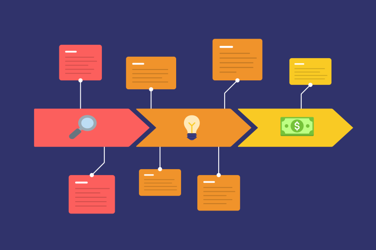
This guide covers 20+ real-world onboarding examples, organized by the UX pattern they use: welcome screens, checklists, product tours, tooltips, modals, banners, and microsurveys. Each example names the activation metric it was built to move, so you can see the logic behind the UI choice, not just the screenshot. Let's go.
The TL;DR
-
Pattern-first structure beats company-name organization. Navigate directly to the mechanic you're building, not a list of logos.
-
Every onboarding decision should trace back to an activation metric. If you can't name the metric, the design is guesswork.
-
Checklists, tours, tooltips, modals, and microsurveys solve different problems in the activation journey. They're not interchangeable.
-
Measure onboarding by activation rate and time to value. Step-completion rate on the onboarding UI tells you almost nothing useful.
Firstly, what are onboarding screens?
Onboarding screens are the sequence of UI surfaces a new user encounters between sign-up and their first activation moment. Not the welcome email, not the help center. The in-product interface that guides, orients, or prompts users to take the specific actions that get them to value. That's the scope. Everything else is adjacent to onboarding, not onboarding itself.
That system is built from six main patterns:
- Welcome screens and first-run flows: orient the user, set expectations, and route them to a first action or setup step
- Checklists: give users a visible activation path with explicit progress tracking
- Product tours: walk users step-by-step through a core workflow or feature set
- Tooltips: surface contextual help attached to specific UI elements, on the user's terms
- Modals and banners: announce changes, prompt key actions, or nudge users toward activation moments
- Microsurveys: collect role, goal, or preference data to branch users into personalized paths
User onboarding in UX design is the designed sequence of in-product UI patterns — welcome screens, checklists, product tours, tooltips, modals, and microsurveys — that guides a new user from sign-up to their first meaningful product outcome. Each pattern addresses a different step in the activation journey, from orienting a new user to prompting a key action at the right moment. The goal is to reach the user's first value moment as quickly as possible, with as little friction as the product complexity allows.
This page is part of our onboarding examples and inspiration deep dive in the user onboarding best practices pillar. For the activation-rate mechanics behind these patterns, see how to improve activation rates in B2B SaaS; for building personalized paths by role or plan, see how to personalize onboarding by role, plan, or use case.
A simple product with a familiar use case needs less guided structure. A complex B2B tool with multiple user roles needs more — a welcome screen to route, a checklist to scaffold, tooltips to explain the unfamiliar UI. The right pattern combination depends on where your users start, not just what your product does.
Pattern selection isn't an aesthetic decision. Best-in-class SaaS products achieve a Time to Value of 0.2 days (Pendo Product Benchmarks, 2026) — and Chameleon's benchmark report shows the gap between median and best-in-class TTV correlates directly with pattern selection. The right pattern at each step compresses that timeline; the wrong one adds friction before the user ever gets there.
Welcome screen and first-run flow examples
A high-converting welcome screen does one of three things: routes users to a meaningful first action, collects just enough data to personalize what follows, or removes a decision the user doesn't need to make yet.
Personalization is the variable with the highest downstream leverage here. 68% of organizations rate it "Very Important" to onboarding success, according to Moxo's 2025 Future of Customer Onboarding report. The welcome screen is where personalization either starts or gets skipped — and that decision has measurable downstream effects on activation.
What makes a great onboarding experience? Routing the user to the right first action fast enough that they feel the product's value before they've had time to question whether they need it. Visual polish matters less than activation logic.
These welcome-screen onboarding flow examples share one common thread: each is optimized for a downstream activation metric, not the visual finish of the screen itself.
Duolingo
Duolingo's welcome flow opens with language selection, then a goal-setting screen: casual learning, conversational fluency, or test preparation. Before users see a single lesson, they've told the app what success looks like for them.
The activation metric Duolingo targets is Day-7 habit retention, not Day-1 completion rate. Users who skip the goal-setting screen tend to abandon within the first week. The welcome flow exists to secure that commitment early, because the metric Duolingo optimizes for is measured a week later, not the moment the user lands.
The copy throughout is direct and encouraging. No feature explanations. The interaction is the product.
For B2B SaaS, the replicable mechanic is the commitment question at the welcome screen: ask users to name a goal before they see the product, and use that answer to route them to the right activation path. The goal-setting screen isn't decoration — it's a leading indicator for the metric that matters.
Canva
Canva's first-run flow routes new users to a blank canvas or template gallery within two clicks of signing up. The activation mechanic is immediate creation: users who complete a first design in session one are far more likely to return than those who browse without making anything.
First-project completion rate is the metric Canva optimized for, and the welcome screen reflects it. No feature explanation, no product overview. Just a canvas or template gallery within two clicks. Show users what they can make, then get out of the way.
The mechanic B2B SaaS teams can copy: replace the blank-state with a pre-populated template matched to the user's stated goal or role. Users who start with something real — a draft report, a sample pipeline, a pre-built dashboard — complete their first session at higher rates than users who start with an empty workspace.

Canva Upsell Modal

Canva Premium Feature Prompt
Twitter/X
Twitter's welcome flow centers on follow recommendations, grouped by topics and people the user might know. The activation event Twitter targets is a personalized feed in the first session. A user who sees a generic feed of strangers has no reason to return.
The welcome mechanic is interest-based routing — not a separate onboarding layer bolted onto the front of the product, but the activation path itself. The interest-selection screen populates the feed before the user has scrolled past a single post, so the first experience they see feels chosen for them. That's the mechanic: deliver a personalized experience fast enough that users don't have time to disengage before they've felt the value.
The B2B SaaS translation: use the welcome screen to route users to a personalized first experience before they've decided whether to bother. A two-click preference or role selector on sign-up can populate a dashboard, template gallery, or feature set that reflects what the user came to do — turning a generic empty state into a starting point that already feels relevant. The follow-recommendations screen isn't asking users to configure the product. It's doing the configuration for them, based on a single input.
Chameleon's Interactive Demos let you embed a no-login first-run experience before account creation, extending the welcome-screen pattern to shrink time to first aha moment without engineering effort.

Twitter Ads Modal Tour
Onboarding checklist examples
An onboarding checklist gives users a visible activation path with progress tracking. The core mechanic is simple: users who can see what's left to complete finish at higher rates than users following a linear tour they can't re-enter or track. The best checklist onboarding screens examples share one principle: every item ties to the activation event, and nothing else makes the list.
Checklists are distinct from product tours. A tour is sequential and linear; the user follows the order the product sets. A checklist is self-paced and persistent; users can complete steps in any order, come back after a break, and see where they are at any time.
The common thread across these checklist examples: scope. Effective checklists tie every item directly to the activation event, and nothing else makes the list. Chameleon's 2025 Benchmarks Report shows checklists with a welcome state hit a 27% click-through rate, and tours launched from a checklist reach 67% completion. Industry benchmarks reinforce why this matters: best-in-class SaaS products achieve a 60.2% in-app guide engagement rate against a 38.5% median (Pendo Product Benchmarks, 2026), and scope is the primary variable separating the two. Include steps that move users toward the activation event; exclude everything that doesn't.
Pipefy
Pipefy's onboarding checklist maps directly to process setup: create your first pipe, invite a team member, connect an integration. Each step is a concrete setup action, not a feature demo.
The metric Pipefy targets is setup-completion rate, measured by whether users build and run at least one automated workflow in their first session. The checklist works because every item on it moves a user closer to that outcome. Nothing on the list is a "did you know" tip. Checklists scoped to a single activation event — rather than showcasing every capability — consistently outperform broader lists on both completion rate and downstream 30-day retention.
For how this same pattern plays out in practice, see how to improve activation rates in B2B SaaS, which covers checklist-first onboarding mechanics in detail.
Pipefy User Onboarding Checklist
Airtable
Airtable's setup wizard presents users with template selection as the first checklist step. Users who pick a template matching their use case add pages and invite collaborators at significantly higher rates in their first 30 days than users who start with an empty workspace.
The metric Airtable targets is workspace-population rate (a proxy for feature adoption breadth). Template selection is the first checklist item because it has the biggest downstream effect on activation, not because it's logically "first" in a feature sequence. Users who reach a meaningful first action within their first session show stronger retention signals at 7 and 30 days than those who browse without completing anything — and template-first checklists reliably produce that first action faster than blank-workspace starts.
The most common checklist mistake: packing 10+ items before users have seen a single meaningful outcome. Pipefy and Airtable both scope their checklists to the minimum steps required to reach activation. More items don't mean more engagement.

Airtable User Onboarding Tour (2016)
Highspot
Highspot uses a structured feature adoption checklist for sales reps joining a new workspace. Each step unlocks a core use case, from content search to guided selling flows. The metric Highspot targets is feature-adoption breadth in the first 14 days.
The checklist is the scaffold. The activation signal is whether reps use content in a live call within two weeks of joining. The checklist steers toward that, one step at a time. Teams running role-specific checklist flows — rather than a single generic list for all users — see measurably shorter time-to-first-use on the features that matter most to each role; the Highspot model is a direct application of that pattern.
To build this pattern without custom state logic, Chameleon's checklist Launchers ship a persistent setup-progress widget your team configures without engineering overhead. For more on this approach, see contextual guidance as a driver of faster activation.

Highspot Feature Adoption Tour
Product tour and guided walkthrough examples
A product tour is a linear, multi-step guide. It walks users through a specific workflow in a fixed order. That's what makes it different from a checklist (self-paced, re-enterable) and from a tooltip (contextual, single-step, user-triggered). The tour controls the sequence. The user follows it.
Onboarding UX vs. a product tour: Onboarding UX is the full system of patterns a new user moves through, from welcome screen to activation. A product tour is one specific linear pattern within that system. The two terms are not interchangeable.
Best-in-class SaaS products achieve a Time to Value of 0.2 days (Pendo Product Benchmarks, 2026). Chameleon's benchmark data shows that user-triggered product tours perform 2–3x better than auto-triggered tours in both completion and engagement — and that tour step count is one of the fastest levers teams have on TTV. Top-performing tours cap at five steps. Tours longer than five steps see completion rates drop by more than 50%.
Moz
Moz's product tour walks new users through a keyword research workflow from project creation to first ranking report. The trigger is account setup completion. Users who've connected a site see the tour automatically.
The metric Moz targets is first-campaign completion rate. Teams that generate their first ranking report in session one show stronger paid conversion signals. The tour is five steps, and each step is a real action in the user's own account, not a sandbox demo. Five steps is deliberate: Chameleon's benchmark data shows that tours longer than five steps see completion rates drop by more than 50%, so every step beyond five is compounding against the metric Moz is trying to move.

Moz Product Tour
Fivetran
Fivetran's connector setup tour guides data engineers through their first source connection: selecting a connector, entering credentials, running the first sync. The trigger is first login after account activation.
The metric is first-sync completion rate — completing the thing that proves Fivetran works is the clearest trial-conversion signal. The tour doesn't explain what Fivetran does. It completes the thing that proves Fivetran works. That framing — what would a user need to do to believe this product works? — is the right starting question for any technical product tour, and the answer almost always yields a shorter, sharper step sequence than the one teams build first.
Levity
Levity runs two distinct tour paths: one for users who want to start with a pre-built AI template, one for users building from scratch. The branching happens at the welcome screen, and the tour that follows is scoped to the path the user chose.
Levity targets first-model-training completion rate as its activation metric. The high-touch path walks through five steps; the template path is three. Same activation goal, two different routes to it. The shorter template path matters beyond convenience: users who reach the activation event in three steps instead of five drop off at meaningfully lower rates before completion, and those who finish are more likely to return for a second session.
GameRefinery
GameRefinery uses a video-based tour for new users exploring its analytics platform. The tour is a short screen recording overlaid on the product interface. Users watch; they don't click through. The metric is time-to-first-query: teams that run a game analysis search in session one are more likely to convert to paid within 30 days.
Video tours and step-by-step tooltip tours are not the same mechanic. A tooltip tour asks users to interact at each step; a video tour is passive. Use the tooltip sequence when you want users to practice a workflow. Use the video when the product is complex enough that watching first reduces early drop-off.
AI tools are changing how teams build and personalize product tours. Copilot lets you define tour variants and run A/B tests through a conversational interface — no rebuilding flows from scratch for each iteration.
Tooltip and contextual guidance examples
There's a specific case where tooltips outperform tours: when the user is mid-task in a complex product and you need to explain a single UI element without pulling them out of what they're doing. A tour would interrupt their workflow. A tooltip surfaces exactly where they're already looking.
Tooltips are single-step, on-click or on-hover overlays. Non-sequential (unlike tour steps), non-blocking (unlike modals). The user triggers them, which is the point: you're not pushing information at someone, you're surfacing it where they're already looking. That's what makes them the right tool for users already engaged with the interface. And the wrong tool for products where users don't yet know where to look.
Best-in-class SaaS products achieve a 60.2% in-app guide engagement rate, compared to a median of 38.5% across 6,800+ applications (Pendo Product Benchmarks, 2026) — and trigger conditions and element placement are the primary variables separating the two. Tooltips contribute to that engagement gap when placed on elements users are actually interacting with. Place them on elements no one visits and they add noise, not guidance.
SendGrid
SendGrid uses tooltips to introduce beta features to users who've already completed initial setup. The trigger is element interaction: hovering over a feature marked as beta surfaces a tooltip explaining what it does, with a link to documentation.
The activation metric is beta-feature opt-in rate. The tooltip appears because the user's cursor is already there, not because SendGrid decided it was time to explain something. Auto-triggered feature announcements to all users get a fraction of the engagement of element-targeted, user-triggered tooltips — which makes user-triggered tooltips one of the highest-ROI announcement mechanics available, particularly for beta rollouts where adoption rate is the signal that matters.

SendGrid Feature Upsell Tooltip
Gusto
Gusto places tooltips on payroll action buttons for trial users who haven't yet processed a payroll run. The tooltip surfaces what clicking the button will do, and what information the user needs to have ready before clicking it.
The metric is trial-user progression toward the first payroll run, which is Gusto's primary activation event. The tooltip removes a decision point without requiring a full walkthrough of the payroll workflow. For complex B2B tools with high drop-off at a specific step, a single well-placed tooltip on the action button consistently outperforms a five-step tour that requires restarting from the beginning on the next session.

Gusto Feature Onboarding Tip
Google Calendar
Google Calendar uses icon-triggered tooltips (hotspots) on newly shipped features during rollout. A persistent icon anchors to the new UI element; hovering or clicking reveals a short explanation with a "try it" CTA.
The metric is feature-awareness-to-first-use rate. Users who interact with the hotspot tooltip adopt the new feature at meaningfully higher rates than users who only see the changelog announcement. The icon persists until the user engages with it, making it discoverable without being intrusive. Hotspot tooltips are particularly effective for post-launch rollouts because they reach users in context, at the moment they're interacting with the area where the new feature lives — rather than catching them at login when they have no frame of reference for what they're being shown.
To build the SendGrid and Gusto targeting logic without custom engineering, Chameleon's Tooltips fire on-click or on-hover with full segment and event targeting built in. This is the app onboarding UX pattern most teams underuse, particularly for beta rollouts and complex feature areas.

Google Calendar Microsurvey
Modal and banner examples
The most common modal mistake is also the most predictable one: triggering on page-load, before the user has any context for what they're being shown. A user who just logged in hasn't done anything yet. They've landed, they're orienting, and here's a modal asking them to confirm something. They don't know what they're being congratulated on, warned about, or asked to confirm. They click dismiss. And somewhere in that click, the product loses a little trust.
Modals are blocking overlays that require acknowledgment. Banners are non-blocking inline or pushdown callouts. They're different patterns for different urgency levels. A modal says "this requires your attention before you continue." A banner says "this is worth knowing, but you can keep going."
Chameleon's benchmark data shows that approximately 38% of users dismiss modals within 4 seconds. Modals with contextual, well-timed triggers achieve completion rates around 47%. Timing is the variable most teams underestimate.
AvidXchange
AvidXchange uses a video modal at the start of a new user's first session after account configuration. The trigger isn't page-load. It fires after the user completes their first setup action, so the video explains what they'll do next, not what the product is in the abstract.
The activation metric is first-invoice-processing rate. Users who watch the video modal complete the first workflow at higher rates than those who skip it. The trigger timing is what separates this from a page-load modal that gets dismissed on reflex.
Joy
Joy's feature discovery modal fires when a user creates their first event, introducing related features that become relevant at that stage. The user just completed an activation step, so they have context for what they're seeing.
The metric is feature-adoption breadth in the first 30 days. The modal doesn't interrupt an in-progress action. It follows one.
Segment
Segment uses a feature-change modal to announce major updates to users who've been in the product before. The trigger is session login after a release, with the modal targeting only users who've used the specific feature that changed. Users who've never touched that feature don't see it.
The metric is change-acknowledgment rate, used as a proxy for preventing support tickets. The targeting logic is what makes it work. Irrelevant announcements train users to dismiss without reading.

Segment Feature Change Modal

Segment's Onboarding Modal
Thistle
Thistle uses a persistent banner to surface health and safety information for users placing their first order. It appears at the top of the checkout flow, not on the homepage. The banner stays visible without blocking any action.
The metric is informed-consent confirmation rate before order completion. A modal would require explicit dismissal. A banner lets users read while continuing through the flow. When acknowledgment isn't time-critical, the banner is the right choice.
Ecosia
Ecosia uses a motivational banner tied to search activity milestones, telling users how many trees their searches have planted. The banner is non-blocking and appears on a timed trigger after a session reaches a certain length.
The metric is daily-active return rate. Users who see the milestone banner during a session return the following day at higher rates than those who don't. The banner reinforces the reason to keep using the product, without asking for anything.
When modals are preferable to banners: time-sensitive actions requiring explicit acknowledgment (compliance updates, payment changes, irreversible settings). When banners are preferable: low-urgency nudges and feature announcements where you want to inform without interrupting.
Chameleon's Banners ship as non-blocking pushdown or inline callouts with conditional segment targeting, so the Thistle and Ecosia targeting patterns don't require custom CSS or engineering changes.
Microsurvey and personalization examples
Microsurveys in onboarding are 1-3 question prompts that collect role, goal, or preference data to route users into personalized paths. They're not post-session NPS surveys. The trigger is during the onboarding flow, the question design is activation-oriented, and the downstream action is routing the user to a different experience based on their answer.
For B2B SaaS, personalization almost always starts with one question: who are you, and what are you here to do?
How to design a user onboarding flow: Start with a microsurvey to segment users by role or goal, then route each segment to the pattern that fits their activation path. A sales rep and a data engineer using the same product need different first actions. The microsurvey is the routing mechanism that makes the right pattern reach the right user.
Notion
Notion's onboarding starts with a use-case picker: personal notes, team projects, or a company wiki. The selection routes users to a pre-built template workspace appropriate for their answer. Users who select "team projects" land in a collaborative workspace setup; users who select "personal notes" land in a single-user note view.
The activation metric is workspace-population rate in the first seven days. Users who pick a use case and see a relevant template add pages and invite collaborators at significantly higher rates than users who start with an empty workspace. Two clicks of personalization produce measurable downstream effects.

Notion Sites Product Tour

Notion's Side Peek Coachmark
Figma
Figma's onboarding includes a role selector: designer, developer, product manager, or student. Each role routes to a different starting project and a different first-tutorial emphasis. Designers go to a canvas setup; developers go to the inspect view with handoff documentation; PMs go to a wireframe project.
The metric is role-appropriate feature activation in the first session. A developer landing in a designer's onboarding flow disengages within minutes because the first things they see aren't relevant to how they'll use the product.
After the role selector, a short follow-up on team size determines whether users see a team-invite prompt or a solo-workspace flow. Two questions, two routing decisions, one cohesive personalized path.
Chameleon's Microsurveys collect role and goal data during onboarding and pass it downstream to segment targeting for Tours or checklist Launchers. The branching logic the Notion and Figma examples depend on is the same mechanic: a survey response routes users into a different experience without custom engineering. For a practical build guide, see how to personalize onboarding by role, plan, or use case.

Figma's Microsurvey

Figma
HubSpot
HubSpot's CRM onboarding opens with a goal question: "What's your primary goal today?" Options include tracking a sales pipeline, managing marketing campaigns, or setting up customer support. Each answer routes the user into a distinct product area with a distinct first-session sequence.
Sales pipeline selection lands users in the Deals board with a contacts-import prompt; the activation event is first deal created and placed in a pipeline stage. Marketing campaigns routes to the Email tool with a list-import step; activation is first campaign draft completed. Customer support routes to the Conversations inbox with a team-invite prompt; activation is first ticket resolved within a session.
Users who select sales never see the marketing tutorial in their first session. HubSpot tracks role-appropriate activation by measuring whether users complete the setup steps specific to the product area they selected, not a generic checklist covering all three.
Without the goal question, activation rate becomes an average across three completely different user jobs. And an average across three different jobs tells you nothing: you can't see what's working, or for whom, or which path is broken. The microsurvey creates per-path measurement. That's the mechanic worth copying.

HubSpot

HubSpot's Gentle Tour Nudge
Common onboarding mistakes to avoid
The teams that consistently get sustained activation aren't the ones with the most polished onboarding on day one. They're the ones with the highest frequency of experimentation, analysis, and iteration — with someone accountable for the results and a regular operating cadence (dashboards, reporting cycles) to keep that loop running. The failure mode isn't starting wrong. It's stopping early, then wondering why the initial gains faded.
When borrowing patterns from other products, the same breakdowns repeat. Teams copy the channel or design — "we should have an onboarding wizard" — without iterating against their actual customers and market context. Examples don't show the whole system; real onboarding is shaped by other channels and techniques a company uses that never appear in a screenshot. And the best onboarding isn't generic: it's adapted to user persona, use case, lifecycle stage, and activity state — none of which transfers from a case study.
The five most common user onboarding mistakes are: copying a UI pattern without understanding the activation metric it was built to protect; treating onboarding as a single first-session event; showing one flow to all users regardless of role or intent; measuring onboarding completion rate instead of downstream activation rate; and over-engineering the welcome flow at the expense of speed to value. Each is a version of the same root cause: designing the UI before defining the metric.
These mistakes come up repeatedly, across products of every size and complexity.
The five mistakes practitioners consistently run into when borrowing patterns from other products:
Copying the UI without understanding the activation logic
Duolingo's welcome flow works because the goal-setting screen predicts Day-7 retention. Copying the goal-setting screen without knowing what downstream metric it moves adds a step to your onboarding without a reason. Before borrowing any pattern, ask: what activation signal does this protect or accelerate?
Treating onboarding as a single first-session event
The Pipefy checklist works because setup completion is the activation event. For products with longer evaluation cycles, onboarding continues through trial. Users who return for a second session having completed a first setup step need a different prompt than users starting fresh. A single welcome tour doesn't address both states.
Showing one flow to all users regardless of role or intent
The Figma and Notion examples work specifically because they ask one question and route accordingly. A developer landing in a designer's onboarding flow disengages within minutes. Segmentation is the mechanism by which personalization produces an activation signal rather than just a pleasant first impression. For a practical guide to building role-based routing, see how to personalize onboarding by role, plan, or use case.
Measuring onboarding completion rate instead of downstream activation rate
A checklist with 100% completion rate that doesn't improve 30-day retention isn't working. It's just being completed. The metric that matters is whether users who go through your onboarding flow reach the defined activation event at a higher rate and in less time than users who don't. Completion rate on the onboarding UI is a leading indicator, at best.
Over-engineering the welcome flow at the expense of speed to activation
93% of organizations view automation as crucial for onboarding success, yet only 25% have fully automated their onboarding processes. The gap isn't always technical. Teams often spend months perfecting a five-screen welcome flow when a two-question microsurvey and a three-item checklist would have moved activation faster. The best onboarding path is the shortest one that reliably gets users to value.
All five mistakes are the same pattern in a different form. Design the UI first, then measure what's easy to measure, not what actually matters. The Pipefy checklist works because it's tied to setup-completion, not tour-completion. The Segment modal works because it reaches only users who've touched the feature that changed. Start from the activation metric. Build the UI backwards from there. Every example in this article followed that logic.
How to A/B test your onboarding flow
Testing is how you close the gap between what you've built and what actually works.
What's worth testing in onboarding: welcome screen copy variants, modal timing (on sign-up vs. on first key action), checklist length (three items vs. five), and microsurvey question order. These are A/B variant tests within a single pattern.
A note on test types: A/B testing compares two versions of the same pattern. Pattern-selection tests compare two different patterns entirely (for example, a checklist vs. a tour as the primary activation path). Both are worth doing. They're not the same practice.
What a winning variant looks like
Higher downstream activation rate or shorter time to value, not higher completion rate on the onboarding UI itself. A three-step checklist that lifts 30-day retention beats a five-step checklist with higher completion numbers and worse retention every time.
A concrete example
A team runs a five-step onboarding checklist. They test a three-step variant. Both versions lead to the same activation event. The five-step version adds two "recommended feature" items after the core setup steps; the three-step version stops at the activation moment.
The winning metric: 7-day activation rate (percentage of users completing the defined activation event within seven days of signing up). The five-step version has higher checklist completion. The three-step version has the better activation rate. The three-step version wins.
The lesson isn't that shorter is always better. The variant you choose should be the one that moves the activation metric, not the one that performs best on onboarding-UI engagement.
A/B testing is the systematic practice that closes this gap — 93% of organizations view automation as crucial for onboarding success, yet only 25% have fully automated their processes (Moxo, 2025). Most teams know they should be iterating faster; the ones who do it run more test cycles, not longer ones.
With Chameleon's Copilot, you can generate and track onboarding Experience variants through a conversational interface. Describe the flow and the variant, and Copilot builds both — build time drops from days to minutes — and teams consistently run more iteration cycles per quarter as a result. For a deeper look at how configurable flows make iteration possible, see how to replace hard-coded onboarding with configurable flows.
How to measure whether your onboarding is working
How do you measure whether user onboarding is working? Start with three numbers before changing anything: your activation rate, your median time to value, and your in-app guide engagement rate. These three metrics diagnose different failure points, and they map back to different patterns.
Activation rate is the percentage of new users completing your defined activation event within a set window. Low activation rate means the onboarding path isn't routing users to the right first action. Check your welcome screen and checklist pattern first.
Time to value is the median time from sign-up to first activation event. Chameleon's benchmark report shows that the gap between median and best-in-class TTV is substantial — and that it correlates directly with pattern selection and step count. If your TTV is measured in days, your checklist or welcome flow likely has too many steps before the activation event, or your tour fires before the user has context to act on it.
In-app guide engagement rate is the percentage of users who interact with your tours, checklists, or tooltips. Pendo's 2026 Product Benchmarks report best-in-class in-app guide engagement at 60.2%, against a median of 38.5% across 6,800+ applications — wide variation driven primarily by trigger timing and targeting conditions. Engagement rate well below your own historical baseline usually signals a timing or targeting issue: the right pattern is firing at the wrong moment, or reaching users who've already moved past the point where it's relevant.
Mapping metrics back to patterns:
- Low guide engagement: check tooltip trigger conditions and tour timing. Guides firing before users have context get dismissed.
- Long TTV: check checklist length and welcome screen complexity. Every step before the activation event is friction.
- Low activation rate: check whether your opening pattern routes users to the right first action, or just explains features.
Baseline these numbers before changing anything. To establish your activation rate baseline: define the activation event precisely (not "created a project" but "created and ran a project in the first session"), isolate your onboarding cohort by signup date, and pick a consistent measurement window (7-day, 14-day, or 30-day, depending on your product's natural evaluation cycle). Without a clean cohort definition and a fixed window, any comparison between variants is noise.
Measure first. Then run the A/B tests from the previous section. A change that lifts checklist completion without moving your activation rate hasn't fixed anything. It's just moved a number that doesn't matter.
For a deeper view of how onboarding fits into product adoption and retention strategy, see User Onboarding Best Practices for SaaS Teams and how to improve activation rates in B2B SaaS. Chameleon's benchmark report includes in-app engagement rates, onboarding completion data, and adoption benchmarks across SaaS products — a practical starting point for setting realistic targets before you run your first test.
Pattern selection and metric-tracing separate onboarding that ships once and stagnates from onboarding that compounds over time. Pick the right pattern for each step in the activation path. Name the metric each pattern is supposed to move. Then test.
If you're building or rebuilding your onboarding flow, Chameleon gives product teams the tools to ship every pattern in this guide, from checklist Launchers and Tours to Microsurveys and Banners, with Copilot to iterate without rebuilding from scratch. Book a demo to see Chameleon in action — or start a free trial and ship your first tour today.
-
Duolingo's goal-setting welcome flow secures a commitment before the first lesson, which predicts Day-7 habit retention. Figma's role selector routes designers, developers, and PMs to role-appropriate first actions — a developer landing in a designer's flow disengages within minutes. Pipefy's setup checklist scopes every item to the setup-completion event, so nothing on the list is a "did you know" tip. Segment's feature-change modal targets only users who've interacted with the feature that changed. Each works because it was designed backwards from the activation metric.
-
User onboarding in UX design is the designed sequence of UI patterns that moves a new user from sign-up to their first meaningful product outcome. It includes welcome screens, checklists, product tours, tooltips, modals, and microsurveys, each chosen to address a specific step in the activation journey.
-
Onboarding UX is the full system of patterns a new user moves through, from welcome screen to activation event. A product tour is one specific linear pattern within that system. Onboarding UX can include checklists, tooltips, modals, microsurveys, and tours. A product tour is the step-by-step guided walkthrough specifically.
-
Onboarding screens are the UI surfaces a new user encounters between sign-up and first activation: welcome screens, checklists, tour modal steps, tooltip overlays, banners, and microsurveys. Together they make up the in-product onboarding experience. Each screen type has a distinct interaction model suited to different activation goals.
-
Start from the activation event and work backwards. Define the minimum steps a user needs to take to reach it. Use a microsurvey to segment users by role or goal, then choose the right pattern for each step: welcome screen, checklist, tour, tooltip, modal, or microsurvey. Baseline your activation rate and time to value before changing anything. Then A/B test variants — both UI changes within a pattern and different patterns entirely — and confirm the winner by whether it moves the activation metric, not the onboarding completion rate.
-
A great onboarding experience routes users to their first activation moment as quickly as possible, with the least friction. The welcome screen collects only the data needed to personalize the path. The pattern chosen for each step matches what the user needs to do next. Success is measured by activation rate and time to value, not by onboarding completion rate.

