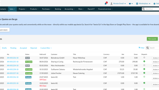
Bexio's New Feature Embedded Banner
Every bexio customer who opens the desktop quoting page sees this banner sitting directly above their quote...
Existing customer? Sign in
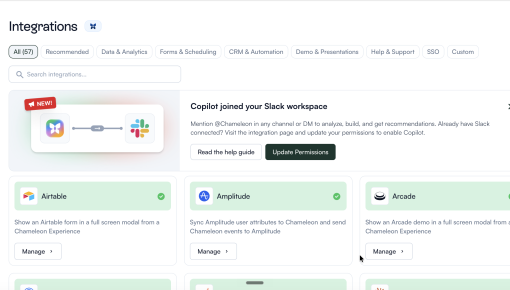
Announcing a new feature without hijacking the screen is a hard problem. Zapier's modal appears only inside the folder view where the feature lives, shows a preview of the output, and points you to the button to click next. It teaches in context, and gets out of the way if you're not in the mood.
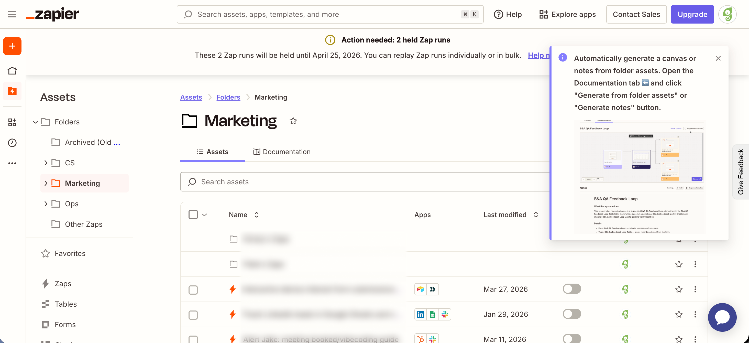
This modal doesn't appear on login, or inside a generic 'What's new' panel. It only shows up inside the folder view where the new feature lives. A user who opens that view is already thinking about folder contents, which makes the announcement feel more like a helpful tip than a pop-up.

A small preview image inside the modal shows what the new feature produces. The user doesn't need to imagine the output or click anywhere to see it. Building that preview alongside the body copy takes extra work, but it turns the announcement into something closer to a demo than a notice.
The body reads as pure instructions. Open a specific tab, click a specific button. There's no marketing wrap-around and no 'introducing our newest feature' throat-clearing. A left-pointing arrow emoji points at the tab where the action lives. Finish reading, and you already know exactly what to click and where to find it.
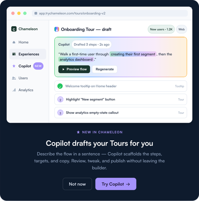
Build a Tour to announce a new feature and drive discovery.
Start a free trial or talk to our team.