


Picture this: You've poured thousands of dollars into marketing your product and then thousands more into pushing it out through sales reps. The revenue still looks underwhelming, and so does your customer satisfaction score.
What went wrong?
No matter how much money and resources you’re willing to invest into marketing and sales, the ROI will never be enough if your product doesn’t have a solid UX to empower users.
Now more than ever, user experience can make or break your SaaS business. So let’s go through the five essential UX principles to build user-friendly interfaces and drive product adoption from hello.
UX principles are critical to designing a functional, appealing, and reliable product that makes life easy for your customers.
Getting the product UX right can ramp up conversions, nudge users to activation, and win users' buy-in.
The five fundamental UX principles for product adoption are usability, clarity, accessibility, relevance, and consistency. We’ll walk you through each in detail to help you unlock product adoption.
Principle #1: Usability
Usability defines the ease of using a product to achieve specific goals. It measures a product's efficiency and effectiveness to help users achieve the expected value while maintaining high productivity.
A user-centric design focuses on both the logical and emotional side of the product. For example, improving a product's usability could mean:
Removing friction points to avoid frustrating the users
Making onboarding workflows more seamless to speed up activation
Creating easy-to-follow documentation to answer questions effortlessly
Using mental models with common UI elements to help users get a hang of the product quickly
Here’s how Jenny Reeves, Director of UX at Gordian, underlines the importance of usability in product design.

As attention spans contract and peoples’ lives grow ever busier, users are raising their standards for intuitive usability. If an app even seems remotely difficult to use, many users won’t bother to install it. They’ve developed a set of expectations for speed, functionality, and design, and it’s up to designers to at least meet those expectations (if not exceed them).
Usability ensures that your users feel fully immersed in the product and recognize its functional value—maximizing user delight.
Here is a graph from the Interaction Design Foundation that shows the importance of how the product looks and feels to users, alongside its usability.

(Source)
Now let's look a deeper look at the five attributes that make a product design more usable.
5 key components of usability in product design
How do you check if a product passes the usability test for its intended audience? Here are five essential elements to review any product's usability.
Efficiency: Is the product fast enough for users to perform required actions and finish tasks?
Learnability: Is it easy for new users to understand the product’s basic functionality and design with a short learning curve?
Memorability: Can users recall the product’s navigation and design if they use it long after their onboarding experience?
Errors: What kind of errors do the users make repeatedly, are these errors easily amendable?
Satisfaction: How satisfied or pleased are the users with the in-product experiences and design?
That said, testing UX patterns for usability requires in-depth planning and click tracking to get the most accurate results. Let’s explore why and how to conduct usability testing for your product.
How to conduct usability testing for a product
Successful product teams perform usability testing at every stage of the product’s development lifecycle instead of leaving it as an afterthought. Think of it as a non-negotiable condition to create a functional and valuable product.
To conduct a usability test, be clear on the kind of insights you want from the testing process. Then, shortlist and interact with a group of potential users via Microsurveys, screening sessions, or interviews. Use these interactions to identify expectations, challenges, and aspirations relevant to your product’s functionality and design.
If you’re a product owner, here’s a handy list of questions to get your potential users’ take on your product’s usability:
What are a few reasons for potential users to search for or make use of your product?
What are a few reasons holding back potential users from trying your product?
What are the main jobs to be done that your product helps them accomplish?
What are the challenges stopping users from completing these jobs to be done?
What contextual factors would make your product more useful for potential users?
Once you’ve gathered enough intel, analyze the data to make conclusive decisions about your product design and in-app flow and ultimately increase product adoption.
Principle #2: Clarity
Clarity measures how easily and quickly the product design delivers the right message at the right time. It's about removing all distractions in the UX design to convey only the most relevant information.
Clarity is a catalyst for usability. It involves organizing information, creating in-app messages, and designing a navigation flow to make the product a breeze to operate.
For example, a clear user experience would focus on:
Streamlining product interactions to produce “aha!” moments quickly
Making the navigation structure more intuitive and user-friendly
Writing clear copy, and choosing compatible colors that align with the brand identity and color psychology
Put simply, clarity is about making information and functions instantly understandable and easy to use. Take a look at four actionable ways to incorporate clarity in product design.
How to bring clarity to product design
Clear and simple design simplifies the product for all users—when done right. It gives them more control over the app to understand every feature, manage tasks, and hit the desired goals.
Here are four best practices to bring clarity to your design and maximize user control and freedom.
Use information architecture: Organize all textual and visual information in order of relevance to the users. Create a seamless hierarchy to help users navigate and discover the app without hiccups.
Design with visual hierarchy: You need a visual map with the right colors, contrast, and size to present information visually. A visual hierarchy guides users to complete key actions and do the job effortlessly. To create a solid visual hierarchy, you should declutter your design and remove any irrelevant elements, like flowery fonts or generic content, and create mental models taking inspiration from similar products to reduce the cognitive efforts they put into learning the product
Follow the Gestalt Laws: Gestalt psychology explains how the human brain interprets information quickly using visual patterns. The Gestalt Laws of visual perception offer these seven core UX principles to create clarity in product design:
Proximity: We tend to link visual elements that are close together as a whole
Similarity: We look for common patterns in colors, shapes, and sizes, and our mind naturally groups similar things together
Common region: When the same barrier encompasses a group of objects, e.g. within a box on the page, we tend to think of them as a whole
Focal point: Our brain places a visual hierarchy on objects that stand out against a regular pattern, so anything that doesn't follow an order will grab our attention first
Continuity: Our mind tends to follow the simplest line pattern on the page, even if the objects are not obviously linked
Closure: We interpret incomplete lines and patterns as 'closed' to see something we're familiar with
Figure-ground: Our brain typically processes the smaller item in the image as the 'figure' and the larger item as the 'ground' – processing the figure first.
Leverage modularity: A modular interface lets users customize and configure the product to their choice. Modular design empowers different user personas to conveniently modify and operate the app, giving them clarity to unlock product value at different levels.
Clarity helps users understand what happens when they interact with different elements of the user interface. Doing so enhances their overall experience to boost customer retention and decrease churn.
Principle #3: Accessibility
Accessibility eliminates barriers preventing someone from understanding or accessing a product. An accessible design enables people with disabilities to use an app without restrictions.
At its core, accessibility in UX is about creating a level playing field for all types of users. Here's how Micheál Heffernan, Senior Manager for Copy and Content at Learnosity, puts it.

Accessibility is just another input mode in designing a good user experience. Treating it as a separate thing is like adding eggs to a cake that’s already sitting in the oven.
Product teams need to have a deep understanding of the differences in user behavior, especially for people with diverse needs, to create accessible interfaces. It’s an ongoing process of trial and error relying on user feedback and iterations.
That said, product teams can incorporate the principle of accessibility in their designs by following a few ground rules.
After extensive research, Xuan Zhu, Product Design Lead at LinkedIn, and Ruoqian Li, User Experience Designer at LinkedIn, wrote about the findings in their article on how to weave accessibility design into your design process. Below, you’ll find their chart that summarizes accessibility needs and how they impact UX design, user needs, and assistive technology needed.

(Source)
How to embrace accessibility in product design
Follow these widely accepted guidelines to make product design more accessible.
Font style and size: Use large and clear fonts to present information neatly. Fonts in the sans-serif typeface, like Arial and Verdana, are more reader-friendly for people with Dyslexia. A text size between 14-16 pt works well for users with visual impairments. An average length of 50-70 characters per line is best suited for Autistic and Dyslexic users. Besides, an option to convert text to speed and read the text aloud also makes the design more accessible.
Colors and contrast: Colors of texts, visuals, and other cues in the product can affect usability for people with diverse abilities. Accessible designs include high-contrast colors for the background and text. Avoid color combinations that affect people with color blindness, like red & green or blue & yellow. Don't use colors to communicate critical information to ensure people with visual impairments or color blindness can use the product correctly.
Motion and animation: Moving elements and patterns can complicate things for people with sensory disorders like epilepsy. Avoid including too much movement or flashy animations in the product. The rule of thumb for animations is to keep it to 3 seconds or less.
Accessible support: Product teams can simplify the user experience for people with diverse needs by offering in-line help within the product. Think of in-app widgets, interactive product tours, tooltips, and more.
Accessibility is a compliance requirement in many industries. However, even if you’re not obliged to meet accessibility guidelines, designing accessible software can help you reach a wider audience and significantly improve user experience.
Principle #4: Relevance
Building a relevant product is closely aligned with user behavior. You have to constantly document and study user interactions with the interface to stay on top of their preferences and pain points. Use this information to add or modify contextual messages in the app.
For example, let’s consider that most users get stuck at the same point of user onboarding. So, you add tooltips to guide users through specific features and use contextual relevance to reduce friction and improve feature adoption.
How to provide relevant in-app guidance
In-app guidance is one of the most effective ways to deliver relevant information at the right time within the product. This guidance can enable users to seamlessly navigate the app and deal with any issues in the process.
Here are a few ways to offer in-app guidance to your users:
Onboarding checklists: Create an in-app widget that includes a list of items a new user has to complete to set up their profile in the app
Product tours: Create interactive tours of the product and features to give users an overview of what they can use and explore further
Tooltips: Add contextual nudges and additional information to help users figure out the next steps if they get stuck anywhere
Help menus: Add self-serve support widgets to let users find the answers they're looking for as quickly as possible

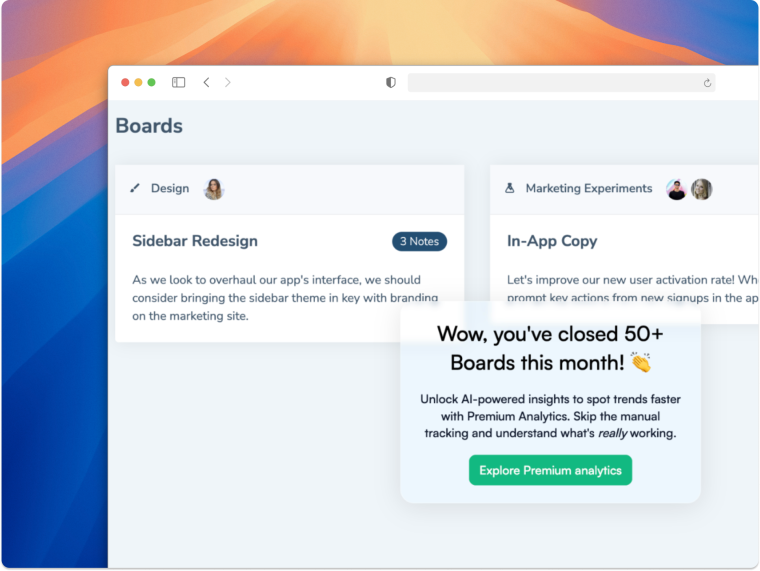
An example of an onboarding checklist built with Chameleon
Intuitive product design is about creating relevance for users at different points in the product. In-app guidance delivers this relevance to help users avoid friction and frustration and increase their engagement with your product.
Principle #5: Consistency
Consistency is the UX principle to make your product interface more coherent and memorable. Consistent design patterns make it easier for users to learn about the app's functionality, flows, and deliver better usability.
Here’s what Gene Kamenez, Co-Founder and CEO at Uxcel, has to say about design principles and their impact on UX.

Design principles are an essential toolset for a modern designer. It helps create great products for people, not just solve user stories. At Uxcel, we silver line our user experience with these UX design principles from day one.
Instead of reinventing the wheel, product teams can stick to an interface similar to a product existing in the same niche or industry. This is only to maintain consistency and create familiarity, allowing users to switch from one product to another effortlessly.
Maintaining consistency makes it easier for you to introduce new features or product upgrades using design elements the user is already familiar with.
Uxcel does exactly this with its own product. Take a look at the visual they sent our way highlighting their go-to UX principles.

(Source)
Now, let’s look at a few proven tips to maintain consistency in product design and simplify the user experience.
How to keep consistency in product design
The consistent design eliminates confusion and unexpected errors for the users. It also saves them the struggle of learning every feature from scratch by leveraging their knowledge of using similar products.
Here’s how you can create a consistent design for your product:
Bring cohesiveness into your interface using visual storytelling and create recognizable patterns across different pages
Choose a fixed typeface and color palette for the entire product and make it relevant to your user personas
Use similar visual cues across the app to help users learn the nuances better
Design all CTA buttons in the same colors and sizes to make them easily distinguishable
In essence, consistency in UX design makes your product’s interface more predictable—which reduces the cognitive efforts needed to understand the app better.
Let’s wrap it all up
Investing in a strong product design is more than a nice-to-have today. With the stream of options available to your potential users, creating a weak UX design means you’re leaving money on the table—for your competitors.
These five UX principles will help you design a functional, appealing, and reliable product that makes life easy for your customers. Don't forget to do your homework and create a strategy before you put any of these principles into action and you’ll come out on top!
Design a seamless UX for happy users
Follow the key UX principles and create effective product Tours, Tooltips, Microsurveys, and various in-app widgets quickly with Chameleon. Start for free by playing around in our sandbox environment or book a personalized call with our product expert.


