


Ever used a new app and immediately knew where to look? That’s good UI design.
Ever used a new app and spent five seconds wondering, What am I supposed to do here? That’s a missed opportunity.
UI design patterns are reusable solutions that help designers highlight key elements—a new feature, an urgent alert, or a subtle nudge toward an action.
But user behavior changes. People scroll faster. They dismiss pop-ups without thinking. Confusing layouts? Users won’t stick around to figure them out.
In this article, we explore innovative UI design patterns that help you highlight elements in your app without disrupting the experience. Plus, we break down real-world use cases to show how these patterns drive engagement.
Let’s get into it!
What are UI design patterns?
UI design patterns are repeatable solutions to common user interface challenges. They help designers create layouts that are intuitive, efficient, and easy to navigate.
Think of UI design patterns as shortcuts to great design. Instead of reinventing the wheel every time, designers use established patterns to guide users through an app without friction.
A few classic examples:
✅ Navigation menus: Keep users oriented and moving smoothly
✅ Modals and tooltips: Provide extra info without cluttering the main screen
✅ Progress indicators: Show users where they are in a process (think checkout steps)
5 Innovative UI design patterns for highlighting elements
People don’t always immediately see what you want them to see when they use your product. Whether it’s a new feature, a critical step in a workflow, or an action they keep missing, getting their attention without disrupting the experience is a challenge.
Let’s look at five innovative UI design patterns that help highlight important elements in an app—while keeping the experience smooth and intuitive.
“The pattern should make the highlighted element obvious, but it should not disrupt the flow or overwhelm the user. Context is key, so make sure the highlighted element aligns with the user’s current task or goal.”
1. Spotlight effect
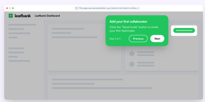
The spotlight effect is a UI pattern that dims the background and highlights a key element, drawing user attention without feeling intrusive. Instead of using pop-ups that demand focus, this method subtly guides users to the next step—whether it’s a button, feature, or important action.
Chameleon does this brilliantly in its product tours. Take the example above: when guiding users to invite a teammate, the UI fades into the background, and the tooltip stands out. This works because it reduces cognitive load. Users don’t have to scan the page or guess what to do next—the UI directs them effortlessly.
But balance is key. If overused, it can feel restrictive, like the app is taking too much control.
“Focus on one element at a time. Highlighting something prevents a user feeling overwhelmed. It helps your users maintain focus."
2. Pulsating animations
A pulsating animation is a UI pattern that gently expands and contracts an element, creating a rhythmic motion that catches the eye without being disruptive. Instead of demanding attention with pop-ups, pulsating elements act as visual cues—guiding users toward key actions naturally.
A great example of this is Grammarly’s step-by-step guidance. When users interact with the editor, key elements like goal-setting, title suggestions, and correction prompts subtly pulse to indicate where to focus next. This ensures users move through the workflow smoothly—one step at a time, without confusion.
“A gentle pulsating button subtly grabs attention without being overwhelming, helping users feel nudged into action rather than forced."
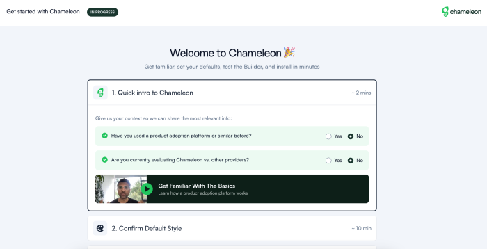
3. Guided tours
A guided tour is an interactive onboarding flow that walks users through an app, step by step. Instead of leaving users to figure things out on their own, it provides clear instructions, highlights key actions, and minimizes friction.
These product tours often use tooltips, spotlights, or pop-ups to direct attention to specific features. The goal? Make onboarding seamless. Users learn by doing—clicking, interacting, and exploring as they go.
See it in action with this interactive demo from Chameleon 👇
4. Tooltips and hints
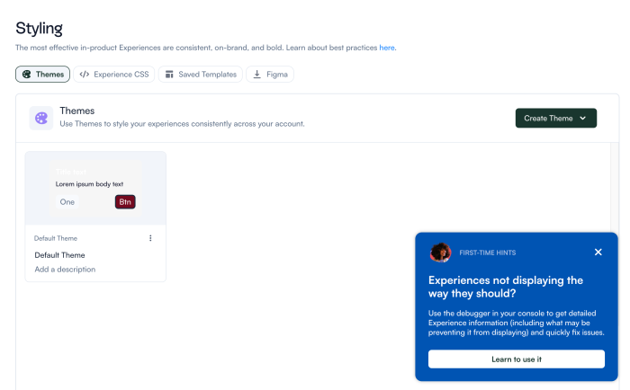
Tooltips and hints are small, contextual pop-ups that provide extra guidance exactly when users need it—without cluttering the interface. They appear when hovering over an icon, clicking a help button, or encountering a new feature, giving just enough information to keep users moving forward without frustration.
Chameleon does this well with its First-Time Hints, like in the example above. Instead of overwhelming users with instructions upfront, these hints appear at the right moment to guide them through the interface. If a user is stuck, they can engage with the tooltip. If not, they can ignore it and continue uninterrupted.
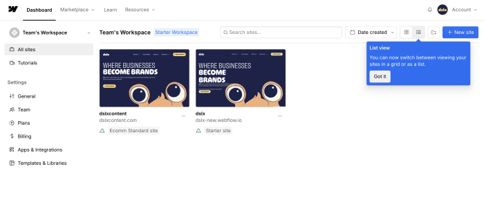
Webflow’s tooltips also provide inline explanations for new features, like the List View toggle. Instead of making users hunt through documentation, Webflow delivers the right information in context. The tooltip clearly explains the change, offers a quick action (click Got it), and disappears once acknowledged—making it useful and non-intrusive.
"Overusing UI patterns can make the interface feel cluttered and confusing. Use patterns sparingly and purposefully to keep the experience smooth."
5. Color accents and highlights
Color accents and highlights are subtle yet powerful design cues that draw attention to key elements without overwhelming the UI. Instead of relying on pop-ups or animations, this pattern uses contrasting colors, bold text, or highlights to naturally guide users’ eyes to important actions.
For example, a primary CTA button often stands out in a bright, contrasting color, making it clear where to click. Notification badges, progress indicators, and subtle background highlights also help signal priority without feeling intrusive.
Chameleon applies this effectively in its in-app guidance tools. When introducing a new feature, it often uses color accents to differentiate tooltips, step indicators, or progress markers—ensuring users don’t miss critical information. By blending seamlessly with the app’s design, these highlights reinforce guidance without disrupting the experience.
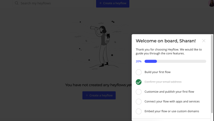
Heyflow, on the other hand, opts for a bolder contrast. The deep blue progress bar immediately signals how far a user has progressed, while bright blue highlights draw attention to interactive elements. This vibrant approach creates a sense of momentum, making onboarding feel dynamic and action-oriented.
The key? Use color with intention. Too many bright accents can dilute their impact, but when used sparingly, they become a powerful way to direct user attention and improve navigation.
Applying design patterns across platforms
Great UI design isn’t one-size-fits-all. A pattern that works seamlessly on a mobile app might feel clunky on a desktop, and web-based interfaces introduce their own interaction challenges.
Gestalt’s grouping principles—such as proximity, similarity, and continuity—ensure that UI patterns remain functional and user-friendly across platforms.
For example:
Proximity helps group related actions together, making interfaces easier to scan on mobile screens with limited space.
Similarity ensures consistency in buttons and navigation, so users quickly recognize interactive elements, whether they’re on an app or a web portal.
Continuity keeps users engaged by leading their eyes through a seamless flow—vital for onboarding experiences and multi-step processes.
When you align UI patterns with how users naturally process visual information, you can create interfaces that are functional and genuinely user-friendly across different platforms.
Let’s explore how different UI patterns translate across different digital experiences.
Web app UI patterns
Web apps rely on clear navigation, responsive layouts, and intuitive interactions to keep users engaged. Here’s how key UI patterns can be effectively implemented in web interfaces:
Persistent navigation: Web apps often have complex structures, so a sticky top bar or sidebar ensures users always have access to key sections.
Expandable sections: Collapsible menus, accordions, or expandable tooltips help keep interfaces clean and scannable without overwhelming users with too much information at once.
Inline editing: Instead of redirecting users to a separate page, inline editing lets them update content directly within the interface—reducing friction and improving efficiency.
Forms and progress indicators: Breaking long forms into bite-sized steps improves completion rates. Progress indicators help users stay oriented.
Adaptive layouts: Since users switch between large screens and resized browser windows, your product designs should be adaptive. Fluid grids and flexible spacing help maintain usability across different viewports.
Mobile app design patterns
Mobile apps demand fast, intuitive interactions with limited screen space. Every design choice should prioritize ease of use, clarity, and efficiency. Here’s how key UI patterns enhance mobile experiences:
Bottom navigation: Essential for apps with multiple sections, bottom navigation keeps key actions within thumb’s reach, ensuring smooth, one-handed use.
Swipe gestures: Swiping replaces taps for actions like deleting emails, switching tabs, or dismissing notifications, making navigation feel fluid and natural.
Floating action button (FAB): A persistent, highly visible button for primary actions like adding a new item or starting a chat. It reduces clutter while keeping key features accessible.
Card-based layouts: Cards help group related content while maintaining a clean, scannable interface—ideal for feeds, dashboards, and content-heavy apps.
Pull-to-refresh: A widely recognized pattern that allows users to refresh content with a simple downward swipe, reducing reliance on extra buttons.
Progressive disclosure: Instead of overwhelming users with too much information at once, mobile apps reveal details gradually—through expandable sections or "See More" options.
Sticky headers: Keep important navigation elements (like search bars or filters) fixed at the top so they remain accessible as users scroll.
Haptic feedback: Subtle vibrations enhance interactions, confirming actions like long presses, button taps, or errors, making the app feel more responsive.
Leveraging UI pattern libraries
UI pattern libraries like Angular and JavaScript are collections of pre-built, reusable design solutions that help developers and designers create consistent, well-structured interfaces quickly. Instead of building components from scratch, teams can pull from these libraries to maintain design uniformity, improve efficiency, and enhance user experience.
UI libraries often include buttons, forms, navigation menus, modal dialogs, and other UI components, all designed to follow best practices in usability and accessibility.
Here are a few open-source and free-to-use UI pattern libraries:
TailwindCSS: A utility-first CSS framework that lets developers build modern and responsive interfaces using pre-defined utility classes. It’s highly customizable and widely used, with 85,000+ GitHub stars and 6 million weekly downloads on NPM.
MUI (Material-UI): A React component library that implements Google’s Material Design system. It provides a range of customizable UI components, making it a top choice for React apps. MUI has 94,000+ GitHub stars.
Chakra UI: A modular and accessible component library for React, designed with flexibility and ease of use in mind. It includes pre-built themes and focuses on developer productivity. It has 30,000+ GitHub stars and 450,000 weekly downloads on NPM.
Ant Design: Built for enterprise-level applications, Ant Design offers a rich set of components tailored for business apps. It follows its own design language and has 93,000+ GitHub stars and 1.2 million weekly downloads on NPM.
React Bootstrap: The official React integration of Bootstrap, offering fully responsive, accessible UI components that align with the popular Bootstrap framework. It has 22,000+ GitHub stars and 2 million+ weekly downloads on NPM.
Uiverse: A community-driven library of open-source UI elements offering a vast collection of HTML, CSS, Tailwind, React, and Figma-ready components. It’s 100% free and features over 5,700 community-made UI elements.
Chameleon helps implement UI design patterns without coding
Designing a great UI is one thing—getting it in front of users, testing its impact, and iterating quickly? That’s where things slow down. Traditional implementation means writing custom code, waiting on developers, and hoping everything works as expected. But what if you could deploy UI design patterns in minutes, not weeks?
With Chameleon you can implement patterns like spotlight effects, tooltips, and guided tours without touching code. Whether you’re onboarding new users, announcing features, or refining navigation, Chameleon helps you bring UI design patterns to life—fast.

