


We rely on accurate data to make better product decisions, but business analytics often look at users as if they were a monolith, with metrics that lump everybody into one big block. Such broad strokes are never a good approach as that likely won’t help us get actionable insights. This is where cohort analysis comes in.
Cohort analysis helps you break the data down with context and nuance. This allows you to find answers that can actually lead to results. Not only do you need to see when and what users do, but you also need to understand why they do it.
Today, we go deep diving into understanding cohort analysis, why it’s important, and how you can leverage it to make data-driven decisions and solve problems.
Cohort analysis is a behavioral analytics method that divides the data into groups with common characteristics, otherwise known as cohorts.
A cohort is a group of people who have shared attributes.
Cohort analysis allows you to find customer behavior insights that are more contextual and targeted.
With cohort analysis you can reduce churn and boost conversion.
Cohort analysis has many use cases. Read on to find out.
What is cohort analysis?
Cohort analysis: a behavioral analytics method that divides the data into groups with common characteristics, otherwise known as cohorts.
Picture this. You start to notice that you are slowly bleeding users. You are wondering about what is happening. Like you always do, you turn to your data to see what the problem is.
The thing is, your data is only showing general statistics like total number of users viewing certain pages, and where users are dropping. It doesn’t show you who the usters dropping off are, what led them to get there, and how that compares to other types of users. It doesn’t show you where the problem really lies.
Cohort analysis is essentially the antidote to this confusion. Instead of looking at all users as a single shapeless mass, you break them down into groups. Then you measure how those cohorts behave, allowing you to notice patterns that differentiate certain cohorts from others.
Here, a cohort is a group of people who have shared attributes. You can break users into cohorts however you see fit, as long as each of those groups have something in common, and they can be measured against one another.
The purpose of cohort analysis
When would you exactly conduct cohort analysis? Simple. When you have a question, and you need an answer that is backed by data-driven evidence.
A large undifferentiated dataset, most often than not, won’t give you what you need, because you’re dealing with people. User behavior can differ in so many different ways due to how organically humans can act. We are not robots that all follow a script.
Cohort analysis allows you to find insights that are more contextual and targeted, which leads to better informed decisions
Types of cohort analysis
All cohort analyses start with their cohort definition. The nature of the traits selected to divide users into groups will impact the approach, the type of questions you can answer, and the strategic value of the answers you can come up with.
In this sense, we can recognize two main types of cohorts that will determine the class of analysis we can conduct: acquisition and behavioral.
Acquisition cohorts
Acquisition cohorts, as its name suggests, are based on when users sign up for a product. Like any cohort, as mentioned earlier, groups are defined by a shared moment and a common event, but that event can’t be anything other than acquisition (purchase, registration, download, you name it). Acquisition cohorts are great for identifying when new users are churning, hence measuring retention and churn rates across a period.
Analyses like this are useful, for example, to measure the success of a product launch. You could break down your cohorts by day for the first week of launching, by week during the first month, and by month during the first six months after your product hits the market, to see how long people continue to use your app from their starting point.
Look out for moments where retention rates drop off drastically—is it on day one, when they had to register, or is it during week two when they finished your onboarding material? That way you’ll get a sense of where potential issues are happening.
Behavioral cohorts
There are some clear limits to what you can do with an acquisition cohort analysis, especially when you want to dive into the why of people leaving or staying—and that’s when behavioral cohorts come to the rescue.
With behavioral cohorts, the event that defines the group can be any action performed within the product after initial acquisition. Users can make hundreds of small actions that will eventually influence their final decision of believing or not in the product: using a certain feature, enabling notifications, integrating with other applications, uploading personal information, etc.
As previously mentioned, customer cohort analysis won't point out the exact causes of retention and churn, but with behavioral cohort analysis, you can test common behaviors of your most engaged active users and find sticky parts of your app. Similarly, you can track cohorts during a certain period to see how long they stay active after they interact with a tricky feature of your app.
For example, if you’re doubting your onboarding UX, you can perform an A/B test offering different onboarding experiences to different users and then track their behavior within the first two weeks as separate cohorts. That way, you’ll be able to compare retention rates and see if one option is much more successful at engaging your customers.
Cohort analysis example
For example, let’s say you want to increase your customer retention rate for your SaaS software. The thing is, you don’t know what exactly leads to higher retention, so you divide your users into cohorts such as users who have completed onboarding against those who haven’t.
After the analysis, you notice that users who have completed onboarding have greater retention rate over time, while users who haven’t have steep dropoff rates within a short period. This tells you that nudging users toward completing their onboarding is the solution to increase customer retention.
Apart from the example above, cohort analysis is applicable across a multitude of use cases such as:
Finding where users are churning
Figuring out what makes users more likely to convert
What leads users to sign up
Now, let’s explore further into all the benefits of cohort analysis and why it’s worth doing.
Use cases of cohort analysis (and benefits for each)
To briefly summarize, cohort analysis is essential for product-led growth—it allows you to examine trends over time and measure how different groups of users behave within your product. It lets you avoid being blinded by vanity metrics, and parse out key metrics into meaningful insights.
This has a myriad of use cases that you can apply to. Let’s take a look at some of the most common ones.
Use case #1: Locate where churn happens
When it comes to customer retention cohort analysis is a key tool. By looking at how certain actions led to a cohort's usage dropping off, you can identify with more accuracy where and how people are more likely to churn.
Use case #2: Optimize acquisition channels
Unsure of whether your marketing efforts are bearing fruit? Set acquisition channels as a differentiator for your cohorts and see how they’re performing. If, let’s say, users who came through your social media ads have a much higher drop-off rate than others, then you know there’s some room for improvement there.
Use case #3: Track different customer journeys
Each type of customer has a unique lifecycle. Monitoring different types of users throughout their journeys helps you understand stage-specific needs and identify issues sooner.
For example, new users will probably need more guidance and better user onboarding, advanced users will want new feature announcements and product upgrades—and all of them can experience the same or different problems along the way.
Cohort analysis reveals where you’ll need to offer extra help, like product tours to guide users or new features to keep the loyalty levels high, and when disturbing trends start to appear in a cohort, so you can react quickly to avoid its spread on the rest of the user base.
Use case #4: Finding where feature adoption excels (and where it doesn’t)
We all wish for that killer feature that will make users get to their “aha!” moment fast. It is one of the biggest factors when it comes to boosting user retention rates. Once again, this is a ripe place for cohort analysis. Set different feature interactions as cohorts and see which features lead to better or worse drop off rates for users.
How to conduct a cohort analysis in 5 steps
It’s clear that cohort analysis is a great tool. So how do you actually go about using it? Let’s take it step by step.
1. Set a clear goal
The right answers start with the right questions. In the case of making great product decisions, data is the answer, and the question is what you want to accomplish.
Are you having churn issues with existing customers and just can't figure out why it's happening? Do you want to boost conversion for new users coming out of free trials? Are you looking to increase your customer lifetime value with upsells and cross-sells? Whatever it is, decide what you want to do, whether it's to solve a problem or make improvements, and choose your goal first.
2. Decide what you want to measure
Once you have your question of what you want to know, then you have to define the metrics. Ask yourself, what should you measure in order to answer the question at hand? If the question is regarding free trial conversion, perhaps the metric could be conversion rate for users who have gone through the trial period. Any user event or interaction can be chosen as long as it is relevant to what you want to figure out.
3. Define your cohorts
With the question, and the metric chosen, now you have to divide users into different cohorts. Like your metrics, you can choose any attribute to differentiate between user groups, as long as it contributes to answering the question. Going back to the trial conversion example, perhaps your cohorts could be users who engaged with a certain feature, and those who did not, as shown below.

4. Create cohort analysis charts
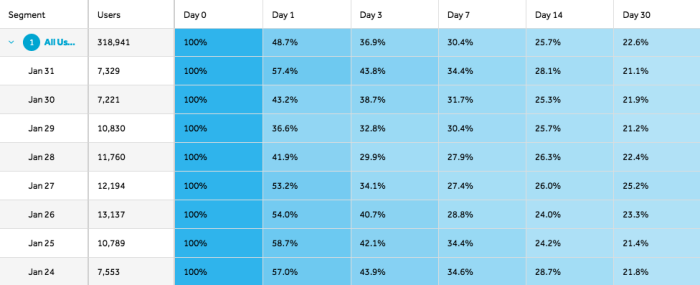
This is where you actually perform the cohort analysis. The data is arranged in a chart like below, called a “cohort chart”, where the combined metric you’re analyzing is displayed in the intersections between the vertical axis and the horizontal one.

A simple example of what a cohort analysis chart looks like when created with Mixpanel
At a glance, it can seem overwhelming, so let’s go through it together:
The vertical axis show cohorts depending on the date of the event’s occurrence, such as the user acquisition date, with the oldest cohorts on the top and the newest at the bottom. In this particular chart, we have monthly cohorts of people who installed an app, starting from February through to August. The first column shows us the dates of installation, the second one the number of users who installed the app that month.
The horizontal axis shows the passage of time. Across it, you’ll find different periods (always from the same length) since the start of each cohort. In the example above, they range from month 0 (the month of acquisition) to month 6, six months from the month of acquisition.
The cells in the middle show the core data for the metric you’re examining—in this case, retention rates N months after acquisition. You’ll always have more data from the oldest cohorts because they were analyzed earlier, resulting in the typical triangle shape of a cohort chart—therefore sometimes referred to as the triangle chart.
After visualizing the whole chart, there are three ways to read it.
Vertically. If we go across a single column, we can analyze the progress of the metric in the same month of acquisition (same moment in the user life cycle) across cohorts.
Horizontally. If we look at the same row, we’ll be analyzing the evolution of the metric in the same cohort throughout time. In the example, how retention rates decrease from month 0 to month 6 in the first cohort.
Diagonally. We can take a peek at how the metric looks like the same calendar month in all cohorts—for example, August user retention rates.
A few additional notes on cohort chart reading. It’s important to be cautious about the cohort size. If they’re too small, your cohort metrics will vary widely and potential analyses will be worthless. A good practice when it comes to visualizing trends is to use color shading. It will be easier to see how the value progresses or decays, and when anomalies appear.
5. Test your findings and get results
Once you’ve got an answer in your hand, then you have to test it out. Do a simple A/B test that tweaks the in-product experience based on your findings. If the experiment actually yields results, voila! Your cohort analysis worked as it should.
Best tools for cohort analysis for Product teams
So how do you get started with cohort analysis? You could try commonly used tools like Google Analytics, but if you’re looking to extract insights regarding your SaaS product, and obtain meaningful engagement metrics, then you need something that is more in line with product analytics. Plus, these tools will give you a visually more informative cohort analysis report.
Here are our top three recommendations.
1. Heap
Heap allows you to have a 360-view of your user journeys. It comes with deep segmentation and other valuable features.
Heap’s cohort analysis tool is called Retention Analysis, with whcoich you can set up a Retention Report. Heap’s cohort grouping really goes into detail so you can capture all kinds of differentiators, like this:

(Source)
With this feature, you can easily create cohort analysis charts, and here’s an example of what it could look like. As they explain in their article, “the table view allows you to see a breakdown of activity for each cohort during each rolling window—each row represents a cohort of users and each column represents a rolling window from the start event, defined by the granularity.”

(Source)
2. Mixpanel
Mixpanel is another great option that counts as a best-in-class product analytics tool. It also comes with a handy Retention Report feature, with which you can be very specific in how you configure your cohorts.

(Source)
With Mixpanel, you can see the retention curve and the chart at the same time, which saves the toggle you have to do in order to see the results from different perspectives.

(Source)
As they explain in their Retention Report Overview, “retention of your users is critical to achieving product-market fit and sustainable long-term growth, and this report will help you understand how long users continue to come back and find value from your product.”
3. Amplitude
With Amplitude, you can also segment your cohorts with precision, allowing you to examine users’ behavior within your product.
Here’s an example of what the configuration could look like.

(Source)
Amplitude has a built-in Retention Report system that helps you easily generate cohort analysis charts. This provides you with a table “displaying a detailed breakdown of the data, broken out by each user cohort and into more granular individual day buckets”.
(Source)
As explained in their help section on interpreting retention analysis, Amplitude also has a feature called Microscope, which allows you to dig deeper into individual data points. This comes in handy if you want a more thorough understanding of user interactions at specific places in your analysis.

(Source)
Get started with cohort analysis
All in all, the above three tools are all great options for getting started with implementing cohort analysis as part of your set of data analytics tools.
But don't forget, once you have the cohort data, it is essential that you experiment with your product. These insights mean nothing if you don't take action and iterate.
To do this, you can use a product adoption platform, like Chameleon, to easily create in-product experiences and experiment with different formats of in-app messages,, or even better, do native A/B testing. Then learn from those experiments with further cohort analysis, and keep iterating after that. It’s a virtuous cycle.
With Chameleon, you can effortlessly connect all your product data in an easy-to-read Dashboard, thanks to our seamless integrations with Mixpanel, Heap and Amplitude. Set up a fluid analytics loop that keeps on giving.

Discover the Mixpanel and Chameleon integration
Leverage your Mixpanel cohorts and target them with specific in-product Chameleon Experiences.


