


If product management is the brain of a company’s product strategy, then product operations (or product ops) is the nervous system.
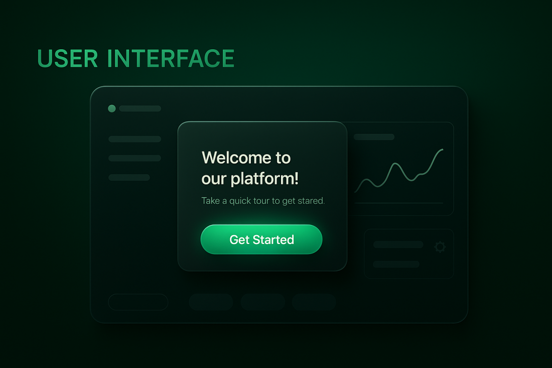
User interface is how your users "talk to" and interact with applications. UI includes all the visual elements and layout that's included in your product, including the buttons, icons, color schemes, and typography. UI design, by extension, is the process of designing the user interface by focusing on the visual elements and layout of a product.
Picture this - it's the weekend and you decide to binge watching your favorite TV show on Netflix and rewind for a bit. You get your phone, log into the app, and a few short taps later you're on your favorite episode. And you know what made this little adventure possible? UI design.
User interface is how you could "talk to" and interact with Netflix. Think of it like the bridge between you and your favorite apps —a digital handshake that determines whether users feel at home or lost in a maze. It’s everything you see and interact with on a screen, from buttons and icons to layouts and color schemes.
Without UI, none of the apps you use would ever be usable. This is because at its core, UI is about usability and aesthetics. It is natural language interface guides users effortlessly through a product, making interactions seamless and enjoyable instead of frustrating.
People ignore design that ignores people
You could have the most powerful, most innovative product on the planet, but if users struggle to navigate it, they’ll bounce faster than a bad first date. A great UI has these elements:
- It boosts engagement – Users stay longer when they actually enjoy the experience.
- It enhances functionality – Good design makes features easy to discover and use.
- It communicates brand identity – Every font, button, and animation speaks volumes about your brand’s personality.
Whether it’s a minimalist design that screams elegance or a bold, interactive interface that keeps users engaged, your UI sets the tone. In this article, you'll know everything there is to know about User interface and how to design the perfect UI.
Let's dive in.
Importance of User Interfaces
What's the difference between a good user interface and great UI? Glad you asked. Great UI makes all the difference between users sticking around or bouncing within seconds.
When an interface is smooth, intuitive, and friction-free, users engage more, stay longer, and convert faster.
Here’s why UI design is a legit growth lever:
Effortless navigation → higher satisfaction – When users don’t have to think twice about where to click, they enjoy the experience and interact more.
Seamless interactions → better retention – A well-designed UI keeps users engaged, making them more likely to return.
Frictionless workflows → more conversions – The easier it is to complete key actions, the faster users move through the funnel.
A clunky, confusing interface is a conversion killer. But a UI that guides users effortlessly to value? That’s how great products win (or at least start to).
Difference between User Interface (UI) and User Experience (UX)
UI and UX (user experience) go together like peanut butter and jelly, but they’re not the same thing.
User Experience (UX) is about the entire user journey - how intuitive, efficient, and satisfying an interaction feels. It includes factors like response time, navigation flow, and content clarity that shape how users perceive a product.
User Interface (UI) is the visual and interactive layer - the buttons, colors, typography, and animations that guide users through a digital experience.
Think of it this way: UI is the car’s dashboard, UX is the driving experience. A sleek dashboard (UI) means nothing if the ride is clunky and confusing (UX). To create a truly great product, you need both working in harmony.
UI comprises creative design elements linked to the look and feel of the end user who's experience, whereas UX involves components like market research and understanding consumer needs.
A great digital product needs both - a visually appealing UI that complements a frictionless UX, ensuring that users not only enjoy the experience but also accomplish their goals with ease.
Types of User Interfaces
User interfaces (UI) aren’t one-size-fits-all. Different technologies and user needs call for different types of interaction models. Whether you’re clicking a button, swiping on a touchscreen, or speaking to a voice assistant, each UI type serves a specific purpose in making digital experiences more intuitive and efficient.
There are various types of UI but they all have one thing in common - they enable users to interact with an application or website and achieve their goals.
Here’s a breakdown of the most common types of user interfaces and where you’ll find them in action:
1. Graphical User Interface (GUI) – The Standard for Digital Products
This is the UI most people interact with daily - think buttons, icons, menus, and windows on websites, mobile apps, and software. GUIs rely on visual elements to make digital interactions accessible to users of all skill levels.
Where you’ll see it: Operating systems (Windows, macOS), web apps, mobile apps.
Why it works: Intuitive, widely adopted, and visually driven for easy navigation.
2. Command-Line Interface (CLI) – The Power User’s Playground
Forget flashy buttons - CLIs rely on text-based commands to interact with a system. They require more technical knowledge but provide unmatched speed and flexibility for developers and IT professionals. Command-line interfaces (CLI) require users to type specific commands to interact with computers.
Where you’ll see it: Linux terminal, Windows Command Prompt, cloud infrastructure management.
Why it works: Efficient for advanced users, automation-friendly, minimal system resource usage.
3. Menu-Driven Interface – Simple and Structured Navigation
A menu-driven UI provides a list of options that users can select to navigate a system - perfect for simplifying complex choices.
Where you’ll see it: ATMs, kiosks, early mobile phone UIs.
Why it works: Easy to follow, no learning curve, guides users step by step.
4. Touch User Interface – The Mobile-First Standard
With smartphones and tablets dominating digital interactions, touch UIs rely on gestures like tapping, swiping, and pinching to have users navigate through apps.
Touch user interfaces allow users to interact through touch on screens using fingers.
Where you’ll see it: iOS, Android, interactive kiosks, smart home devices.
Why it works: Fast, natural interactions, designed for mobile accessibility.
5. Voice User Interface (VUI) – Hands-Free Interactions
VUI enables users to interact via voice commands using natural language processing.
Voice-controlled UIs let users interact with a system through speech where no typing or clicking required. While still evolving, VUI is redefining accessibility and hands-free operation.
Where you’ll see it: Amazon Alexa, Google Assistant, Apple Siri.
Why it works: Convenient for multitasking, accessibility-friendly, fast-growing adoption in smart devices.
What is User Interface Design?
Now what we know what UI is, let's look at what user interface design is.
UI includes all the visual elements and layout that's included in your product, including the buttons, icons, color schemes, and typography. UI design, by extension, is the process of designing the user interface by focusing on the visual elements and layout of a product.
And that's what UI designers do - they consider factors like typography, color palettes, spacing, and interactive elements to create a user-friendly, functional and aesthetic looking interface.
Principles & Best practices for doing User interface design
A beautifully designed interface doesn't count for much if it’s confusing, inconsistent, or frustrating.
Here’s a breakdown of the key UI design principles that make or break a user’s experience:
1. Consistency: The Golden Rule of UI
Ever wondered why switching from one app to another doesn’t feel like learning an entirely new language? That’s consistency at play. Users rely on familiar patterns, and when UI elements behave predictably, it reduces cognitive load and improves usability.
Visual consistency – Fonts, colors, buttons, and icons should maintain a uniform style across the product.
Functional consistency – Similar actions should produce predictable results (e.g., a trash icon should always mean “delete”).
Internal & external consistency – Keep interactions within your product aligned, but also match industry-wide conventions (e.g., a gear icon = settings).
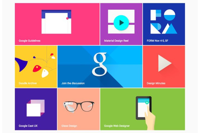
Example: Google’s Material Design framework ensures Android apps follow a consistent design language, making interactions intuitive across multiple apps.
2. Familiarity & Predictability: Make Users Feel at Home
Users shouldn’t have to decode your interface like a puzzle - the best UIs feel instantly familiar. By leveraging common UI patterns, designers make interactions more predictable and reduce friction for new users.
Use standard UI elements (e.g., hamburger menus, search bars, back buttons).
Stick to intuitive iconography - users shouldn’t have to guess what a symbol means.
Follow platform conventions - iOS apps shouldn’t feel like Android apps, and vice versa.
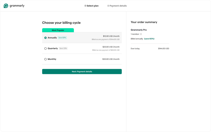
Example: Every checkout flow includes a payment selection, billing flow, and order confirmation page - no surprises, just familiarity.
3. Feedback: Keep Users in the Loop
Imagine clicking a button and nothing happens - was it broken? Did the app freeze? Users need instant feedback to confirm that their actions are registered.
Feedback mechanisms are essential in UI design to inform users of the outcome of their actions, so it enhances their confidence in using the interface. A few tips:
Use visual cues (button color changes, progress indicators) to show interaction.
Provide real-time validation (e.g., password strength meters, form error messages).
Offer clear system feedback (e.g., success confirmations, loading states).
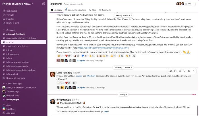
Example: When Slack channels are read, the text turns gray to show that the messages within the channel are read while the unread ones are in white.
4. Flexibility & Efficiency: Design for Newbies and Power Users
A great UI works for everyone - whether it’s a first-time user exploring the interface or a power user trying to get things done fast.
Progressive disclosure – Hide advanced features until they’re needed to prevent overwhelming users.
Keyboard shortcuts & gestures – Let experienced users bypass repetitive steps for faster workflows.
Multi-modal interactions – Allow users to interact using touch, keyboard, or voice, depending on preference.
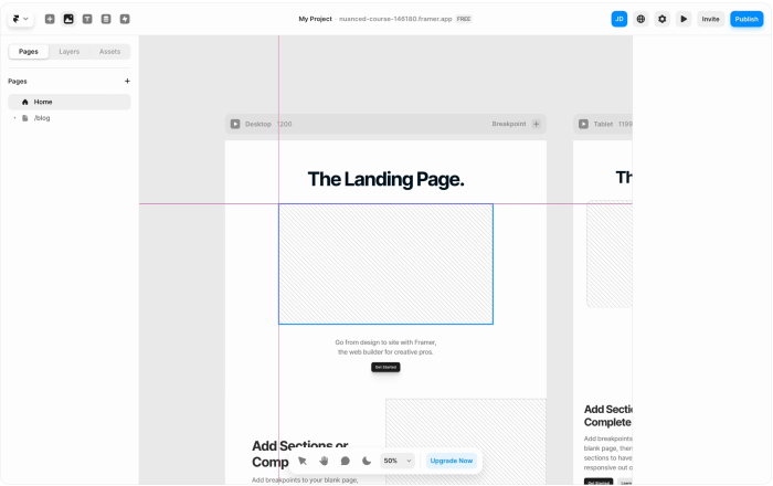
Example: Framer allows new users to design with simple drag-and-drop, while power users can leverage keyboard shortcuts for rapid prototyping.
The UI Design Process
User Interface (UI) design is more than just picking colors and arranging buttons. It is a structured, iterative process that ensures a product is not only visually appealing but also intuitive and functional. While UI designers typically come in during the later stages of product design, their role is essential in translating product vision into tangible, user-friendly experiences.
Here's a step by step on how execute the UI design process.
1. Understanding the User and Defining Objectives
Before designing a single screen, UI designers must have a deep understanding of who the users are, what they need, and how they will interact with the product. This requires analyzing user behavior, gathering insights from UX and user research themselves, and aligning with business objectives.
Conduct stakeholder interviews to understand the product’s vision.
Review user personas and journey maps to identify pain points.
Define core usability goals to guide the design direction.
Without a strong foundation in user understanding, even the most visually stunning UI can fail.
2. Information Architecture: Structuring the Experience
Once the objectives are clear, designers move to information architecture (IA) - the blueprint of the product’s interface. IA focuses on organizing content and navigation in a way that feels natural to users.
Define the hierarchy of pages and screens to ensure logical navigation.
Group related features and content to reduce cognitive load.
Plan for scalability, ensuring the UI structure can evolve with the product.
A well-organized IA is critical in preventing user frustration and ensuring smooth interaction flow.
3. Wireframing and Prototyping: Laying the Visual Foundation
Before jumping into high-fidelity designs, UI designers create wireframes and prototypes to establish layout, spacing, and interaction patterns.
Wireframing: Simple, low-fidelity sketches that outline screen layouts and key UI elements.
Prototyping: Interactive mockups that simulate real user interactions, allowing designers to test workflows.
At this stage, the focus is on functionality, not aesthetics. It is an opportunity to refine usability before investing time in final visuals.
4. Visual Design: Crafting the Look and Feel
Once wireframes and prototypes are validated, designers move into the visual design phase, where the UI truly takes shape. This includes:
Selecting typography, color schemes, and imagery that align with the brand identity.
Defining iconography, buttons, and interactive elements for consistency.
Establishing design systems to maintain uniformity across all screens.
A well-executed visual design enhances usability by guiding users’ attention to key actions and reinforcing the product’s identity.
5. Usability Testing: Validating Design Decisions
Even the most well-planned designs need real-world validation. Usability testing ensures that the UI is intuitive and free of friction.
Conduct A/B tests to compare different design variations.
Observe how users interact with prototypes, identifying potential usability issues.
Gather feedback on clarity, navigation, and responsiveness.
Testing helps designers catch and refine details before final implementation, preventing costly redesigns later
6. Interaction Design: Enhancing the User Experience
Interaction design focuses on micro interactions - the small but critical details that make a UI feel smooth and engaging.
Define hover states, animations, and transitions to provide feedback.
Optimize click targets, scrolling behaviors, and input responsiveness.
Ensure that interactions guide users naturally, rather than causing confusion.
A well-designed interface feels effortless because the interactions work exactly as users expect.
7. Implementation and Developer Handoff
A UI design is only as good as its execution. Designers work closely with developers to ensure that every element is built exactly as intended.
Provide detailed design specifications and assets through tools like Figma or Zeplin.
Ensure developers understand spacing, typography, and component behaviors.
Maintain communication to resolve discrepancies between design and implementation.
A strong designer-developer collaboration is essential in bringing a UI from concept to reality without losing its intended impact.
8. Review, Iteration, and Continuous Improvement
Even after launch, UI design is never truly finished. Continuous iteration based on user feedback, analytics, and usability testing ensures that the interface remains functional and effective as the product evolves.
Analyze user behavior data to identify friction points.
Conduct post-launch usability testing to refine the experience.
Update UI elements based on new trends, accessibility requirements, or feature expansions.
A great UI adapts over time, refining itself based on real user interactions rather than staying static.
UI Design Tools and Software
UI design is part creativity, part precision - and the right tools make all the difference. From wireframing to prototyping, modern UI design software helps teams create, test, and refine every element of a product before launch.
Here are some of the top UI design tools used by professionals:
Figma – Cloud-based collaboration with real-time design updates.
Sketch – A vector-based design tool built for macOS users.
Adobe XD – Ideal for prototyping, interactions, and seamless integrations.
InVision Studio – Combines design, prototyping, and collaboration.
Proto – Helps designers build fully interactive prototypes without code.
Marvel – Streamlined design, prototyping, and usability testing.
UXPin – Focuses on interactive elements and UX workflows.
Zeplin – Bridges the gap between design and development with structured handoff features.
Origami Studio – A tool created by Facebook for advanced prototyping and animation.
Uizard – AI-powered UI design, great for rapid prototyping.
Conclusion
UI is more than just a visual layer - it's a critical aspect of human-computer interaction, providing the first visual representations and interactive elements that users interact with. As technology evolves, UI design is transforming, bringing new ways for people to experience software beyond screens and buttons.
The next generation of UI design is about expanding how people interact with technology. Innovations like voice user interfaces (VUI), augmented reality (AR), and virtual reality (VR) are making digital experiences more immersive, intuitive, and accessible.
Voice UI (VUI) – Devices like Alexa and Google Assistant are proving that conversational interfaces are no longer futuristic—they're mainstream. UI designers are adapting to interactions that don’t rely on screens.
Augmented Reality (AR) – UI is now blending with the real world. Apps like IKEA Place let users see how furniture fits in their home before buying, reshaping the role of UI in e-commerce.
Virtual Reality (VR) – Entire digital environments are being designed in 3D, changing how users interact with applications in gaming, education, and training.
Despite these advancements, the core principles of good UI design remain the same -- boost user engagement, improve user functionality, and drive conversions. Read more on how to design an onboarding flow that incorporates the best UI principles.
