


The key lessons from brick-and-mortar expertise on how to engage new visitors.
The Apple retail store on 5th Avenue in New York City is designed to feel like an underground clubhouse.
Architect Peter Bohlin designed the store with the customer's literal journey in mind. The storefront is a giant glass cube that draws pedestrians' attention. To enter, you must step down an intricate (and patented!) staircase, which Bohlin says is supposed to make a “ceremony of descent.” Once finally underground, customers are treated to a treasure trove of sleek gadgetry.
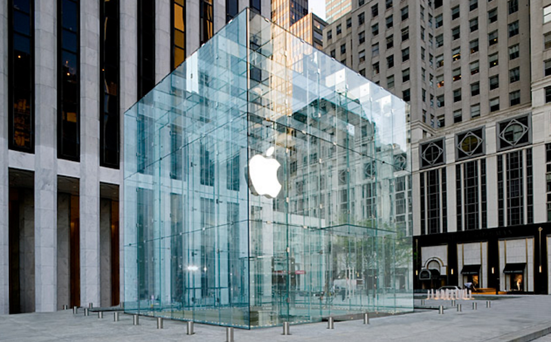
Much like its actual products, Apple stores are the result of brilliant, customer-centric engineering. They subtly, carefully inform the users' actions at every step of the journey. It's onboarding at its finest, and turns visitors into fans.
Here are the 3 top onboarding lessons your product can draw from these genius stores.
1. Do More Than Just Greet Customers At The Door
It's not unusual for brick-and-mortar stores to employ greeters. Retailers from Walmart to Barnes and Noble have been doing it for years, but Apple does more than greet customers—it ENGAGES them.
When customers walk into an Apple Store, a specialist with an iPad welcomes them and asks a simple question: “What are you here for today?” From there, the specialist directs that customer’s Apple journey based their needs; setting up an appointment at the Genius Bar or answering questions about a new product. And if customers don't need help, the specialist gets out of the way. 🤘
In addition, by engaging customers right off the bat, Apple establishes the role of specialists in the store. Users now know that anyone in the uniform is a resource they seek out. By using a consistent design patter (the Apple T-shirt), customers understand how to locate help when they need it. 🤘
What was a simple greeting became an important exchange of information: Apple learned something about the customer, and the customer learned something about Apple. Here’s how software can do the same thing:
Ask about visitors' needs to customize their experience
When visitors come to video hosting platform Wistia's homepage, they're asked a simple question: What is your main goal with video?
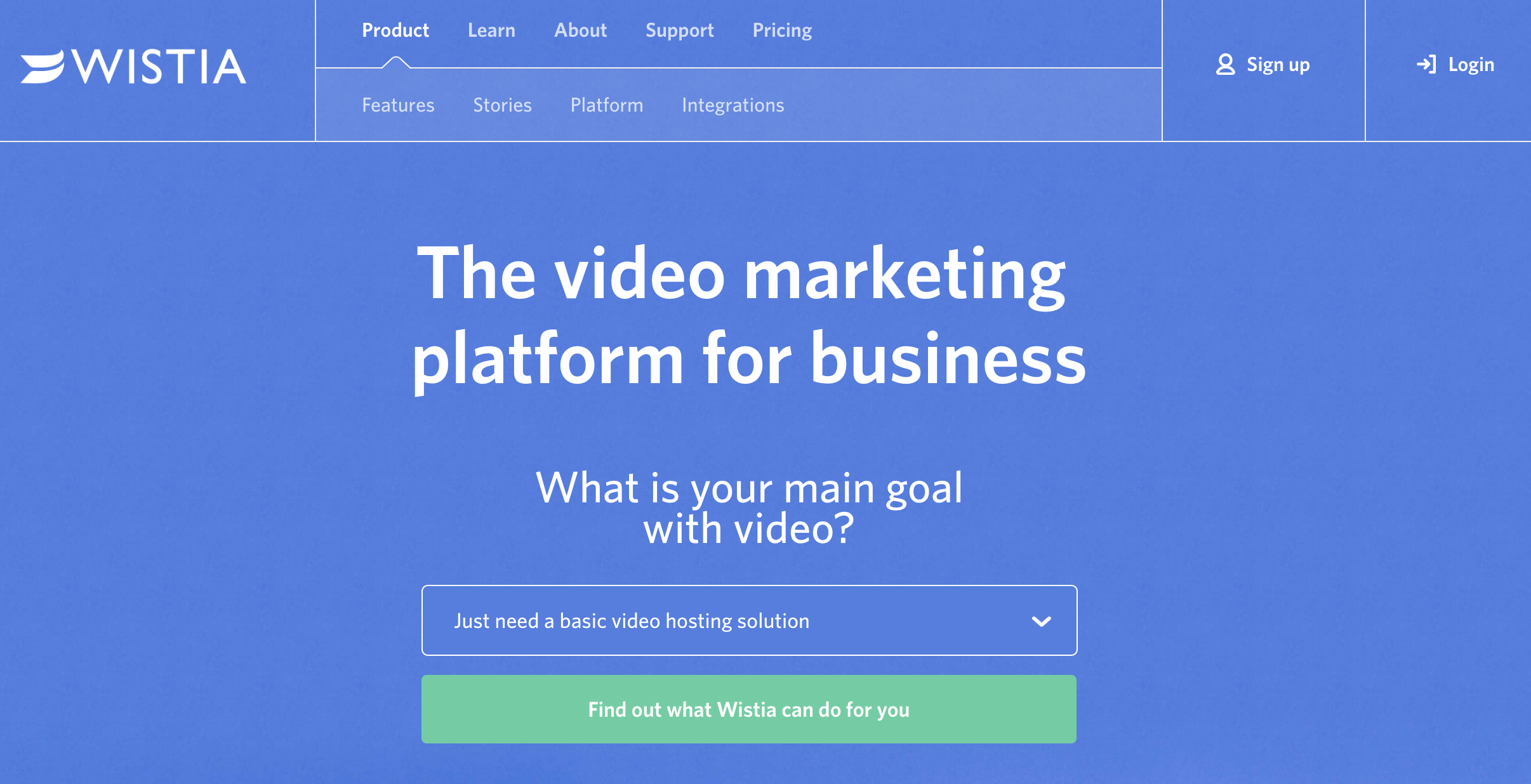
Depending on which use case Wistia visitors select, they're taken to a specific landing page that addresses their needs. Like many SaaS products, Wistia works with a bunch of different buyer personas.
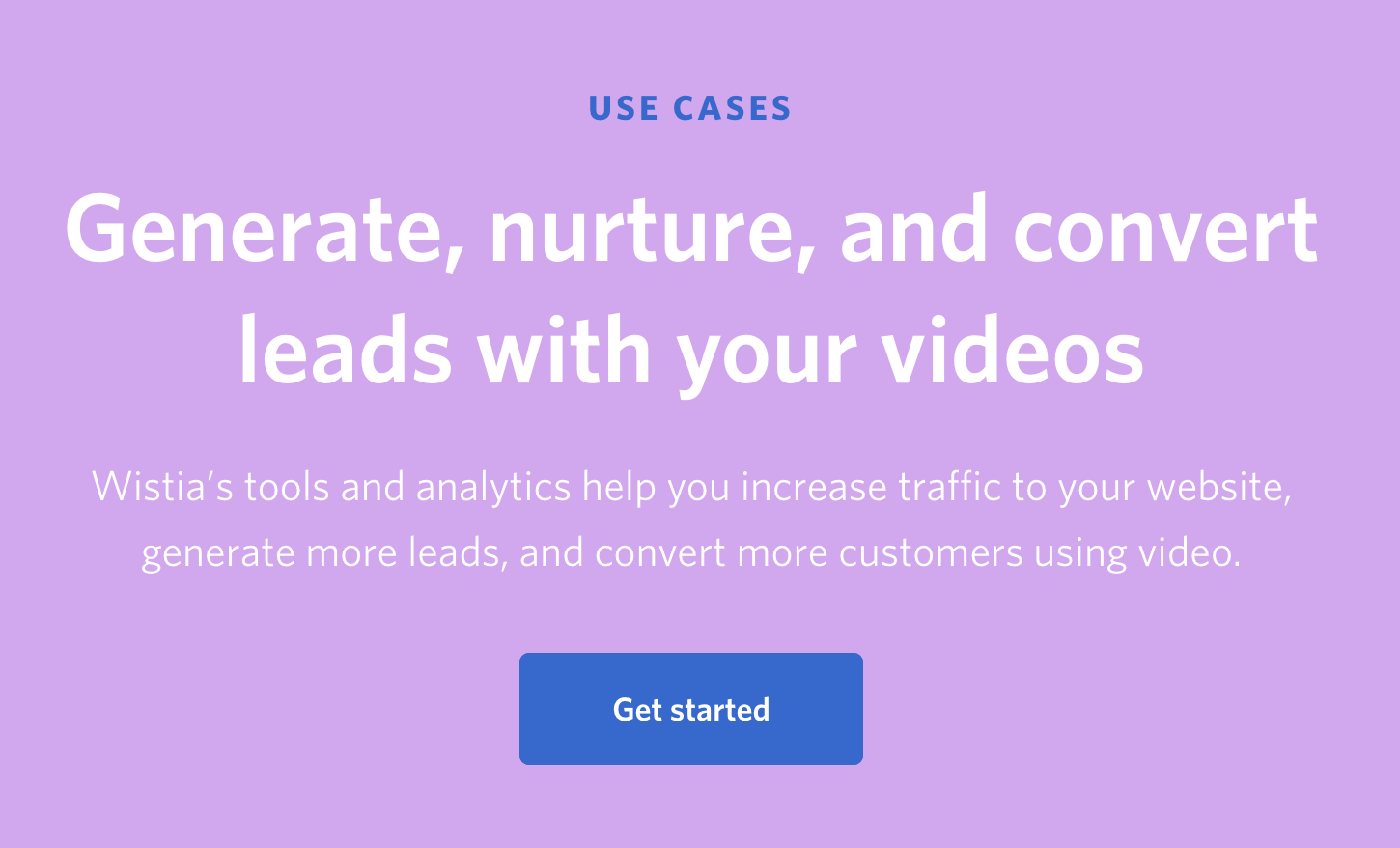
If they select “Improve my video marketing (capture leads and increase sales)” visitors see this use case:
If they select “Host training and educational video,” they see this use case:
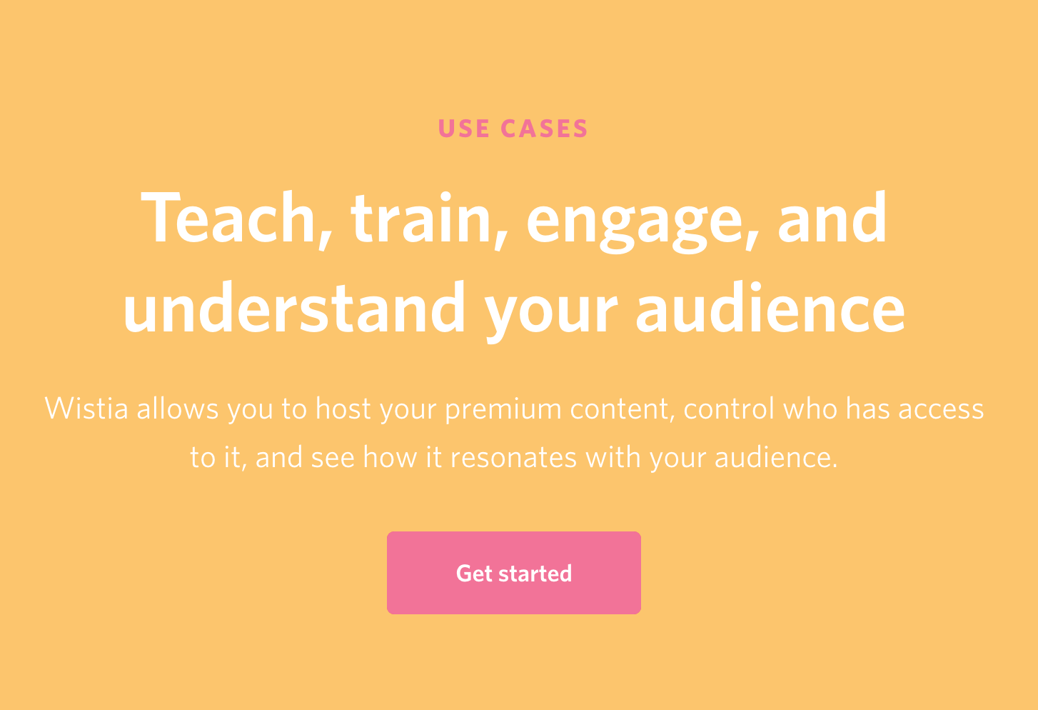
Wistia's gentle way of engaging and learning about users ensures that everyone will see value in Wistia as soon as possible.
Get out of the way when it’s not your customer’s first rodeo
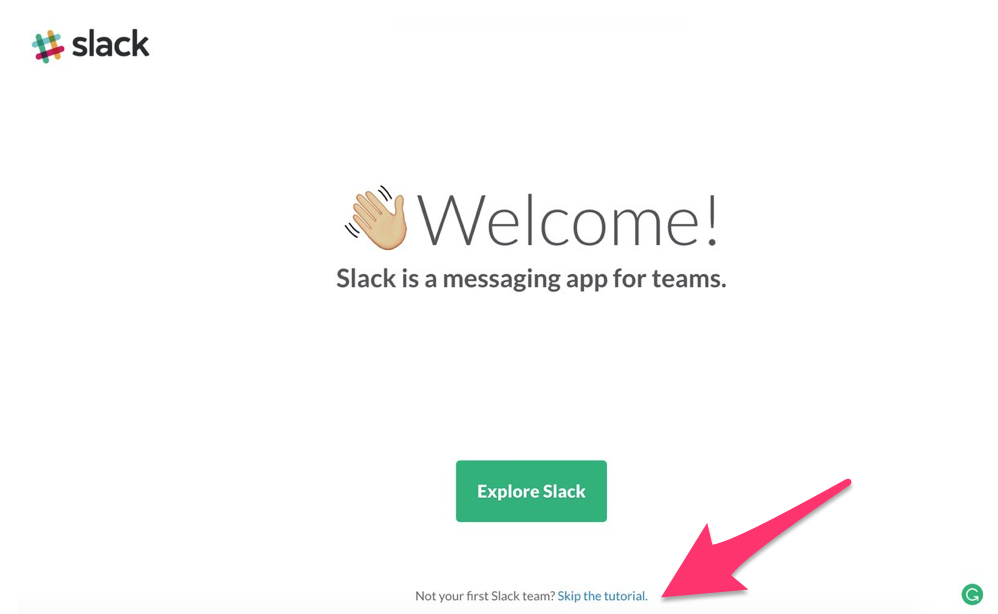
Of course, when you check in with users during onboarding, you might learn that they don't need a helping hand. That’s why Slack offers a handy opt-out button if it’s not your first rodeo.
While signs point towards people to explore Slack using the regular onboarding feature, there’s a “skip the tutorial” button.
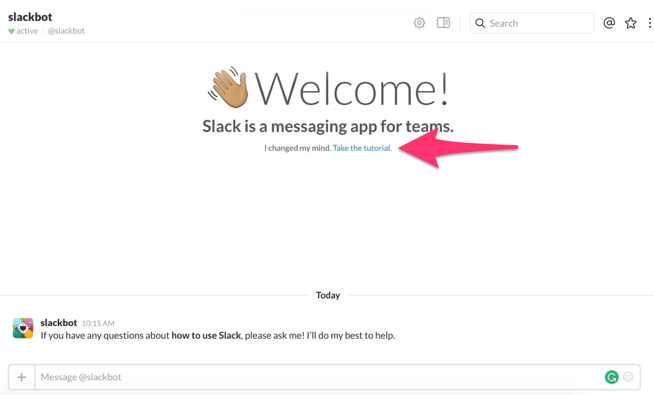
If users clicked the wrong thing, they can change their minds and take the tutorial on the next screen:
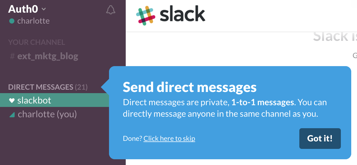
Or if they start the onboarding process and decide to opt-out later, they can skip onboarding messaging for specific features:
📌 Key Takeaway:
By engaging with new users right from the get go, you help people see value in your product as soon as possible. And if they’ve already seen the value, then get out of the way!
2. Model the Product in Full Swing
A lot of SaaS apps start onboarding by bringing users to an empty dashboard. As newbies, they have little to no data in the app, so all they see is a blank slate.
Blank states are incredibly confusing during onboarding.
That’s why, when Apple shows users a product, they don’t bring them to a blank slate. Instead, they show their products as if they're in full swing. Not only do the MacBooks on display have all the apps that come with new products (like iBooks, Garage Band, and iTunes), all those apps are filled with data. Open up the Notes app in an Apple store and you'll see examples of different kinds of use cases for the product, from grocery checklists to class notes to a made up art history seminar.
Every product on display demos the best use-case of the products to educate users during onboarding. 🤘
In addition, even the way objects are displayed mimics optimal use. When you come to the store, products are placed at eye level (with children's section at children's eye level) and iPads are tilted at a 45-degree angle, just as though you were using them at home.
If users still don't fully understand the optimal use case for products, they can sign up for any number of free workshops at the Genius Bar to learn more about all the stuff they can do, from the how to discover Apps for your Apple Watch to how to become a pro videographer with just your iPhone. By modeling the product at its optimal use, Apple stores help users become pro users in no time.
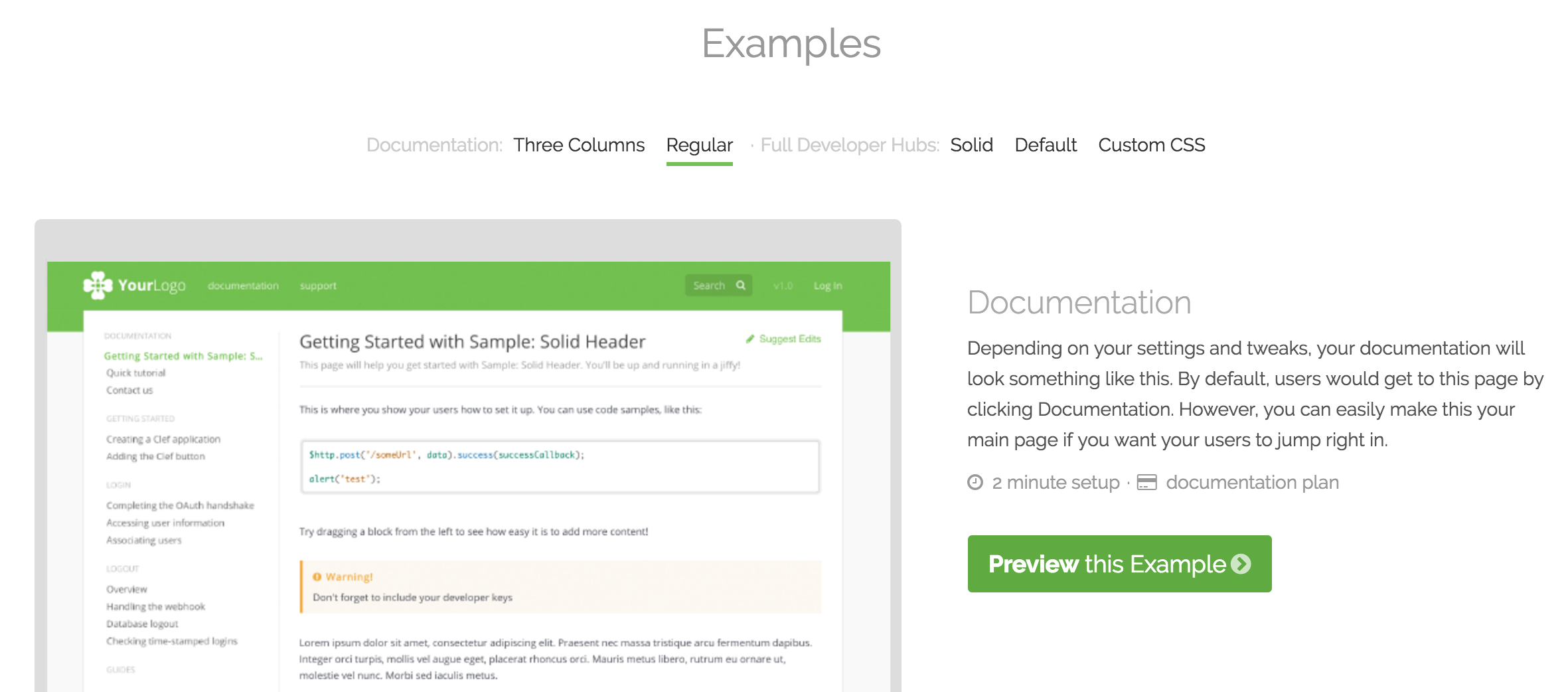
ReadMe.io does the same thing with their API documentation product.
In fact, the founder says that’s one of the reasons ReadMe got into into Y Combinator at the second time. Initially the partners didn’t think that bad documentation was a problem that needed solving. In order to convince new users the benefits of good documentation, they have a couple of examples that users can preview and play around with during their onboarding. By modeling the product at its fullest, instead of directing new users to a blank API documentation page, they get people fully engaged right off the bat.
It’s also important to note that these previews (at Apple and at ReadMe) are entirely free. By offering use of their products in full swing, they make sure that customers see value in the app before they ask for cash in return.
📌 Key Takeaway:
Make sure users understand the maximum potential your product has before charging them for it.
3. Make Your Help Center a Destination
Apple retail stores serve as the hub for every aspect of the customer journey, not just the initial purchase. And, no surprise, they're great at onboarding users to other stages as well, like customer support.
Through gentle nudges, Apple encourages users to feel welcome to use their help center. They let you know from your very first visit that the Genius bar is not your average help desk.
For one, nothing about it says “IT support,” since even the language used to discuss it is different. You're not talking to a salesperson, you're talking to a genius. You're not going to a help desk, you're pulling up a stool to chat at a bar. And no one feels uncomfortable going to talk to a Genius about their computer woes because they're worried someone will try to upsell them.
SaaS companies can learn about the popularity (and reliability) of the Genius bar and apply it to their own onboarding experiences.
Help Centers should Be a Delight, not a Chore
People tend to have negative associations with customer support. But by establishing during onboarding that your support center is a welcoming experience, you encourage customers to use the resource, which makes them get more value out of your product. 🤘
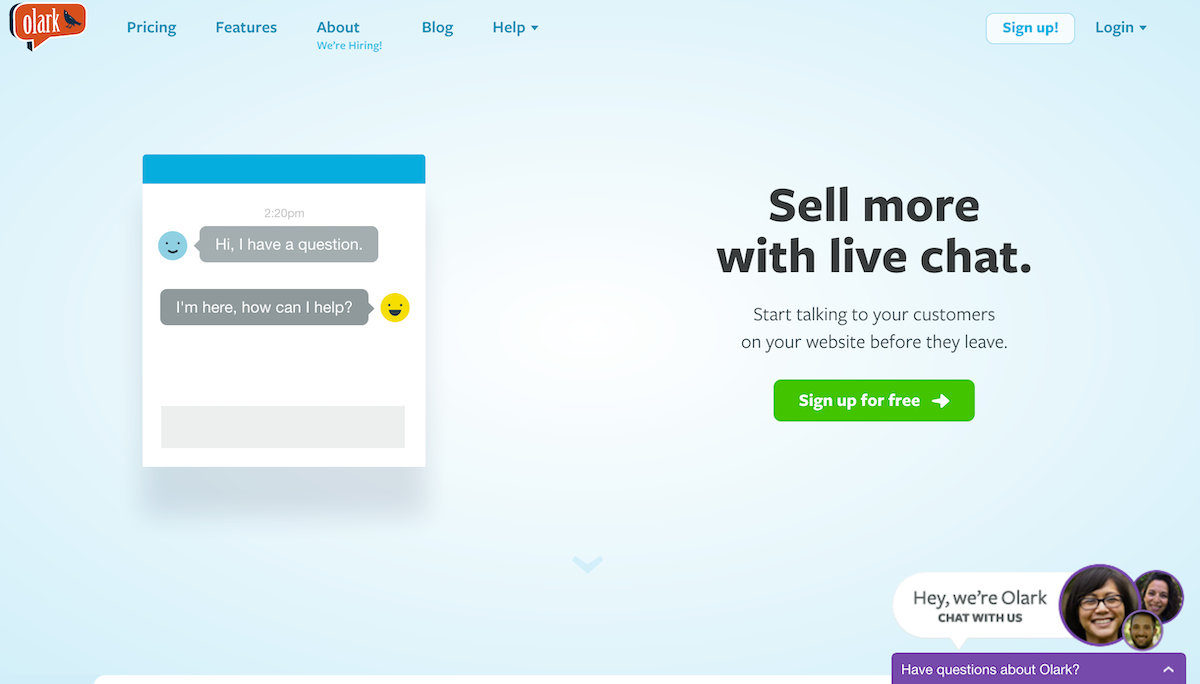
Olark’s home page does a good job of directing the reader's attention to the help center right away. Just like the Genius Bar is welcoming and hard to miss at the Apple store, Olark's pop-up chat tool is made visible right when newcomers land on the home page.
There's a popup chat tool on every page inviting people to ask questions to real Olark employees.
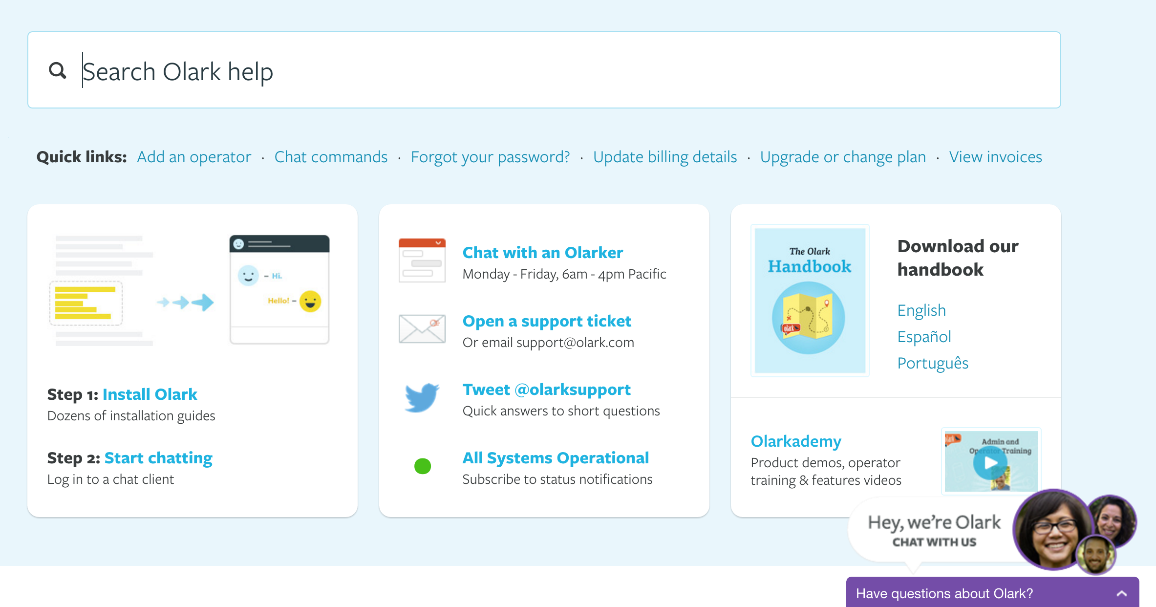
And on the actual help page, the site is searchable and has tons of different ways for people to connect to Olark.
📌 Key Takeaway:
Help people see the value in your app by making the help center approachable, even during onboarding.
Bonus: What The Apple Store Doesn’t Do
Above all, Apple’s onboarding is great because of what it doesn’t do: it doesn't overwhelm people.
If someone wants to play with a product, no one comes up and demands their information. If someone walks into the store and says “I’m just browsing,” the clerk backs off and doesn’t press them for their email, phone number, or credit card. When someone is ready to make a purchase, the Apple employee walks right up to them to take a payment, rather than telling them to go wait in line at the checkout desk. They remove all points of friction. 🤘
It takes some time to warm up and explore a product, and all the ways it can benefit someone. By letting people learn about Apple in the onboarding process, customers learn how to get the most value possible out of their store.
Your app needs to do the same thing. Great onboarding is only the first step towards an amazing customer experience that actually retains users.
Chameleon is built to help you create and optimize these tips. Show tours only to users that are interested; launch tours from your support docs; and iterate based on knowing what's working. Sign-up for a free trial to see how it can help drive your users to be fans.


