










Want to improve UX for your JavaScript web app? Add tooltips: small pop-ups that show helpful text when a user hovers over, clicks, or focuses on an element. They give your users quick access to the right information, exactly when and where they need it while they interact with your product.
If you've got the skills and resources, you can build tooltips on your own, or you can save time by using open-source tooltip libraries.
💡 If coding isn't part of your skillset, don't give up just yet! You can add a dedicated tooltip builder to your tech stack to easily build and deploy on-brand tooltips without writing a line of code.
The TL;DR
-
You can build tooltips yourself, or save time with an open-source JavaScript tooltip library.
-
Popper.js handles positioning and powers other libraries on this list. Bootstrap Tooltip needs it installed.
-
Already on jQuery? jQuery UI Tooltip, PowerTip and EasyUI Tooltip plug straight in. React teams can reach for Ant Design Tooltip.
-
7 of the 10 libraries install with one npm command, like npm i @popperjs/core.
-
No coding skills? A no-code tooltip builder like Chameleon lets you ship on-brand tooltips without writing a line of code.
10 JavaScript Tooltip Libraries
It can be difficult to find well-maintained JavaScript libraries that have a rich set of features. But we did our best to bring you this curated list of top 10 tooltip libraries out there.
1. Opentip
Opentip is a tooltip library that supports a wide range of features, including custom CSS, animations, and themes. Core features include customizable themes, positioning, and animation options.
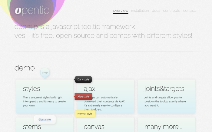
To get started with Opentip, download the appropriate opentip bundle from github for your framework. Also download the opentip CSS file.
Afterwards, embed the Javascript and the CSS file in your page.
Or you can do it via an npm command:
npm i opentip
2. Popper.js
Popper.js is a powerful library for positioning tooltips and other popovers. Part of what makes it so great is that it’s built upon Floating UI – a robust JavaScript library for floating elements.
Popper also powers various other tooltip libraries, including some on this list. It supports a wide range of positioning options, including automatic positioning based on the available space.
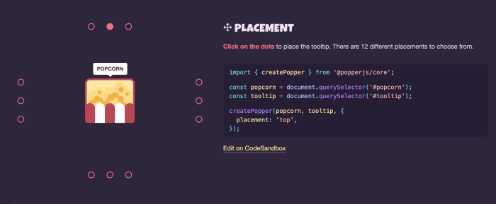
To begin with Popper.js, you can use npm by running the following command:
npm i @popperjs/core
3. QTip2
QTip2 is a feature-rich tooltip library that supports a wide range of features, including custom positioning, animations, and themes. Core features include customizable themes, positioning, and animation options.
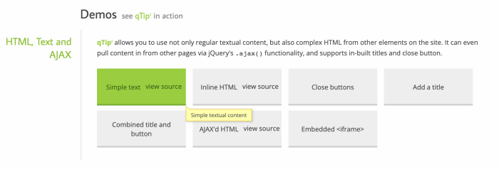
You can start with QTip2 by downloading it and following the guide on the website.
You can also start with an npm command:
npm i qtip2
4. Bootstrap Tooltip
Bootstrap Tooltip is a tooltip library that is part of the popular Bootstrap framework. It relies on Popper for positioning so make sure that you have Popper installed. It supports a wide range of features, including custom positioning on links or buttons, HTML options, and various animation possibilities.
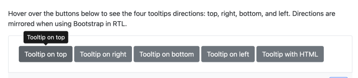
To use Bootstrap Tooltip, you can include the necessary JavaScript and CSS files in your HTML file, which can be found on the Bootstrap website.
5. jQuery UI Tooltip
jQuery UI Tooltip is a simple tooltip plugin that is part of the jQuery UI library. It provides a wide range of customization options, including content formatting, animation demos, styling options, tracking mouse clicks, and more.
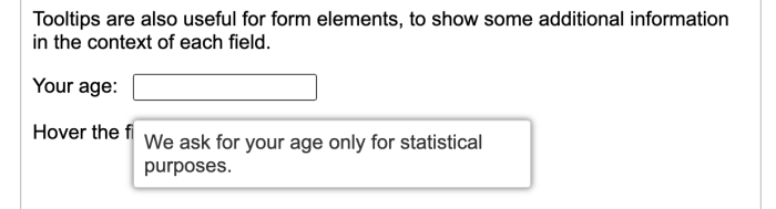
To install jQuery UI Tooltip, download the JavaScript and CSS files from the jQuery UI website.
6. jQuery PowerTip
jQuery PowerTip is a jQuery tooltip plugin that is lightweight, customizable, and supports various features such as animation, positioning, and styling. It is easy to use and requires minimal setup.
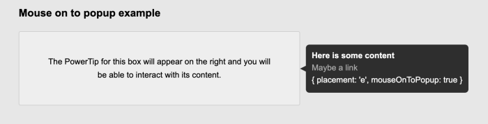
To install jQuery PowerTip, you can use npm by running the following command:
npm install jquery-powertip --save
7. jQuery EasyUI Tooltip:
jQuery EasyUI Tooltip is a tooltip plugin that is part of the jQuery EasyUI library. It provides various customization options, including themes, positioning, and content formatting.

To use jQuery EasyUI Tooltip, grab the JavaScript and CSS files which can be found on the jQuery EasyUI website.
8. PNotify
PNotify is a library for building notifications and prompts, but this means it can also be used for tooltip design. It is designed to be easy to use and it supports complex tooltips with HTML content.
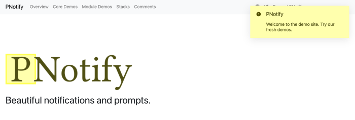
To get started with PNotify, you can get started by running the following command with npm:
npm install --save-dev pnotify
9. Materialize
Materialize is a popular framework that comes with its own set of UI components, including tooltips. Its tooltips are simple, lightweight, and easy to use, and they come with a range of customization options such as position, delay, and HTML content.
Materialize tooltips can be easily integrated with other Materialize components such as buttons and icons. They also support mobile touch events. You can create these tooltips by using simple HTML data attributes or through JavaScript initialization.
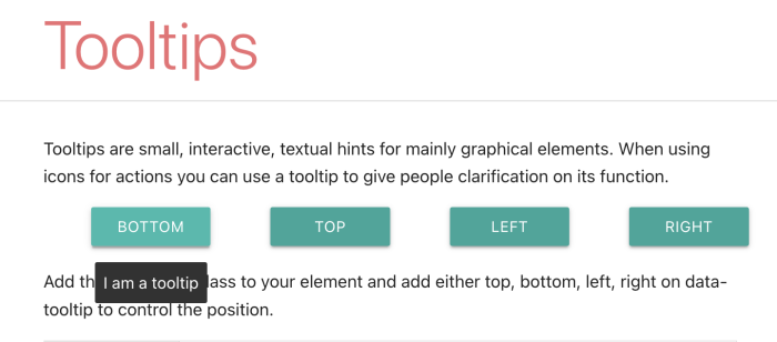
To install Materialize, you can either download the source files directly from the official website or use a package manager such as npm or yarn. Here are the steps to install Materialize using npm:
npm install materialize-css
10. Ant Design Tooltip
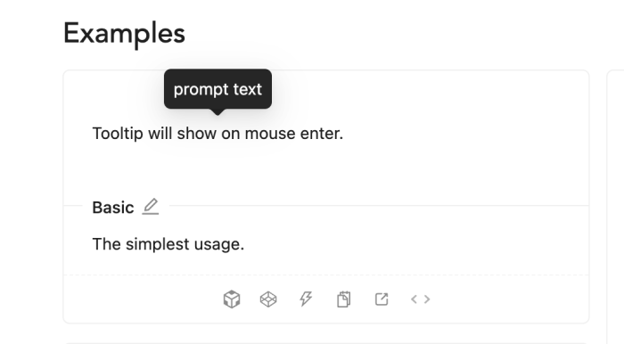
Ant Design Tooltip is a part of the Ant Design UI library for React. It is a customizable and flexible tooltip component that provides a wide range of options to customize the look and feel of the tooltip. It can also be easily integrated with other Ant Design components and supports a range of trigger events such as hover, click, and focus.
Here’s the command you can use to install Ant Design Tooltip:
npm install antd
Save dev resources and create quickly with dedicated software
While open-source tooltip libraries are a great option if you want to build custom tooltips in-house for your web applications. But using purpose-built software for tooltips can be a better choice.
Here are a few reasons why you might want to consider purchasing a software solution:
No need to start from scratch: Tooltip software typically provides a no-code solution and easy-to-use WYSIWYG editor, as well as templates you can customize to your brand style. This can save both time and effort for your engineers.
Support and maintenance: When you purchase tooltip software, you often get access to dedicated support and success managers who can be very helpful in resolving any issues that may arise.
Time-saving: Developing custom tooltips can be a time-consuming process even with an open-source library, especially if you need to build complex and highly interactive tooltips. Purchasing tooltip software can save you a significant amount of time and allow your dev team to focus on other aspects of product development.
Licensing and legal considerations: Open-source libraries often come with licensing restrictions and legal considerations that you need to be aware of. On the other hand, tooltip software can provide you with a more straightforward licensing model and clear legal guidelines.
If you want to try a tooltip software, Chameleon offers a rich suite of tools that make in-app guidance simple and easy to deploy. Besides tooltips, you can use it to create product tours, interactive tutorials, onboarding checklists, in-app help menus, product surveys, and more. Try for free!

Build tooltips for JavaScript apps in minutes
Save time with Chameleon's no-code editor and rapidly deploy tooltips for your JavaScript web app
Frequently asked questions about JavaScript tooltip libraries
-
A JavaScript tooltip is a small pop-up that shows extra information when a user hovers over, clicks, or focuses on an element in a web app. JavaScript controls when it appears, where it sits on the page, and how it animates, so users get help right where they need it.
-
It depends on your stack. Popper.js is the go-to for positioning and powers several other libraries. If you already use Bootstrap, jQuery, Materialize or Ant Design, their built-in tooltip components are the easiest fit. Opentip and QTip2 are good standalone picks with themes and animations.
-
People often use "tooltip.js" to mean any JavaScript tooltip library. The original tooltip.js package was a small companion to Popper.js v1 and is no longer maintained. Most teams now use Popper directly, or a library built on it such as Bootstrap Tooltip.
-
Most install with a single npm command. For example, run npm i @popperjs/core for Popper.js, npm i opentip for Opentip, or npm install antd for Ant Design. Others, like jQuery UI Tooltip and Bootstrap Tooltip, can be added by including their JavaScript and CSS files in your page.
-
No. jQuery UI Tooltip, jQuery PowerTip and jQuery EasyUI Tooltip need jQuery, but plenty of libraries do not. Popper.js, Opentip, PNotify and Materialize work without it, and Ant Design Tooltip is a React component.
-
Yes. Ant Design Tooltip is part of the Ant Design UI library for React. It supports hover, click and focus triggers, has plenty of styling options, and works with other Ant Design components. Install it with npm install antd.
-
Yes. A no-code tooltip builder like Chameleon gives you a WYSIWYG editor and brand-ready templates, so product teams can build and ship tooltips without waiting on engineers. It also saves your developers from maintaining a tooltip library themselves.