


Hi, welcome to the Chameleon blog! Looking for ways to improve your UX writing and in-app messaging? Read below.
See what we did there? UX writing is everywhere in SaaS. It directs new users to where they need to go, guides old users through new features, and is every user’s best friend.
Keep scrolling.
UX Writing skills are a whole different ball game to conventional writing techniques. UX writers need to be concise, clear, and know how to kill those darlings! But, they also need to understand the user's pain points, in-product goals, and general lingo.
In this article, we’ll run you through how you can improve your UX writing skills and overall in-app messaging for happier, more in-the-know users.
Read on!
In-app messaging needs to be sharp, avoid jargon, and be peppered with personality if you hope to keep users engaged and happy.
UX writers should always ask themselves: what is happening now? What should the user do next? And, how can the user go back if they made a mistake? — if UX writers answer these questions, they’ll deliver better copy.
User research is the backbone of successful UX writing. Research enables product teams to segment user groups and deliver more relevant copy based on users’ pain points and jobs to be done.
What is UX Writing?
UX writing includes everything from error messages and CTA buttons, to product tours designed to introduce advanced features or menu items. This product copy helps guide users through the interface, while not interfering with their flow or distracting them from their job to be done.
You’ll find UX writing throughout all of your in-app messaging. Product and UX teams need to consider this product copy as carefully as the interface design itself.
UX designers rely on copy to educate users to the point they no longer need it. Done well, UX copy makes itself redundant in a user’s journey.
What’s more, UX copy is best delivered in the brand voice. However, this specific tone of voice can often be hard to achieve given the limitations of microcopy. A good UX writer is still able to thread a brand’s personality into UX copy, despite their character count limitations.
9 ways to improve your product and in-app copy
Right, let’s get into improving UX writing and how to write clearer copy. Implement these nine UX writing tips the next time you’re crafting in-app messages:
Segment your users with precision
Understand the stages of the user journey
Provide clear and concise information
When in doubt, use plain language
Make the message instantly understandable
Use a conversational tone in your copy
Make the message reassuring
Try different in-app messaging formats
Test your copy for efficiency and engagement
1. Segment your users with precision
First and foremost, you need to be segmenting your users in a way that makes sense for your product and broader user base. By segmenting users, you’re able to craft relevant product messages that are appropriate to each user’s jobs to be done (JTBD) and the informational knowledge they have on your product.
Consider segmenting users going on their job title, pain point, JTBD, and language. These will help you deliver more personalized and relevant messages.
Take a look at Uxcel. They set their onboarding flows up for segmentation success by getting into a user’s WHY. With this information at hand, they’re able to provide in-app messaging that’s more relevant to what their customers are using their product for.

(Source)
2. Understand the stages of the user journey for each segment
User journeys are complicated, and they’ll require a bit of unpicking to deliver contextual and timely UX writing. First up, map out each segment’s unique journey and in-product pathways. From there, collect qualitative user feedback on any pathways that seem cumbersome or without clear guidance.
Use screen recording tools like Hotjar or FullStory to highlight individual flows, rage clicks, or incorrect pathways.
How to engage users who are rage-clicking with Chameleon and FullStory
With this information in hand, you’ll be able to deliver reassuring product messages at more complicated steps in the journey and provide a clear message as to exactly what the user needs to do next. The good news is, if you already utilize product-led marketing efforts, then you’ll most likely already have this information to hand.
In understanding where a user is coming from and where they need to go, you can ensure your in-app messaging doesn’t get repetitive. Google does this well with their in-app messaging: “get started”, highlighting they know that the user is new to the platform. They continue by providing options to learn on their own or be led by in-product tooltips.

(Source)
3. Provide clear and concise information at every point of interaction
In-app guidance and product tours must accommodate user needs, goals, and context. Once you’ve understood those three core areas of the user, you’ll know exactly what users are looking for—and can cut anything they’re not.
This goes beyond just cutting fluffy sentences, but cutting any information that just isn’t relevant. This helps your UX messaging scannability, ensures it remains relevant to each interaction, and keeps users on track rather than rabbit-holing them.
LastPass leaves nothing to the imagination with its tooltips. Take a look at the example below, rather than saying “click here” they repeat the exact copy on the CTA, leaving nothing to chance.

4. When in doubt, use plain language
Whether you’re writing walkthroughs and tooltips or error messages and CTA buttons, there’s no need to try and impress users (or risk baffling them) with technical jargon. They’re already users, so it’s time to implement the KISS principle: Keep it simple, stupid.
Keep your messaging easy to understand and in an active voice, just as Grammarly does in our example below. You never want your user to trip over something you’ve said, or be unsure whether they should take the action you recommend now, or later.
Consistent language alongside UX/UI patterns helps with this a lot: naming or referring to items the same way time and time again will help users understand what you’re referring to better.

(Source)
5. Make the message instantly understandable
This is especially the case with next step CTAs, kill your darlings and never marry yourself to the beauty of a line; in your simplicity, your users will find beauty. Concise copy means that every word should have a purpose, if it doesn’t progress the user on their journey, give it the boot!
Grammarly does exactly this within its app. It’s up to the UX writer to decide when to be smart or playful with language, and when you need to use language plainly to enable users to get their job done faster.

(Source)
6. Use the conversational tone in your copy
A great way to improve UX writing instantly is to use a conversational tone—still in line with your brand voice, of course. This is especially the case in user onboarding flows and when you need to explain core features.
A conversational tone will be easier to digest for users, be more empathetic, and enable them to relate to your product quicker.
A few quick wins to consider for making your copy more conversational are:
Intros
Outros
Exclamation marks
Emojis
Questions
7. Make the message reassuring
Improve in-app messages by reassuring users that they can make mistakes, and mistakes can be easily corrected. Whether that’s incorrectly submitting information, or accidentally skipping to the next step of an onboarding tour, ensure users can identify how they can backtrack.
TravelPerk does this well by offering users the chance to backtrack if they try to delete something. Users will quickly learn that clicking delete isn’t an immediate delete.

(Source)
At the same time, promote value for users by allowing them to get to their job-to-be-done and come back to your messaging later. There’s nothing worse than a one-time modal pop-up when you have something that you need to do. Allow a click-out of every message, and let users know where they can find it if they want to view it later.
Figma did exactly this when they introduced widgets. They gave users the option to explore widgets and what they can do, but also has a clear CTA: “Not now” — reassuring users that they can always come back and explore widgets later.

(Source)
8. Try different in-app messaging formats to find the best fit
Put what you’re saying to the side, and let’s focus on how you say. It is just as important. If you find that users are missing your copy altogether, then perhaps your delivery needs another go. A few alternative formats to consider are:
Onboarding checklists
Help docs
A knowledge base: great for additional resources
The presentation of your copy is just as impactful as what your copy is actually saying.
Slack announces new features smoothly within its in-app help center. Anything it wants a user to see will feature at the top of the help center, just as many brands do with “editor pick” blogs. These banner-style announcements are assisted with GIFs to make them ping a little bit more.

(Source)
9. Test your copy for efficiency and engagement
Lastly, if you hope to improve in-app messages for each user segment, then test, test, and test again. The benefits of testing mean you’ll be able to tweak your copy delivery, both in vocabulary, timing, and format—giving users exactly what they need when they need it, keeping user engagement high and churn low.
HubSpot does a great job of pulse-testing its onboarding flow to ensure new users are happy with their experience, and can easily give feedback without it interrupting their flow too heavily.

(Source)
3 Questions you should always keep in mind when writing in-product copy
Improving UX writing tips aside, there are three questions you’ll need to answer when writing UX copy for users.
What is happening now?
Every piece of in-app messaging needs to state what’s happening on the page the user is interacting with right there and then, address pain points, goals, or opportunities.
What should the user do next?
From stating what’s happening, you’ll need to give clear direction on what the user can and should do next—giving them information tailored to their product goals.
How can the user go back if they made a mistake?
All in-app messaging should clearly display how users can go back if they don’t like the place they’ve advanced to. This reassurance will build trust and investment in your copy guidance, making users more likely to interact with it in the future.
Take the next step in improving your UX writing
Better UX starts with better copy. If you want to improve in-app messages then UX writers need to put the user experience at the heart of everything they do. It’s time to rid yourself of the ego and write for users, not for yourself.
Scrap what you like, break up with your words, and deliver for your user.
Only when you’re able to put your user first are you able to craft UX copy that people find valuable and engaging—copy that helps them fall in love with your product that little bit more.
Share this post with a colleague that needs to read it!
Did it work?
.gif)
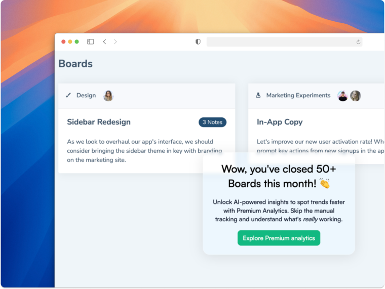
Improve your in-app copy with AI
Chameleon's new AI feature will have you writing copy that gets users excited.


