










8 In-App Training Formats and How to Deliver Useful Product Education
In-app training enhances your product education to ensure users stick around. Here are 8 ways you can deliver effective in-app training.
Read blog post
Existing customer? Sign in
Panel overlays that slide onto users' screens to provide additional information or prompts
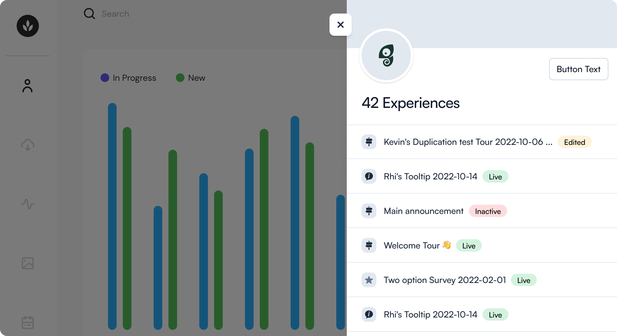
Slideouts are mid-sized UI elements that emerge from the side of the screen, often on the right side. They may be full-screen height and designed to distract users from the main app as part of a core workflow, or they may be smaller and more informative.
These patterns are designed to engage users effectively by offering a variety of interactions, such as gathering feedback or prompting actions.
User Preferences: Adjust settings or preferences within an app, often related to the main underlying page, and where that context needs to be preserved or returned to (instead of a full page navigation away)
Auxiliary Information: Display related details or content from a component or element in the main application
Additional Resources: gateway to help documentation, chat, or other helpful content or resources
Promotions or Offers: Highlight special offers or important notices
Start a free trial or talk to our team.