






🎁 Let your Theme match the user experience
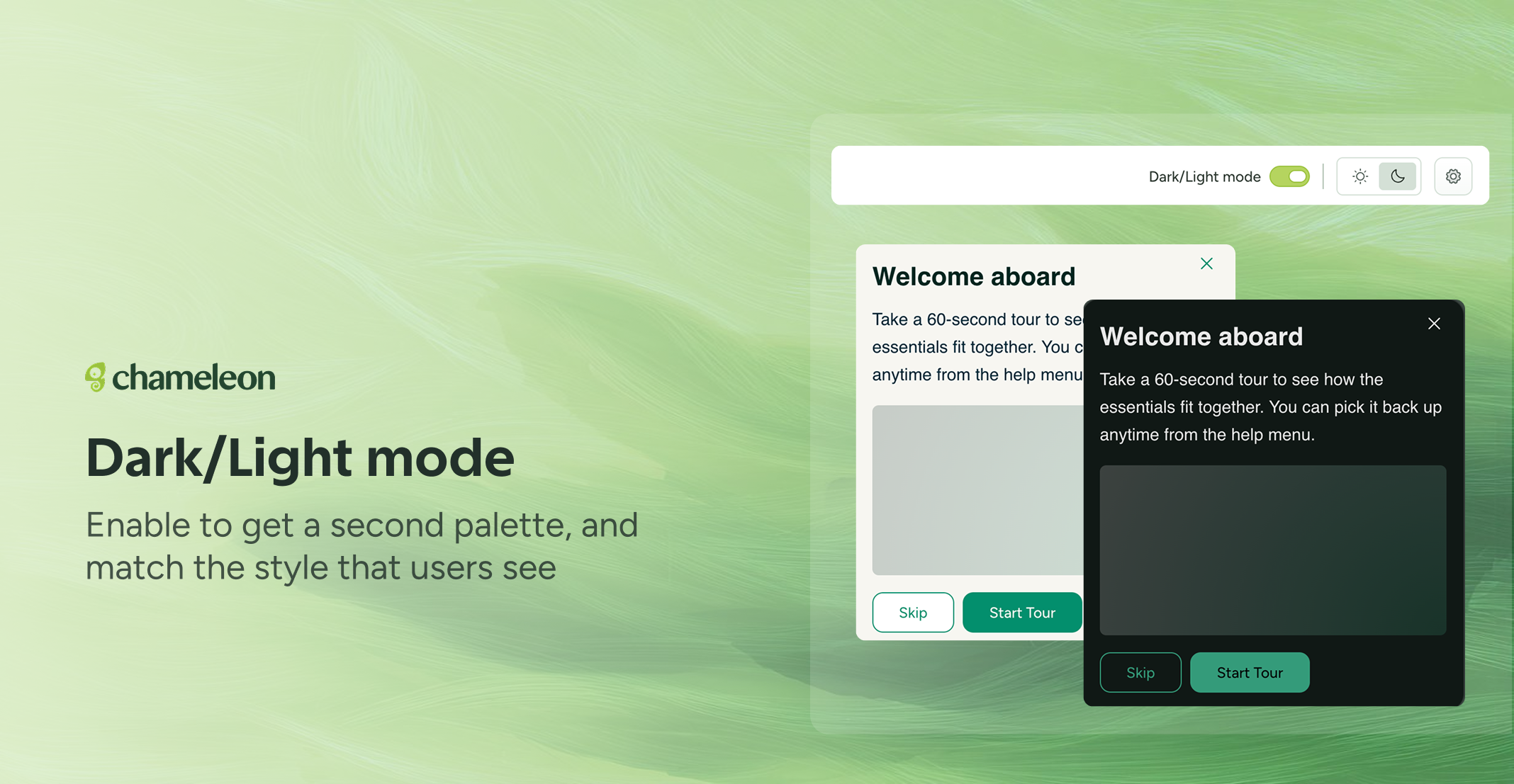
A Theme can now carry two palettes, Light and Dark, and Chameleon renders whichever fits the person looking at it. You choose the rule: a user or company property, or a CSS selector on the page, so the Theme follows your own app settings when it goes dark.
When you enable Darl/Light mode on your Theme, Chameleon generates the contrasting palette for you, and turning it back off keeps whichever palette you choose. The Builder's preview follows the variant you're editing, so you're looking at the real thing while you work.
Tips for using Dark/Light mode
No stored property? Use the selector. If you don't keep a light/dark setting, point the rule at the CSS class your app already applies in dark mode, and Chameleon follows it.
Any property works. The property rule takes any user or company attribute you already send and matches on it, so you don't have to start tracking a new one.
Pick a fallback. If the property or selector can't be read, Chameleon falls back to whichever palette you've marked as the base.
Dark/Light mode for Themes is currently rolling out to all accounts.